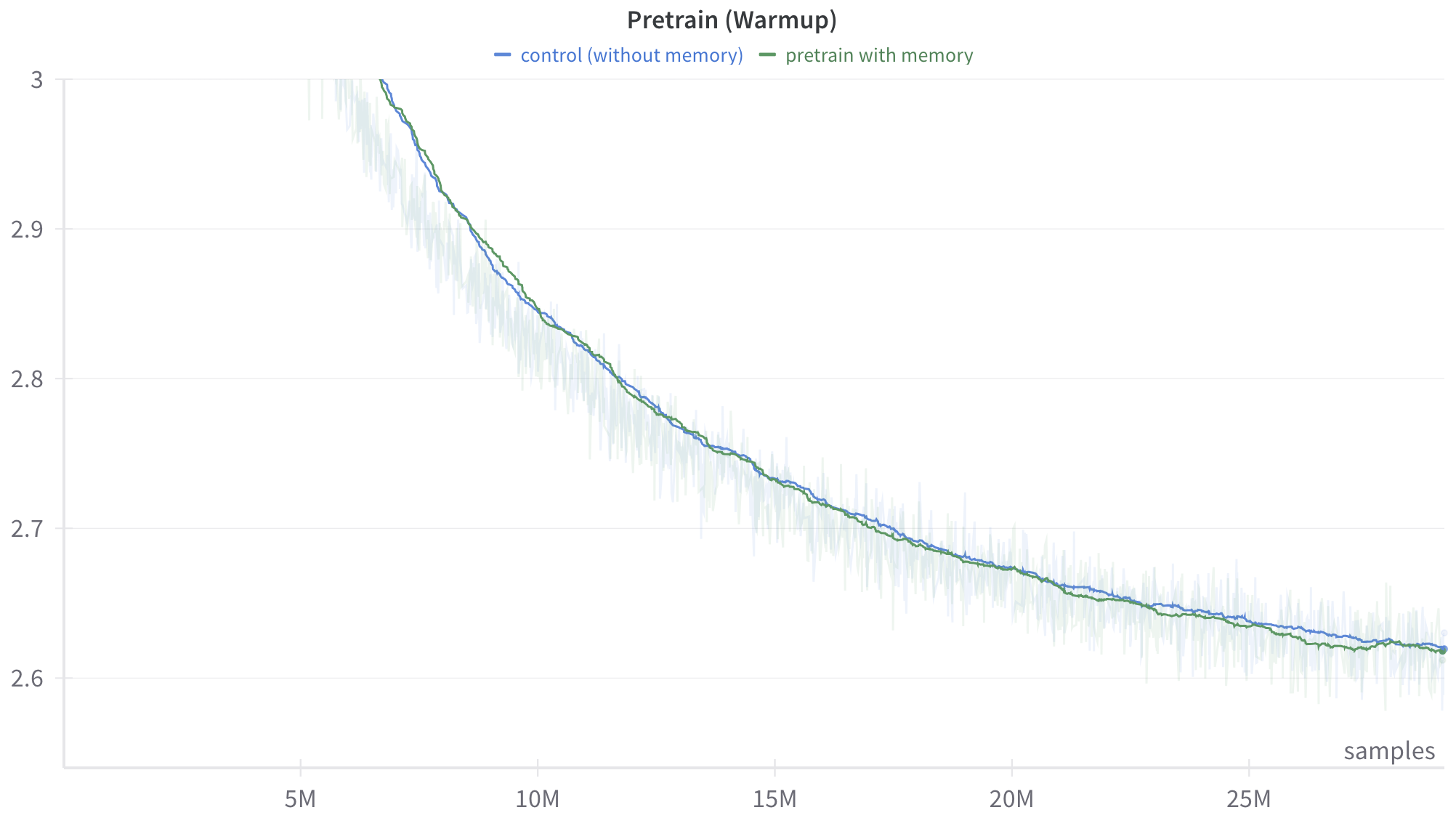
## Line Chart: Pretrain (Warmup)
### Overview
This image is a line chart displaying the training progression of two distinct machine learning models or configurations during a "warmup" phase. The chart plots a performance metric (implied to be loss or error, given the downward trajectory) against the number of training samples processed. It compares a baseline "control" model against a model utilizing "memory."
### Components/Axes
**Header Region (Top):**
* **Title (Top-Center):** "Pretrain (Warmup)"
* **Legend (Below Title, Center):**
* Blue horizontal dash: `control (without memory)`
* Green horizontal dash: `pretrain with memory`
**Y-Axis (Left side, vertical):**
* **Label:** None explicitly provided. Based on the visual trend of a training curve, this represents a metric where lower is better, such as Loss (e.g., Cross-Entropy Loss).
* **Scale:** Linear.
* **Markers:** 2.6, 2.7, 2.8, 2.9, 3 (Note: The top marker is written as "3", not "3.0").
* **Gridlines:** Faint, light gray horizontal lines extend across the chart from each Y-axis marker.
**X-Axis (Bottom, horizontal):**
* **Label (Bottom-Right):** "samples"
* **Scale:** Linear.
* **Markers:** 5M, 10M, 15M, 20M, 25M (M denotes Millions).
* **Gridlines:** Faint tick marks are present on the axis line itself, but vertical gridlines do not extend up through the chart area.
### Detailed Analysis
**Visual Trend Verification:**
Both data series exhibit a steep downward slope starting from the top-left, which gradually flattens out as it moves toward the bottom-right. This represents an exponential decay curve, characteristic of a machine learning model rapidly learning at the beginning of training and then experiencing diminishing returns as it converges.
Behind the solid lines, there is a highly volatile, semi-transparent "shadow" or noise pattern in corresponding light blue and light green colors. This indicates that the solid lines are smoothed representations (likely an exponential moving average) of the raw, highly fluctuating step-by-step training data.
**Data Series 1: Control (without memory) - Solid Blue Line**
* *Trend:* Slopes downward, starting above the visible Y-axis limit and ending near the bottom right.
* *Approximate Data Points (±0.02 uncertainty):*
* Enters the visible chart area (Y=3.0) at approximately X = 6.5M samples.
* At X = 10M samples: Y ≈ 2.84
* At X = 15M samples: Y ≈ 2.73
* At X = 20M samples: Y ≈ 2.67
* At X = 25M samples: Y ≈ 2.64
* Ends at approximately X = 28M samples: Y ≈ 2.61
**Data Series 2: Pretrain with memory - Solid Green Line**
* *Trend:* Slopes downward, closely mirroring the blue line.
* *Approximate Data Points (±0.02 uncertainty):*
* Enters the visible chart area (Y=3.0) at approximately X = 6.4M samples (marginally earlier than the blue line).
* At X = 10M samples: Y ≈ 2.84
* At X = 15M samples: Y ≈ 2.73
* At X = 20M samples: Y ≈ 2.67
* At X = 25M samples: Y ≈ 2.63
* Ends at approximately X = 28M samples: Y ≈ 2.61
### Key Observations
1. **High Correlation:** The two lines track each other extremely closely throughout the entire visible warmup phase.
2. **Marginal Divergence:** Between approximately 15M and 25M samples, the green line ("pretrain with memory") sits *very slightly* below the blue line ("control"). If the Y-axis represents loss, this indicates a microscopic performance advantage for the memory model during this specific window.
3. **Convergence:** By the end of the plotted data (around 28M samples), the two smoothed lines converge almost perfectly at a value of approximately 2.61.
4. **Data Volatility:** The faint background noise shows that the actual step-by-step metric fluctuates wildly (spanning ranges of up to 0.1 on the Y-axis at any given X value), necessitating the smoothed lines to interpret the overall trend.
### Interpretation
This chart demonstrates the learning dynamics of two neural network architectures during the initial "warmup" phase of pretraining (spanning the first ~28 million samples).
The data suggests that introducing a "memory" mechanism to the architecture does not significantly alter the learning trajectory or the rate of convergence during this early phase. Both models learn at virtually the same rate, experiencing rapid initial improvement before settling into a slower, steady decline.
While there is a negligible visual advantage for the "memory" model in the middle of the chart (15M-25M samples), the lines converge by the end of the graph. From a Peircean investigative standpoint, reading between the lines suggests one of two things:
1. The "memory" component requires more than 28 million samples to populate and become useful, meaning its true impact will only be seen later in the training run (beyond the right edge of this chart).
2. The "memory" component is ineffective or irrelevant for the specific task/data being used during this warmup phase.
Ultimately, based *solely* on this chart, a researcher would conclude that adding memory incurs no penalty to early training stability, but also provides no meaningful acceleration to the warmup phase.