\n
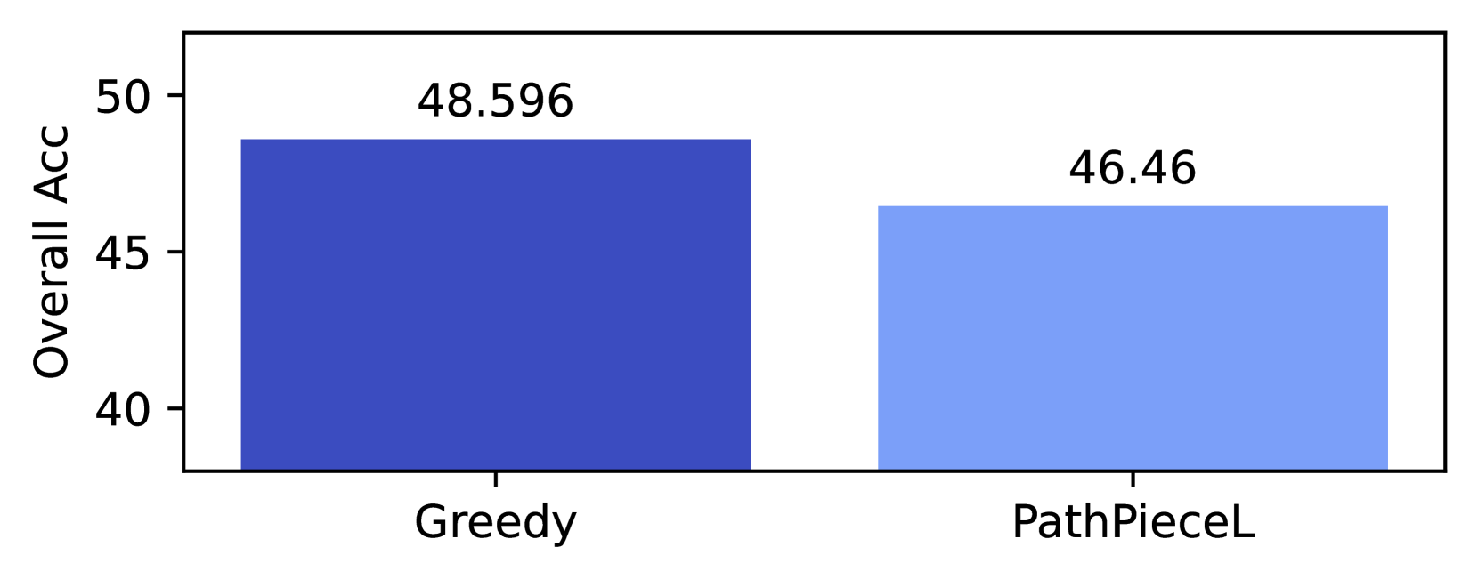
## Bar Chart: Overall Accuracy Comparison
### Overview
This image presents a bar chart comparing the "Overall ACC" (Accuracy) of two methods: "Greedy" and "PathPieceL". The chart visually represents the accuracy scores for each method using rectangular bars.
### Components/Axes
* **X-axis:** Represents the methods being compared: "Greedy" and "PathPieceL".
* **Y-axis:** Labeled "Overall ACC", representing the accuracy score. The scale ranges from approximately 35 to 50, with increments of 5.
* **Bars:** Two bars, one for each method, indicating their respective accuracy scores. Both bars are filled with a solid blue color.
* **Data Labels:** Numerical values are displayed above each bar, indicating the exact accuracy score.
### Detailed Analysis
* **Greedy:** The bar for "Greedy" is positioned on the left side of the chart. The bar extends to approximately 48.596 on the Y-axis. The data label above the bar reads "48.596".
* **PathPieceL:** The bar for "PathPieceL" is positioned on the right side of the chart. The bar extends to approximately 46.46 on the Y-axis. The data label above the bar reads "46.46".
* **Trend:** The "Greedy" method has a higher accuracy score than the "PathPieceL" method. The difference in height between the two bars visually demonstrates this.
### Key Observations
* The "Greedy" method achieves an accuracy of approximately 48.596.
* The "PathPieceL" method achieves an accuracy of approximately 46.46.
* The "Greedy" method outperforms the "PathPieceL" method in terms of overall accuracy, with a difference of approximately 2.136.
### Interpretation
The data suggests that the "Greedy" method is more accurate than the "PathPieceL" method for the task being evaluated. The chart provides a clear visual comparison of the performance of these two methods, highlighting the advantage of the "Greedy" approach. The difference in accuracy, while not substantial, indicates that the "Greedy" method may be a preferable choice in this context. Further investigation could explore the reasons behind this performance difference and whether the results generalize to other datasets or scenarios. The chart is a straightforward presentation of comparative performance, lacking any complex relationships or anomalies beyond the simple difference in accuracy scores.