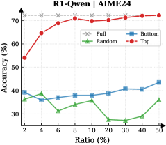
## Line Chart: Accuracy vs. Ratio for Different Data Selection Strategies
### Overview
This line chart displays the accuracy of a model (likely a language model, given the context "R1-Qwen | AIME24") as a function of the ratio of data used, comparing four different data selection strategies: Full, Random, Bottom, and Top. The accuracy is measured in percentage (%), and the ratio is also expressed as a percentage (%).
### Components/Axes
* **Title:** R1-Qwen | AIME24 (top-center)
* **X-axis:** Ratio (%) - ranging from 2% to 50%. Markers are placed at 2, 4, 6, 8, 10, 20, 30, 40, and 50.
* **Y-axis:** Accuracy (%) - ranging from approximately 30% to 75%.
* **Legend:** Located in the top-right corner.
* Full (gray dashed line with 'x' markers)
* Random (green solid line with triangle markers)
* Bottom (blue solid line with diamond markers)
* Top (red solid line with circle markers)
### Detailed Analysis
* **Full (Gray):** The line representing "Full" data starts at approximately 72% accuracy at 2% ratio and remains relatively constant at around 72-73% accuracy throughout the entire ratio range (up to 50%).
* **Random (Green):** The "Random" line starts at approximately 36% accuracy at 2% ratio. It initially decreases to around 32% at 6% ratio, then increases to approximately 35% at 50% ratio. The trend is generally flat with some fluctuations.
* **Bottom (Blue):** The "Bottom" line begins at approximately 38% accuracy at 2% ratio. It fluctuates between approximately 38% and 42% accuracy, with a slight upward trend towards the end, reaching around 43% at 50% ratio.
* **Top (Red):** The "Top" line shows a strong upward trend. It starts at approximately 54% accuracy at 2% ratio, increases rapidly to around 68% at 6% ratio, reaches a peak of approximately 72% at 8% ratio, and then plateaus around 72-73% accuracy for the remainder of the ratio range.
**Data Points (Approximate):**
| Ratio (%) | Full (%) | Random (%) | Bottom (%) | Top (%) |
|---|---|---|---|---|
| 2 | 72 | 36 | 38 | 54 |
| 4 | 72 | 34 | 39 | 64 |
| 6 | 72 | 32 | 40 | 68 |
| 8 | 72 | 33 | 41 | 72 |
| 10 | 72 | 34 | 40 | 72 |
| 20 | 72 | 33 | 40 | 72 |
| 30 | 72 | 34 | 41 | 72 |
| 40 | 72 | 33 | 42 | 72 |
| 50 | 72 | 35 | 43 | 72 |
### Key Observations
* The "Top" data selection strategy consistently outperforms all other strategies, especially at lower ratios (2% to 8%).
* The "Full" data strategy maintains a high and stable accuracy across all ratios.
* "Random" and "Bottom" strategies exhibit relatively low and fluctuating accuracy.
* The "Top" strategy shows diminishing returns after 8% ratio, as its accuracy plateaus.
### Interpretation
The chart demonstrates the effectiveness of selecting the "Top" data for training a model, particularly when limited data is available. The rapid increase in accuracy with the "Top" strategy suggests that focusing on the most informative or relevant data points leads to significant performance gains. The "Full" strategy provides a stable baseline, indicating that using all available data is also effective, but may not be as efficient as targeted data selection. The lower performance of "Random" and "Bottom" strategies suggests that randomly or selecting the least informative data points does not contribute significantly to model accuracy. The plateauing of the "Top" strategy at higher ratios indicates that there is a limit to the benefits of selecting only the top data, and adding more data (even if it's not the "top") may not further improve performance. This data suggests a strategy of prioritizing high-quality data over quantity, especially in resource-constrained scenarios.