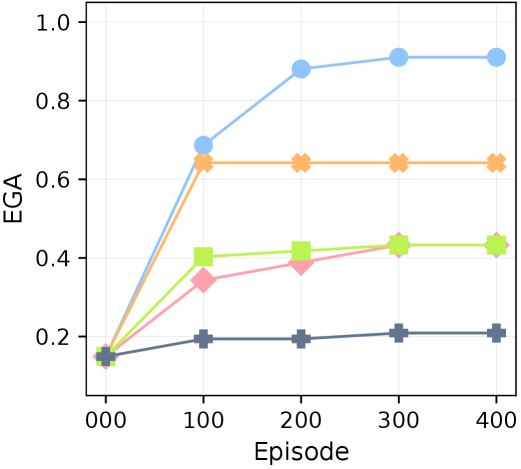
## Line Chart: EGA vs Episode
### Overview
The image is a line chart displaying the relationship between Episode (x-axis) and EGA (y-axis) for four different data series, each represented by a distinct color and marker. The chart shows how EGA changes over the course of 400 episodes for each series.
### Components/Axes
* **X-axis:** Episode, with markers at 0, 100, 200, 300, and 400.
* **Y-axis:** EGA, ranging from 0.0 to 1.0, with markers at 0.2 intervals.
* **Data Series:**
* Blue line with circle markers.
* Orange line with cross markers.
* Light Green line with square markers.
* Pink line with diamond markers.
* Dark Grey line with plus markers.
### Detailed Analysis
* **Blue Line (Circle Markers):**
* Trend: Initially increases sharply, then plateaus.
* Data Points:
* Episode 0: EGA ~0.15
* Episode 100: EGA ~0.7
* Episode 200: EGA ~0.9
* Episode 300: EGA ~0.9
* Episode 400: EGA ~0.9
* **Orange Line (Cross Markers):**
* Trend: Increases sharply initially, then remains relatively constant.
* Data Points:
* Episode 0: EGA ~0.15
* Episode 100: EGA ~0.65
* Episode 200: EGA ~0.65
* Episode 300: EGA ~0.65
* Episode 400: EGA ~0.65
* **Light Green Line (Square Markers):**
* Trend: Increases gradually, then plateaus.
* Data Points:
* Episode 0: EGA ~0.15
* Episode 100: EGA ~0.4
* Episode 200: EGA ~0.42
* Episode 300: EGA ~0.44
* Episode 400: EGA ~0.44
* **Pink Line (Diamond Markers):**
* Trend: Increases gradually, then plateaus.
* Data Points:
* Episode 0: EGA ~0.15
* Episode 100: EGA ~0.35
* Episode 200: EGA ~0.4
* Episode 300: EGA ~0.43
* Episode 400: EGA ~0.43
* **Dark Grey Line (Plus Markers):**
* Trend: Increases slightly, then plateaus.
* Data Points:
* Episode 0: EGA ~0.15
* Episode 100: EGA ~0.2
* Episode 200: EGA ~0.2
* Episode 300: EGA ~0.21
* Episode 400: EGA ~0.21
### Key Observations
* The blue line (circle markers) shows the highest EGA values and the most significant initial increase.
* The orange line (cross markers) also shows a significant initial increase but plateaus at a lower EGA value than the blue line.
* The light green and pink lines (square and diamond markers, respectively) show more gradual increases in EGA.
* The dark grey line (plus markers) shows the lowest EGA values and the least change over the episodes.
* All lines start at approximately the same EGA value (~0.15) at Episode 0.
* All lines plateau after approximately 200 episodes.
### Interpretation
The chart compares the performance of four different strategies or algorithms (represented by the different colored lines) in terms of EGA (likely a performance metric) over a series of episodes. The blue line represents the most effective strategy, achieving the highest EGA values and a rapid initial improvement. The orange line is also effective initially but plateaus at a lower level. The light green, pink, and dark grey lines represent less effective strategies, with lower EGA values and slower improvement. The fact that all lines start at the same EGA value suggests that all strategies begin with similar initial performance. The plateauing of all lines indicates that the strategies reach a point of diminishing returns, where further episodes do not lead to significant improvements in EGA.