\n
## Line Chart: EGA vs. Episode
### Overview
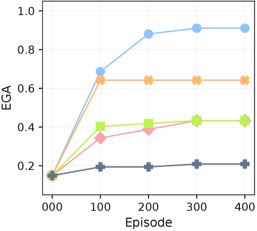
The image presents a line chart illustrating the relationship between "Episode" (on the x-axis) and "EGA" (on the y-axis). Five different data series are plotted, each represented by a distinct color. The chart appears to track the evolution of EGA across a range of episodes from 0 to 400.
### Components/Axes
* **X-axis:** Labeled "Episode", ranging from 0 to 400, with markers at 0, 100, 200, 300, and 400.
* **Y-axis:** Labeled "EGA", ranging from 0 to 1.0, with markers at 0, 0.2, 0.4, 0.6, 0.8, and 1.0.
* **Data Series:** Five lines, each representing a different experimental condition or variable. The colors are:
* Blue
* Orange
* Green
* Pink
* Gray
### Detailed Analysis
Let's analyze each line individually, noting trends and approximate data points.
* **Blue Line:** This line shows a strong upward trend, starting at approximately 0.15 at Episode 0, rising rapidly to around 0.7 at Episode 100, reaching approximately 0.9 at Episode 200, and plateauing around 0.92-0.95 from Episode 200 to 400.
* **Orange Line:** This line also shows an initial increase, starting at approximately 0.15 at Episode 0, rising to around 0.65 at Episode 100, and then leveling off, remaining relatively constant between 0.6 and 0.7 from Episode 100 to 400.
* **Green Line:** This line exhibits a moderate upward trend, starting at approximately 0.1 at Episode 0, increasing to around 0.4 at Episode 100, and then showing a slower increase, reaching approximately 0.45 at Episode 400.
* **Pink Line:** This line shows a moderate upward trend, starting at approximately 0.1 at Episode 0, increasing to around 0.3 at Episode 100, and then showing a slower increase, reaching approximately 0.4 at Episode 400.
* **Gray Line:** This line remains relatively flat throughout the entire range of episodes, starting at approximately 0.15 at Episode 0, and fluctuating around 0.2, ending at approximately 0.2 at Episode 400.
### Key Observations
* The blue line consistently exhibits the highest EGA values across all episodes.
* The gray line demonstrates the lowest and most stable EGA values.
* The orange, green, and pink lines show similar, moderate growth patterns.
* The rate of increase for all lines (except gray) is most pronounced between Episodes 0 and 100.
* After Episode 100, the growth rate slows down significantly for all lines.
### Interpretation
The chart suggests that the "EGA" metric is sensitive to the "Episode" number, at least initially. The blue line's rapid increase and subsequent plateau could indicate a saturation point or a limit to the improvement achievable with increasing episodes. The relatively stable gray line might represent a baseline or a control condition that is not affected by the episode number. The convergence of the orange, green, and pink lines towards a similar EGA value suggests that these conditions may be approaching a similar state. The initial rapid increase across all lines could represent a learning or adaptation phase, where the system quickly improves with early exposure to episodes. The plateauing after 100 episodes suggests diminishing returns or a stabilization of the system's performance. Further investigation would be needed to understand the underlying mechanisms driving these trends and the specific meaning of "EGA" in the context of the experiment.