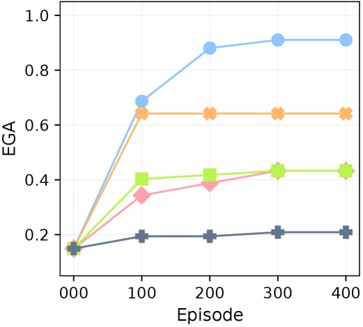
## Line Chart: EGA Performance Across Episodes
### Overview
The image is a line chart depicting the performance of five distinct entities (labeled as Blue Line, Orange Line, Green Line, Pink Line, and Dark Blue Line) across episodes. The y-axis represents "EGA" (a metric ranging from 0.0 to 1.0), while the x-axis represents "Episode" (from 000 to 400). Each line shows a unique trend, with some lines plateauing after an initial increase.
### Components/Axes
- **Y-axis (EGA)**: Labeled "EGA" with a scale from 0.0 to 1.0 in increments of 0.2.
- **X-axis (Episode)**: Labeled "Episode" with a scale from 000 to 400 in increments of 100.
- **Legend**: Positioned on the right side of the chart, with five entries:
- **Blue Line**: Blue color, circular markers.
- **Orange Line**: Orange color, square markers.
- **Green Line**: Green color, diamond markers.
- **Pink Line**: Pink color, triangle markers.
- **Dark Blue Line**: Dark blue color, square markers.
### Detailed Analysis
1. **Blue Line**:
- Starts at 0.0 (Episode 000).
- Rises sharply to approximately 0.9 by Episode 100.
- Plateaus at ~0.9 from Episode 100 to 400.
- **Trend**: Steep upward slope followed by a flat line.
2. **Orange Line**:
- Starts at 0.0 (Episode 000).
- Rises to ~0.65 by Episode 100.
- Remains flat at ~0.65 from Episode 100 to 400.
- **Trend**: Moderate upward slope followed by a plateau.
3. **Green Line**:
- Starts at 0.0 (Episode 000).
- Gradually increases to ~0.45 by Episode 300.
- Plateaus at ~0.45 from Episode 300 to 400.
- **Trend**: Slow upward slope followed by a plateau.
4. **Pink Line**:
- Starts at 0.0 (Episode 000).
- Rises to ~0.4 by Episode 300.
- Plateaus at ~0.4 from Episode 300 to 400.
- **Trend**: Gradual upward slope followed by a plateau.
5. **Dark Blue Line**:
- Starts at 0.0 (Episode 000).
- Increases to ~0.2 by Episode 300.
- Plateaus at ~0.2 from Episode 300 to 400.
- **Trend**: Slow upward slope followed by a plateau.
### Key Observations
- **Blue Line** consistently achieves the highest EGA, reaching ~0.9 and maintaining it.
- **Orange Line** is the second-highest, peaking at ~0.65.
- **Green Line** and **Pink Line** show similar trends but with lower EGA values (~0.45 and ~0.4, respectively).
- **Dark Blue Line** has the lowest EGA, peaking at ~0.2.
- All lines plateau after their initial rise, suggesting stabilization of EGA over time.
### Interpretation
The chart demonstrates that the **Blue Line** (likely representing a specific entity or strategy) is the most effective, achieving the highest EGA and maintaining it across episodes. The **Orange Line** follows as the second-most effective, while the **Green**, **Pink**, and **Dark Blue Lines** show progressively lower performance. The plateauing trends indicate that EGA stabilizes after a certain number of episodes, suggesting diminishing returns or convergence in performance. The sharp rise of the Blue Line implies a rapid improvement in effectiveness early on, which is not observed in the other lines. This could reflect differences in initial conditions, strategies, or inherent capabilities of the entities being measured.