## Charts: Current vs. Time Plots
### Overview
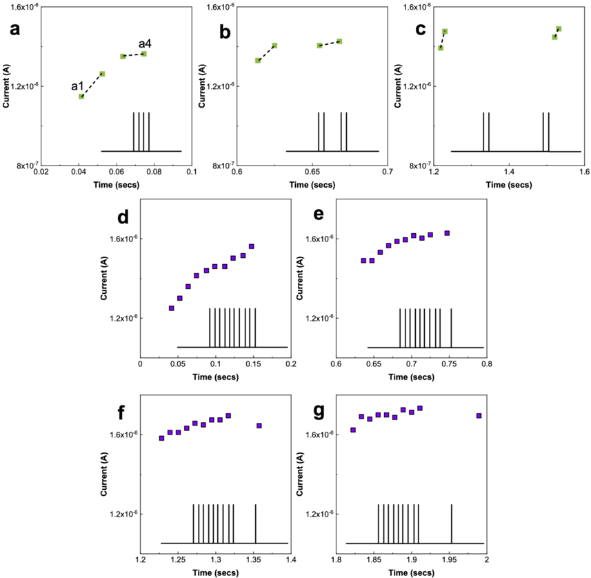
The image presents seven separate charts (labeled a through g) displaying current (in Amperes, A) as a function of time (in seconds, secs). Each chart shows a series of data points, some connected by lines, and a series of vertical lines at the bottom of each plot, likely representing a pulsed signal or measurement intervals. The y-axis scale is logarithmic.
### Components/Axes
* **X-axis (all charts):** Time (secs). Scales vary per chart.
* **Y-axis (all charts):** Current (A). Logarithmic scale, ranging approximately from 8x10<sup>-7</sup> A to 1.6x10<sup>-6</sup> A.
* **Chart a:** Green data points connected by a dashed line.
* **Chart b:** Green data points connected by a dashed line.
* **Chart c:** Green data points connected by a dashed line.
* **Chart d:** Purple data points.
* **Chart e:** Purple data points.
* **Chart f:** Purple data points.
* **Chart g:** Purple data points.
* **Bottom of each chart:** Series of vertical lines, indicating time intervals.
### Detailed Analysis or Content Details
**Chart a:**
* Trend: The line slopes upward, then plateaus.
* Data Points (approximate):
* (0.02 secs, 8.5x10<sup>-7</sup> A) - labeled "a1"
* (0.08 secs, 1.5x10<sup>-6</sup> A) - labeled "a4"
**Chart b:**
* Trend: The line initially rises, then fluctuates around a plateau.
* Data Points (approximate):
* (0.6 secs, 1.2x10<sup>-6</sup> A)
* (0.65 secs, 1.6x10<sup>-6</sup> A)
* (0.7 secs, 1.3x10<sup>-6</sup> A)
**Chart c:**
* Trend: The line rises, then fluctuates around a plateau.
* Data Points (approximate):
* (1.2 secs, 1.2x10<sup>-6</sup> A)
* (1.4 secs, 1.6x10<sup>-6</sup> A)
* (1.6 secs, 1.3x10<sup>-6</sup> A)
**Chart d:**
* Trend: The data points decrease in value as time increases.
* Data Points (approximate):
* (0 secs, 1.6x10<sup>-6</sup> A)
* (0.05 secs, 1.4x10<sup>-6</sup> A)
* (0.1 secs, 1.3x10<sup>-6</sup> A)
* (0.15 secs, 1.25x10<sup>-6</sup> A)
* (0.2 secs, 1.2x10<sup>-6</sup> A)
**Chart e:**
* Trend: The data points decrease in value as time increases.
* Data Points (approximate):
* (0.6 secs, 1.6x10<sup>-6</sup> A)
* (0.65 secs, 1.5x10<sup>-6</sup> A)
* (0.7 secs, 1.4x10<sup>-6</sup> A)
* (0.75 secs, 1.3x10<sup>-6</sup> A)
* (0.8 secs, 1.2x10<sup>-6</sup> A)
**Chart f:**
* Trend: The data points decrease in value as time increases.
* Data Points (approximate):
* (1.2 secs, 1.6x10<sup>-6</sup> A)
* (1.25 secs, 1.5x10<sup>-6</sup> A)
* (1.3 secs, 1.4x10<sup>-6</sup> A)
* (1.35 secs, 1.3x10<sup>-6</sup> A)
* (1.4 secs, 1.2x10<sup>-6</sup> A)
**Chart g:**
* Trend: The data points decrease in value as time increases.
* Data Points (approximate):
* (1.8 secs, 1.6x10<sup>-6</sup> A)
* (1.85 secs, 1.5x10<sup>-6</sup> A)
* (1.9 secs, 1.4x10<sup>-6</sup> A)
* (1.95 secs, 1.3x10<sup>-6</sup> A)
* (2 secs, 1.2x10<sup>-6</sup> A)
### Key Observations
* Charts a, b, and c show an initial rise in current followed by a plateau or fluctuation. These charts use green data points and dashed lines.
* Charts d, e, f, and g show a consistent decrease in current over time. These charts use purple data points.
* The vertical lines at the bottom of each chart suggest a periodic or pulsed measurement.
* The logarithmic y-axis emphasizes relative changes in current rather than absolute values.
### Interpretation
The data suggests two distinct behaviors: a rapid current increase followed by stabilization (charts a-c), and a current decay (charts d-g). The pulsed nature of the measurements (indicated by the vertical lines) implies that these measurements are taken during or after a stimulus. The green charts (a-c) might represent the current response *during* a pulse, while the purple charts (d-g) might represent the current decay *after* the pulse. The consistent decay in the purple charts suggests an exponential decay process. The initial rise in the green charts could be due to a charging or activation process. The different time scales of the charts suggest that the experiments were conducted with varying pulse durations or measurement intervals. The labels "a1" and "a4" suggest these are specific points of interest within chart a, potentially marking key stages in the current rise.