\n
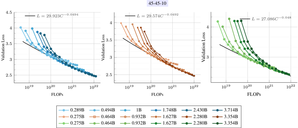
## Chart: Validation Loss vs. FLOPs for Different Model Sizes
### Overview
The image presents three line charts, arranged horizontally, depicting the relationship between Validation Loss and FLOPs (Floating Point Operations) for various model sizes. Each chart represents a different scaling factor, indicated by the title "45-45-10". The charts aim to illustrate how model complexity (as measured by FLOPs) affects validation loss.
### Components/Axes
* **X-axis:** FLOPs, ranging from approximately 10<sup>19</sup> to 10<sup>22</sup> (left chart), 10<sup>19</sup> to 10<sup>22</sup> (middle chart), and 10<sup>19</sup> to 10<sup>22</sup> (right chart). The scale is logarithmic.
* **Y-axis:** Validation Loss, ranging from approximately 2.5 to 4.5.
* **Title:** "45-45-10" appears above all three charts.
* **Legend:** Located at the bottom of the image, containing labels for different model sizes: 0.289B, 0.499B, 1B, 1.748B, 2.430B, 3.714B, 0.275B, 0.464B, 0.932B, 1.627B, 2.280B, 3.354B. Each model size is associated with a specific color.
* **Lines:** Each line represents a model size, with the color corresponding to the legend. Each line is labeled with an equation of the form "L = C<sub>1</sub>C<sub>2</sub><sup>-C<sub>3</sub></sup>", where C<sub>1</sub>, C<sub>2</sub>, and C<sub>3</sub> are numerical values.
### Detailed Analysis or Content Details
**Chart 1 (Left):**
* The black line (L = 29.923C<sup>-0.0494</sup>) shows a steep downward slope, indicating a rapid decrease in validation loss as FLOPs increase.
* The light blue line (0.289B) starts at approximately 4.0 and decreases to around 2.8 as FLOPs increase from 10<sup>19</sup> to 10<sup>22</sup>.
* The orange line (0.499B) starts at approximately 3.8 and decreases to around 2.7 as FLOPs increase.
* The dark blue line (1B) starts at approximately 3.6 and decreases to around 2.6 as FLOPs increase.
* The red line (1.748B) starts at approximately 3.4 and decreases to around 2.5 as FLOPs increase.
* The green line (2.430B) starts at approximately 3.2 and decreases to around 2.4 as FLOPs increase.
* The purple line (3.714B) starts at approximately 3.0 and decreases to around 2.3 as FLOPs increase.
**Chart 2 (Middle):**
* The black line (L = 29.574C<sup>-0.0492</sup>) shows a steep downward slope.
* The orange line (0.275B) starts at approximately 4.0 and decreases to around 2.7 as FLOPs increase.
* The light blue line (0.464B) starts at approximately 3.8 and decreases to around 2.6 as FLOPs increase.
* The green line (0.932B) starts at approximately 3.6 and decreases to around 2.5 as FLOPs increase.
* The red line (1.627B) starts at approximately 3.4 and decreases to around 2.4 as FLOPs increase.
* The dark blue line (2.280B) starts at approximately 3.2 and decreases to around 2.3 as FLOPs increase.
* The purple line (3.354B) starts at approximately 3.0 and decreases to around 2.2 as FLOPs increase.
**Chart 3 (Right):**
* The black line (L = 27.086C<sup>-0.048</sup>) shows a steep downward slope.
* The green line (0.275B) starts at approximately 4.0 and decreases to around 2.7 as FLOPs increase.
* The light blue line (0.464B) starts at approximately 3.8 and decreases to around 2.6 as FLOPs increase.
* The orange line (0.932B) starts at approximately 3.6 and decreases to around 2.5 as FLOPs increase.
* The red line (1.627B) starts at approximately 3.4 and decreases to around 2.4 as FLOPs increase.
* The dark blue line (2.280B) starts at approximately 3.2 and decreases to around 2.3 as FLOPs increase.
* The purple line (3.354B) starts at approximately 3.0 and decreases to around 2.2 as FLOPs increase.
### Key Observations
* In all three charts, validation loss generally decreases as FLOPs increase, indicating that larger models (requiring more computation) tend to perform better.
* The rate of decrease in validation loss appears to diminish as FLOPs increase, suggesting diminishing returns from increasing model size beyond a certain point.
* The black lines in each chart represent a fitted curve, and the values of C<sub>1</sub>, C<sub>2</sub>, and C<sub>3</sub> change across the charts.
* The lines are relatively close together, suggesting that the impact of model size on validation loss is consistent across the different scaling factors.
### Interpretation
The charts demonstrate a clear trade-off between model complexity (FLOPs) and validation loss. Increasing model size generally leads to lower validation loss, but the improvement becomes less significant as the model grows larger. The fitted curves (black lines) provide a mathematical representation of this relationship, and the changing coefficients suggest that the optimal scaling factor may influence the specific form of this relationship. The consistent trend across the three charts suggests that this trade-off is a fundamental characteristic of the model architecture and training process. The "45-45-10" title likely refers to specific hyperparameters or experimental settings used during training, and further investigation would be needed to understand their influence on the observed results. The diminishing returns observed at higher FLOPs suggest that there may be a point of diminishing returns where increasing model size no longer provides a significant improvement in performance.