## 3D Scatter Plots: Data Distribution Comparison
### Overview
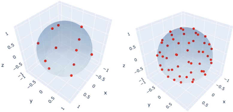
The image presents two 3D scatter plots, side-by-side, visualizing data distribution in a three-dimensional space defined by the X, Y, and Z axes. Each plot contains a collection of red data points scattered within and around a translucent blue sphere. The plots appear to be comparing two different datasets or the effect of a transformation on a single dataset.
### Components/Axes
* **Axes:** Each plot has three axes labeled X, Y, and Z. The axes range from approximately -1 to 1.
* **Data Points:** Each plot contains approximately 20-30 red circular data points.
* **Sphere:** A translucent blue sphere is present in each plot, seemingly defining a boundary or region of interest. The sphere's center is approximately at (0, 0, 0).
* **Perspective:** The plots are viewed from a slightly elevated perspective, allowing for a clear view of the data distribution in 3D.
### Detailed Analysis or Content Details
**Plot 1 (Left):**
* The data points are more sparsely distributed.
* A significant number of points lie outside the blue sphere. Approximately 6-8 points are clearly outside the sphere.
* The points appear somewhat randomly scattered, with no obvious clustering within the sphere.
* The sphere appears to encompass approximately half of the data points.
**Plot 2 (Right):**
* The data points are much more densely packed.
* The majority of the points lie within the blue sphere. Only approximately 3-4 points are clearly outside the sphere.
* The points appear more concentrated towards the center of the sphere.
* The sphere appears to encompass the vast majority of the data points.
**Approximate Data Point Coordinates (Plot 1 - Left):**
Due to the perspective and resolution, precise coordinates are difficult to determine. Approximate values:
* (-0.8, -0.6, 0.2)
* (-0.7, 0.3, -0.4)
* (0.1, -0.9, 0.5)
* (0.6, 0.7, -0.1)
* (-0.2, 0.8, 0.3)
* (0.9, -0.4, 0.6)
* (-0.5, -0.2, -0.7)
* (0.3, 0.5, 0.8)
* (-0.9, 0.1, -0.3)
* (0.7, -0.8, 0.4)
**Approximate Data Point Coordinates (Plot 2 - Right):**
* (-0.6, -0.5, 0.1)
* (-0.4, 0.2, -0.3)
* (0.2, -0.7, 0.4)
* (0.5, 0.6, -0.2)
* (-0.1, 0.7, 0.2)
* (0.8, -0.3, 0.5)
* (-0.3, -0.1, -0.6)
* (0.4, 0.4, 0.7)
* (-0.7, 0.0, -0.2)
* (0.6, -0.6, 0.3)
### Key Observations
* The density of data points within the sphere significantly increases from Plot 1 to Plot 2.
* The number of outliers (points outside the sphere) decreases from Plot 1 to Plot 2.
* The sphere appears to represent a decision boundary or a region of high probability density.
### Interpretation
The two plots likely represent a before-and-after scenario, potentially illustrating the effect of a data transformation or a machine learning algorithm. Plot 1 shows a more dispersed dataset with several outliers, while Plot 2 shows a more concentrated dataset largely contained within the sphere.
This could represent:
* **Data Cleaning:** Plot 1 is the raw data, and Plot 2 is the data after outlier removal.
* **Feature Transformation:** Plot 1 is the data in its original feature space, and Plot 2 is the data after a transformation that concentrates the data around the origin.
* **Model Training:** Plot 1 represents the initial data distribution, and Plot 2 represents the data distribution after a model has been trained to classify or cluster the data. The sphere could represent a decision boundary learned by the model.
* **Dimensionality Reduction:** The sphere could represent the space captured by a dimensionality reduction technique, with Plot 1 showing the original high-dimensional data and Plot 2 showing the reduced representation.
The significant difference in data density and outlier count suggests a substantial change has occurred between the two plots, indicating a successful transformation or learning process. The sphere's role as a boundary or region of interest is central to understanding the data's behavior.