## 3D Scatter Plots: Point Distribution on a Sphere
### Overview
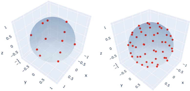
The image presents two 3D scatter plots, each displaying the distribution of red points on the surface of a sphere. The plots share the same axes (x, y, z) and scale, but differ in the number and arrangement of points. The left plot shows a sparser, potentially more structured distribution, while the right plot shows a denser, seemingly more random distribution.
### Components/Axes
* **Axes:** Both plots have three axes labeled x, y, and z.
* **Scale:** The axes range from -1 to 1, with tick marks at -1, -0.5, 0, 0.5, and 1.
* **Sphere:** A light blue sphere is centered at the origin (0, 0, 0) in each plot.
* **Data Points:** Red dots represent data points plotted on the surface of the sphere.
### Detailed Analysis
**Left Plot:**
* The red points appear to be distributed in a more structured manner.
* There are approximately 12-15 points visible.
* Points are somewhat evenly spaced around the sphere.
* Example point locations (approximate): (0, 0, 1), (0, 0, -1), (1, 0, 0), (-1, 0, 0), (0, 1, 0), (0, -1, 0), and points in between.
**Right Plot:**
* The red points appear to be distributed in a more random manner.
* There are approximately 50-60 points visible.
* The distribution seems less uniform compared to the left plot.
* Points are scattered across the sphere's surface with no obvious pattern.
### Key Observations
* The primary difference between the two plots is the density and distribution pattern of the red points.
* The left plot suggests a deliberate or algorithmic placement of points, while the right plot suggests a more random or stochastic placement.
* Both plots use the same coordinate system and sphere, allowing for a direct visual comparison of point distributions.
### Interpretation
The image likely illustrates two different methods of generating points on a sphere. The left plot could represent a uniform sampling strategy, aiming for even coverage of the sphere's surface. The right plot could represent a random sampling strategy, where points are generated without a specific pattern. The comparison highlights the impact of different sampling methods on the resulting distribution of points. The plots could be used to visualize or compare the effectiveness of different algorithms for generating points on a sphere, which has applications in computer graphics, simulations, and other fields.