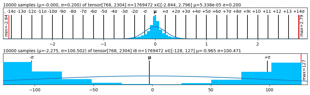
## Histogram: Distribution of Tensor Data
### Overview
The image presents two histograms, each displaying the distribution of data from a tensor. The top histogram shows a distribution centered around zero with a small standard deviation, while the bottom histogram shows a distribution that is more spread out. Both histograms are overlaid with a curve, presumably representing a fitted normal distribution.
### Components/Axes
**Top Histogram:**
* **Title:** 10000 samples (μ=-0.000, σ=0.200) of tensor[768, 2304] n=1769472 x∈[-2.844, 2.796] μ=5.338e-05 σ=0.200
* **X-axis:** Labeled with multiples of the standard deviation (σ) from -14σ to +14σ, with numerical values ranging approximately from -2 to 2.
* **Y-axis:** Implicit, representing the frequency or count of samples within each bin.
* **Vertical Lines:** Black vertical lines mark the positions of -14σ to +14σ.
* **Minimum Value:** Indicated by a red line on the left side of the histogram, labeled "min=-2.84".
* **Maximum Value:** Indicated by a red line on the right side of the histogram, labeled "max=2.79".
* **Curve:** A blue curve is overlaid on the histogram, representing a fitted normal distribution.
**Bottom Histogram:**
* **Title:** 10000 samples (μ=-2.275, σ=100.502) of tensor[768, 2304] i8 n=1769472 x∈[-128, 127] μ=-0.965 σ=100.471
* **X-axis:** Numerical values ranging from approximately -100 to 100.
* **Y-axis:** Implicit, representing the frequency or count of samples within each bin.
* **Vertical Lines:** Black vertical lines mark the positions of -σ, μ, and +σ.
* **Maximum Value:** Indicated by a red line on the right side of the histogram, labeled "max=127".
* **Curve:** A blue curve is overlaid on the histogram, representing a fitted normal distribution.
### Detailed Analysis
**Top Histogram:**
* The histogram is centered around 0, as indicated by μ ≈ 0.
* The distribution is narrow, with most of the data concentrated near the center, reflecting a small standard deviation (σ = 0.200).
* The x-axis range is approximately from -2.844 to 2.796.
* The data appears to follow a normal distribution, as suggested by the overlaid blue curve.
**Bottom Histogram:**
* The histogram is centered near 0, as indicated by μ = -0.965.
* The distribution is much wider than the top histogram, with data spread out over a larger range, reflecting a larger standard deviation (σ = 100.471).
* The x-axis range is approximately from -128 to 127.
* The data distribution is less clearly normal compared to the top histogram.
### Key Observations
* The top histogram represents a distribution with a small standard deviation, indicating that the data points are clustered closely around the mean.
* The bottom histogram represents a distribution with a large standard deviation, indicating that the data points are more spread out.
* Both histograms are overlaid with curves that appear to represent fitted normal distributions.
### Interpretation
The two histograms illustrate the distribution of data from two different tensors. The top histogram shows a distribution that is tightly clustered around the mean, suggesting that the data is relatively consistent. The bottom histogram shows a distribution that is more spread out, suggesting that the data is more variable. The overlaid curves provide a visual representation of how well the data fits a normal distribution. The parameters (μ and σ) provided in the titles of each histogram give a quantitative measure of the center and spread of the data. The tensor shape [768, 2304] and the number of elements n=1769472 are metadata about the tensor itself. The i8 in the second histogram's title likely refers to the data type of the tensor elements (8-bit integer).