\n
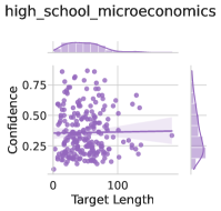
## Scatter Plot with Marginal Distributions: high_school_microeconomics
### Overview
The image is a statistical visualization, specifically a scatter plot with marginal distribution plots (density curves) on the top and right sides. The chart appears to analyze data related to "high_school_microeconomics," likely examining the relationship between a "Target Length" variable and an unnamed performance or score metric. The overall aesthetic uses a monochromatic purple color scheme against a white background with light gray grid lines.
### Components/Axes
* **Main Plot (Center):** A scatter plot.
* **X-axis:** Labeled "Target Length". The scale runs from 0 to approximately 200, with major tick marks at 0 and 100.
* **Y-axis:** **Unlabeled.** The scale runs from 0.00 to 1.00, with major tick marks at 0.00, 0.25, 0.50, and 0.75.
* **Data Points:** Numerous circular points plotted in a medium purple color.
* **Reference Line:** A solid, horizontal purple line is drawn across the plot at approximately y = 0.35.
* **Top Marginal Plot:** A density plot (smoothed histogram) showing the distribution of the "Target Length" (x-axis) variable. It is filled with a light purple color.
* **Right Marginal Plot:** A density plot showing the distribution of the unnamed y-axis variable. It is also filled with a light purple color and is oriented vertically.
* **Title:** "high_school_microeconomics" is displayed at the top center of the entire graphic.
### Detailed Analysis
* **Data Distribution (Main Scatter Plot):**
* The data points are densely clustered in the lower-left quadrant of the plot.
* The highest concentration of points occurs between `Target Length` values of approximately **0 to 100** and y-axis values of **0.25 to 0.75**.
* There is a noticeable spread of points along the y-axis for any given short `Target Length` (e.g., at length ~50, y-values range from ~0.1 to ~0.9).
* As `Target Length` increases beyond 100, the number of data points decreases significantly. The few points with `Target Length` > 150 are sparse and scattered across a wide range of y-values.
* The horizontal reference line at **y ≈ 0.35** passes through the lower portion of the main data cluster. A significant number of points lie above this line, and a substantial number lie below it.
* **Marginal Distributions:**
* **Top (Target Length):** The density curve is unimodal and right-skewed. The peak (mode) is at a low `Target Length`, approximately **40-60**. The tail extends towards higher values, confirming the scarcity of data points beyond 100.
* **Right (Unnamed Y-variable):** The density curve is roughly unimodal and symmetric, centered near **y = 0.5**. The distribution appears relatively broad, spanning from near 0 to 1, which matches the vertical spread seen in the scatter plot.
### Key Observations
1. **Inverse Density Relationship:** There is a clear inverse relationship between the density of data points and the `Target Length`. Shorter targets are heavily overrepresented in the dataset.
2. **High Variance at Short Lengths:** For short `Target Length` values (0-100), the outcome variable (y-axis) shows very high variance, covering almost its entire possible range (0 to 1).
3. **Central Tendency Marker:** The horizontal line at y ≈ 0.35 serves as a visual benchmark. It does not appear to be a line of best fit, as the data does not show a strong linear trend. It may represent a mean, median, or a predefined threshold.
4. **Missing Critical Label:** The y-axis lacks a descriptive label, which is a significant omission for interpreting the chart's meaning. We can only refer to it as an "unnamed score or metric."
### Interpretation
This chart likely explores the relationship between the length of a learning target or assignment ("Target Length") and some measure of student performance or engagement (the unnamed y-axis) in a high school microeconomics context.
* **What the data suggests:** The data suggests that most learning targets or assignments are relatively short (clustered below length 100). For these common, shorter tasks, student outcomes are highly variable—some students achieve very high scores (near 1.0), while others score very low (near 0.0). This implies that for short tasks, factors other than length (e.g., student preparation, topic difficulty, instruction quality) are the primary drivers of the outcome.
* **The role of the reference line:** The line at y ≈ 0.35 could represent a passing threshold, a historical average, or a target benchmark. The fact that the data is widely dispersed around it indicates that meeting this benchmark is not strongly correlated with target length alone.
* **The outlier region:** The sparse data points for very long targets (Length > 150) are interesting. Their scattered y-values suggest that when very long assignments are given, outcomes are unpredictable—they can be high or low. The lack of data here makes it difficult to draw firm conclusions about the effect of extremely long targets.
* **Underlying question:** The visualization prompts an investigation into what causes the high variance in outcomes for short targets. It argues against using target length as a simple predictor of the measured outcome and points to the need for more nuanced factors in understanding student performance in microeconomics.
**Language Declaration:** All text in the image is in English.