## Line Chart: EGA vs. Environment Step
### Overview
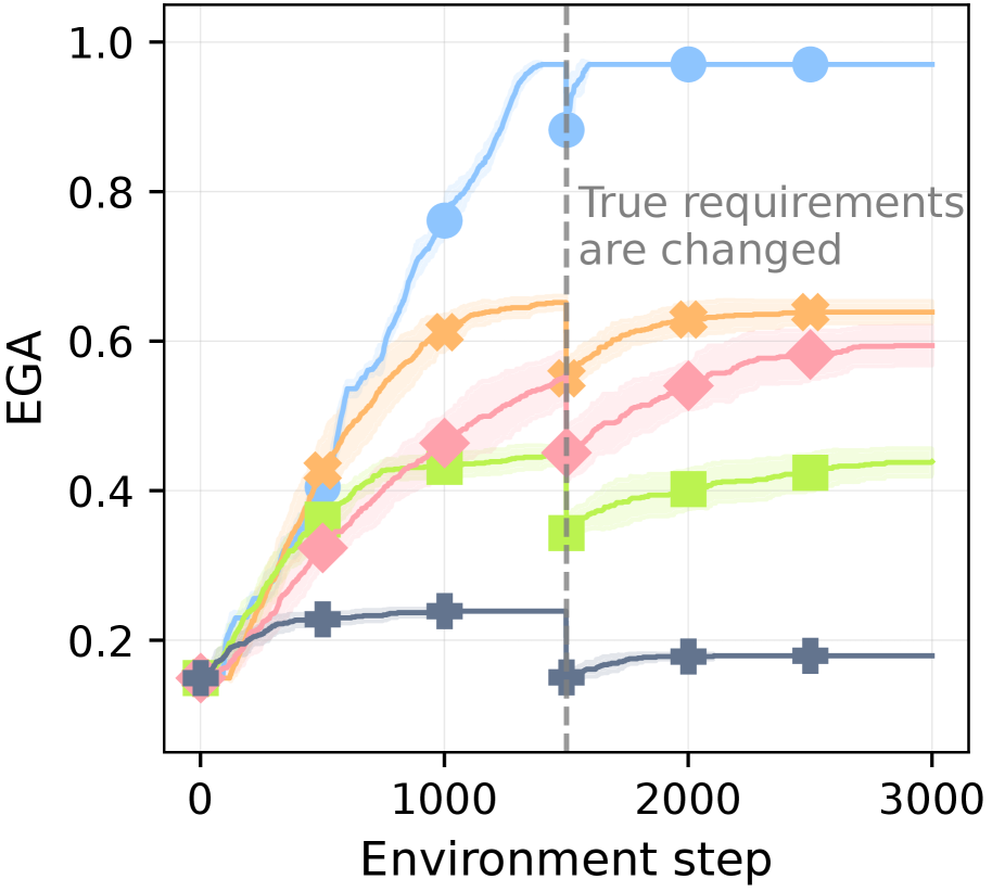
The image is a line chart showing the relationship between EGA (likely an evaluation metric) and the environment step. There are five distinct data series, each represented by a different color and marker. A vertical dashed line indicates a change in true requirements. The chart visualizes how different strategies or algorithms perform over time, and how they are affected by the change in requirements.
### Components/Axes
* **Y-axis (Vertical):** Labeled "EGA", with a scale from 0.0 to 1.0 in increments of 0.2.
* **X-axis (Horizontal):** Labeled "Environment step", ranging from 0 to 3000 in increments of 1000.
* **Data Series:** Five distinct lines, each with a unique color and marker:
* Light Blue with Circle marker
* Orange with X marker
* Pink with Diamond marker
* Lime Green with Square marker
* Dark Blue/Gray with Plus marker
* **Vertical Dashed Line:** Located at approximately x = 1600, labeled "True requirements are changed".
### Detailed Analysis
* **Light Blue (Circle):** This line increases rapidly from approximately 0.15 at step 0 to approximately 0.9 at step 1600. After the change in requirements, it plateaus at approximately 0.98.
* (0, 0.15)
* (1600, 0.9)
* (2000, 0.98)
* (3000, 0.98)
* **Orange (X):** This line increases from approximately 0.15 at step 0 to approximately 0.65 at step 1600. After the change in requirements, it remains relatively stable at approximately 0.65.
* (0, 0.15)
* (1000, 0.6)
* (1600, 0.65)
* (2000, 0.65)
* (3000, 0.65)
* **Pink (Diamond):** This line increases from approximately 0.15 at step 0 to approximately 0.5 at step 1600. After the change in requirements, it continues to increase slightly to approximately 0.6.
* (0, 0.15)
* (500, 0.35)
* (1000, 0.4)
* (1600, 0.5)
* (2000, 0.58)
* (3000, 0.6)
* **Lime Green (Square):** This line increases from approximately 0.15 at step 0 to approximately 0.45 at step 1600. After the change in requirements, it remains relatively stable at approximately 0.45.
* (0, 0.15)
* (500, 0.3)
* (1000, 0.4)
* (1600, 0.45)
* (2000, 0.45)
* (3000, 0.45)
* **Dark Blue/Gray (Plus):** This line increases from approximately 0.15 at step 0 to approximately 0.25 at step 1600. After the change in requirements, it decreases slightly to approximately 0.18 and remains stable.
* (0, 0.15)
* (500, 0.22)
* (1000, 0.24)
* (1600, 0.25)
* (2000, 0.18)
* (3000, 0.18)
### Key Observations
* The light blue line (with circle markers) demonstrates the best performance, reaching an EGA of nearly 1.0.
* The dark blue/gray line (with plus markers) shows the worst performance, with an EGA remaining below 0.3.
* The change in requirements at step 1600 has a noticeable impact on the dark blue/gray line, causing a slight decrease in EGA. The light blue line plateaus after this change.
* The orange, pink, and lime green lines show intermediate performance, with the orange line achieving a higher EGA than the other two.
### Interpretation
The chart compares the performance of five different strategies or algorithms (represented by the different colored lines) in an environment where the requirements change at step 1600. The light blue strategy appears to be the most effective, quickly reaching a high EGA and maintaining it even after the requirements change. The dark blue/gray strategy is the least effective. The change in requirements has a varying impact on the different strategies, suggesting that some are more robust to changes in the environment than others. The shaded regions around each line likely represent the variance or uncertainty in the EGA values.