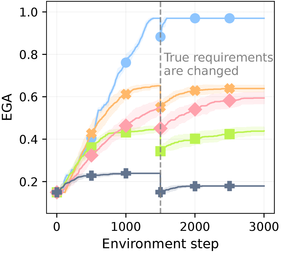
## Line Chart: EGA vs. Environment Step
### Overview
This image presents a line chart illustrating the relationship between EGA (presumably a performance metric) and Environment Step, representing time or iterations. The chart displays multiple lines, each representing a different experimental condition or algorithm. A vertical dashed line indicates a point where "True requirements are changed," suggesting a shift in the evaluation criteria or environment. Shaded areas around each line represent confidence intervals or standard deviations.
### Components/Axes
* **X-axis:** "Environment step" ranging from 0 to 3000, with tick marks at 0, 1000, 2000, and 3000.
* **Y-axis:** "EGA" ranging from 0 to 1.0, with tick marks at 0, 0.2, 0.4, 0.6, 0.8, and 1.0.
* **Lines:** Six distinct lines, each with a different color and marker:
* Blue circle: Rapidly increasing EGA, plateauing near 1.0.
* Orange cross: Increasing EGA, plateauing around 0.65.
* Pink diamond: Increasing EGA, plateauing around 0.6.
* Light blue triangle: Increasing EGA, plateauing around 0.5.
* Green square: Relatively stable EGA, increasing slowly to around 0.45.
* Gray plus sign: Relatively stable EGA, around 0.2.
* **Vertical Dashed Line:** Located at approximately Environment Step 1750, labeled "True requirements are changed."
* **Shaded Areas:** Lightly colored areas surrounding each line, indicating variability or confidence intervals.
### Detailed Analysis
Let's analyze each line's trend and approximate data points:
* **Blue Line (Circle):** Starts at approximately EGA 0.15 at Environment Step 0. Rapidly increases, reaching EGA 0.95 by Environment Step 1500. Plateaus around EGA 0.98 from Environment Step 1750 to 3000.
* **Orange Line (Cross):** Starts at approximately EGA 0.18 at Environment Step 0. Increases steadily, reaching EGA 0.65 by Environment Step 1500. Plateaus around EGA 0.63 from Environment Step 1750 to 3000.
* **Pink Line (Diamond):** Starts at approximately EGA 0.2 at Environment Step 0. Increases steadily, reaching EGA 0.6 by Environment Step 1500. Plateaus around EGA 0.58 from Environment Step 1750 to 3000.
* **Light Blue Line (Triangle):** Starts at approximately EGA 0.25 at Environment Step 0. Increases steadily, reaching EGA 0.5 by Environment Step 1500. Plateaus around EGA 0.48 from Environment Step 1750 to 3000.
* **Green Line (Square):** Starts at approximately EGA 0.3 at Environment Step 0. Increases slowly, reaching EGA 0.45 by Environment Step 3000. Remains relatively flat throughout the entire range.
* **Gray Line (Plus Sign):** Starts at approximately EGA 0.18 at Environment Step 0. Remains relatively stable around EGA 0.2 throughout the entire range, with minor fluctuations.
### Key Observations
* The blue line demonstrates the fastest and most significant improvement in EGA, reaching a high plateau.
* The gray line shows minimal change in EGA, indicating a lack of adaptation or a stable performance level.
* The vertical dashed line ("True requirements are changed") appears to have little impact on the blue, orange, pink, and light blue lines, as their plateaus were already established. The green and gray lines are unaffected.
* The shaded areas indicate that the orange, pink, and light blue lines have more variability in their performance than the blue and gray lines.
### Interpretation
The chart likely represents the performance of different algorithms or strategies in a dynamic environment. The "EGA" metric could be a measure of accuracy, efficiency, or some other relevant performance indicator. The "Environment Step" represents the progression of learning or adaptation.
The rapid improvement of the blue line suggests a highly effective algorithm that quickly converges to optimal performance. The gray line indicates a strategy that is either ineffective or already optimized for the initial environment.
The "True requirements are changed" event suggests a shift in the evaluation criteria or the environment itself. The fact that most lines plateaued *before* this change suggests that the algorithms had already reached their limits under the initial conditions. The lack of significant change after the event indicates that the algorithms were unable to adapt to the new requirements.
The variability in the orange, pink, and light blue lines suggests that their performance is more sensitive to environmental factors or random fluctuations. The green line's slow increase suggests a gradual learning process, but it may not be sufficient to achieve high performance.
This data suggests that the blue algorithm is the most robust and adaptable, while the gray algorithm is the least. The change in requirements highlights the importance of adaptability in dynamic environments. Further investigation could focus on understanding why the other algorithms failed to adapt and how to improve their performance.