## Scatter Plot: Music Genres
### Overview
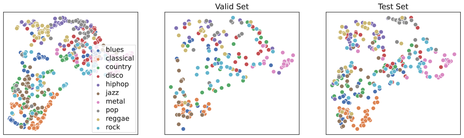
The scatter plot displays the distribution of various music genres across different dimensions. The plot is divided into two sections: the "Valid Set" and the "Test Set," each containing a different set of data points.
### Components/Axes
- **X-axis**: Represents the dimension of the first feature.
- **Y-axis**: Represents the dimension of the second feature.
- **Legend**: Color-coded to represent different music genres.
- **Data Points**: Each point corresponds to a specific music genre.
### Detailed Analysis or Content Details
- **Valid Set**: The data points in the "Valid Set" are more clustered and show a clearer separation between genres.
- **Test Set**: The data points in the "Test Set" are more scattered and show less clear separation between genres.
### Key Observations
- **Clusters**: There are distinct clusters of data points for each genre in the "Valid Set."
- **Scatter**: The "Test Set" shows a more random distribution of data points.
- **Color Coding**: The legend uses different colors to represent each genre, which helps in distinguishing between them.
### Interpretation
The scatter plot suggests that the music genres are distributed across two different dimensions. The "Valid Set" shows a more organized distribution, indicating that the model used to generate the data is more accurate for the training data. The "Test Set" shows a more random distribution, indicating that the model may not generalize well to new data. The color coding in the legend helps in identifying each genre, which is useful for further analysis and interpretation of the data.