## Box Plot: Normalized Cut Across 10 Graphs
### Overview
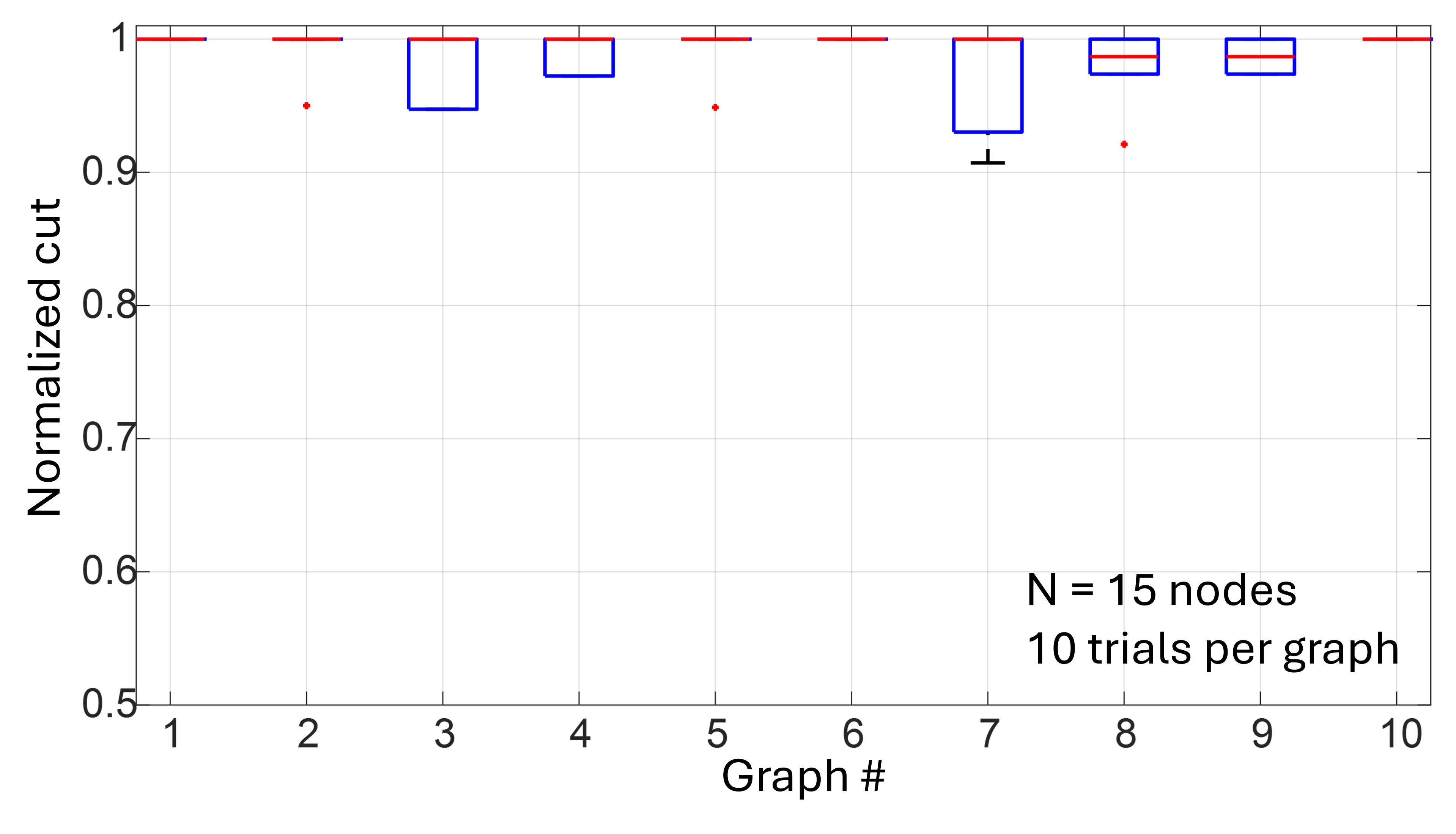
This is a box-and-whisker plot displaying the distribution of "Normalized cut" values for 10 distinct graphs (labeled Graph #1 to #10). Annotations indicate each graph has 15 nodes, with 10 trials conducted per graph to generate the distribution data.
### Components/Axes
- **Y-axis**: Labeled *Normalized cut*, with a linear scale ranging from 0.5 to 1.0, marked at intervals of 0.1 (0.5, 0.6, 0.7, 0.8, 0.9, 1.0).
- **X-axis**: Labeled *Graph #*, with categorical markers for 10 discrete graphs (1 through 10).
- **Box Plot Elements**:
- Blue outlined boxes: Represent the interquartile range (IQR, 25th to 75th percentile) of normalized cut values for each graph.
- Red horizontal lines inside boxes: Indicate the median value of the distribution.
- Black whiskers: Extend to the minimum/maximum values within 1.5×IQR of the box.
- Red dots: Mark outlier values outside the whisker range.
- **Annotations**: Bottom-right corner contains text: *N = 15 nodes* and *10 trials per graph*.
### Detailed Analysis
For each graph, the distribution of normalized cut values is as follows:
1. **Graph #1**: All data points cluster at 1.0; box, median, and whiskers are all at the top of the y-axis (1.0), no outliers.
2. **Graph #2**: Median and box at 1.0; one outlier (red dot) at ~0.95.
3. **Graph #3**: Box spans ~0.95 to 1.0; median at 1.0, no whiskers or outliers.
4. **Graph #4**: Box spans ~0.97 to 1.0; median at 1.0, no whiskers or outliers.
5. **Graph #5**: Median and box at 1.0; one outlier at ~0.95.
6. **Graph #6**: All data points cluster at 1.0; box, median, and whiskers at 1.0, no outliers.
7. **Graph #7**: Box spans ~0.92 to 1.0; median at 1.0, whisker extends down to ~0.9 (the lowest minimum value across all graphs), no outliers.
8. **Graph #8**: Box spans ~0.97 to 1.0; median at ~0.98, one outlier at ~0.92.
9. **Graph #9**: Box spans ~0.97 to 1.0; median at ~0.98, no whiskers or outliers.
10. **Graph #10**: All data points cluster at 1.0; box, median, and whiskers at 1.0, no outliers.
### Key Observations
- 7 out of 10 graphs (1,2,3,4,5,6,10) have a median normalized cut of 1.0, the maximum value on the scale.
- Only Graph #7 has a whisker extending below its box, indicating a wider spread of lower values.
- Outliers are present in 4 graphs (2,5,8), all representing values below the main data cluster.
- Graphs #8 and #9 are the only ones with medians slightly below 1.0 (~0.98).
### Interpretation
Normalized cut is a metric for graph partitioning quality, where higher values (closer to 1.0) indicate better partitioning performance. The data suggests:
- The partitioning algorithm performs extremely consistently for most 15-node graphs, achieving near-perfect normalized cut (1.0) across 10 trials.
- Graphs #7, #8, and #9 show minor variability, with Graph #7 having the lowest minimum value, indicating some trials produced less optimal partitions.
- Outliers represent rare trials where the algorithm underperformed relative to the majority of trials for that graph.
- The consistent high performance across most graphs indicates the algorithm is reliable for small (15-node) graph partitioning tasks.