## Box Plot: Normalized Cut for Different Graphs
### Overview
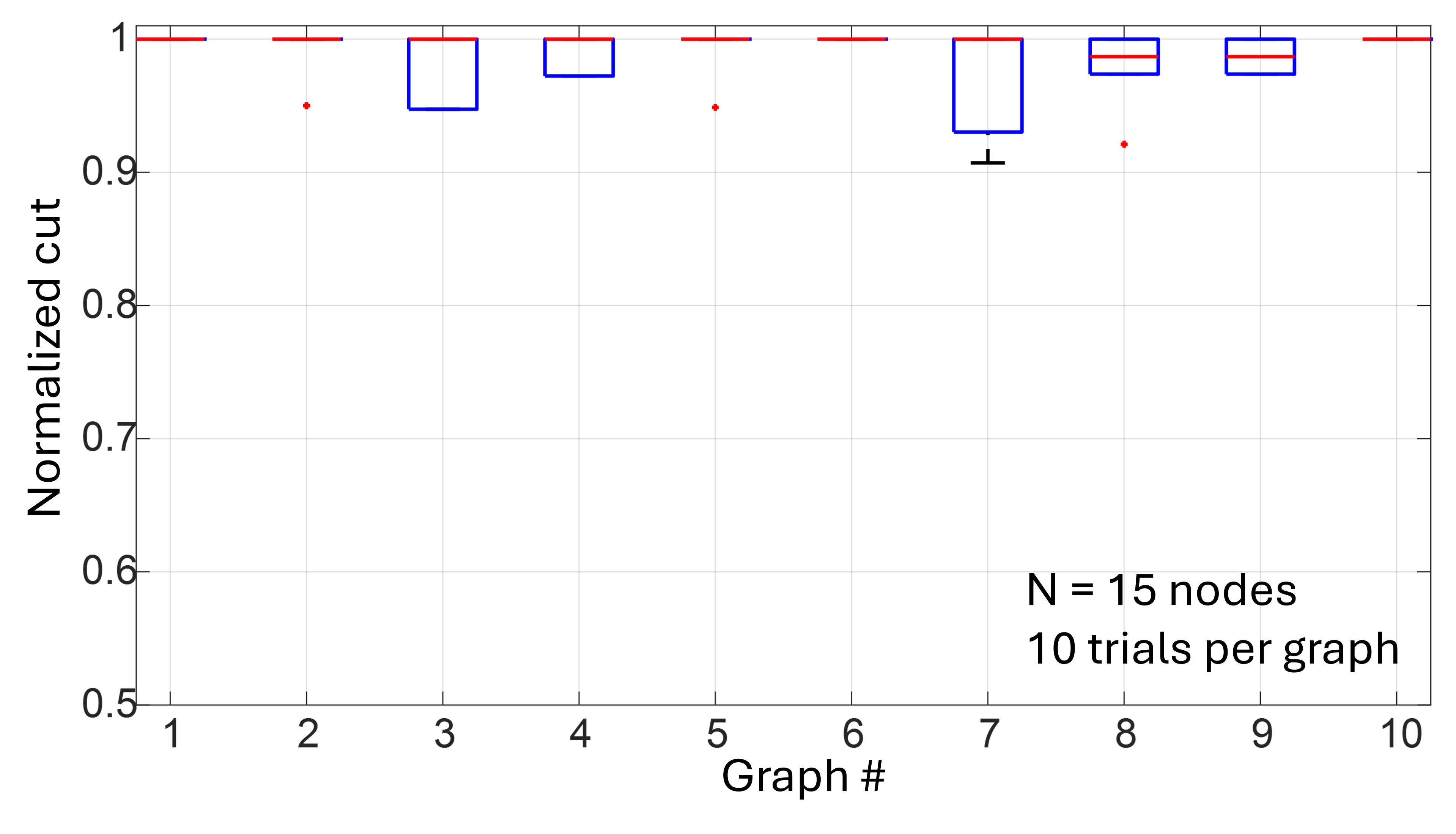
The image is a box plot visualizing the normalized cut values for 10 different graphs. Each graph was tested with 10 trials, and each graph has 15 nodes. The y-axis represents the normalized cut, ranging from 0.5 to 1. The x-axis represents the graph number, from 1 to 10. The box plots show the distribution of normalized cut values for each graph.
### Components/Axes
* **Y-axis:** "Normalized cut", ranging from 0.5 to 1.0, with tick marks at 0.5, 0.6, 0.7, 0.8, 0.9, and 1.
* **X-axis:** "Graph #", ranging from 1 to 10, with tick marks at each integer value.
* **Box Plots:** Each box plot (in blue) represents the distribution of normalized cut values for a specific graph. The red line within each box represents the median. The top and bottom edges of the box represent the upper and lower quartiles. The red lines extending from the box represent the range of the data. Red dots represent outliers.
* **Text:** "N = 15 nodes" and "10 trials per graph" are located in the bottom-right corner of the chart.
### Detailed Analysis
Here's a breakdown of the box plots for each graph:
* **Graph 1:** The box plot is a horizontal red line at approximately 0.99.
* **Graph 2:** The box plot is a horizontal red line at approximately 0.99, with one outlier at approximately 0.95.
* **Graph 3:** The box plot ranges from approximately 0.94 to 1.0, with a median around 0.98.
* **Graph 4:** The box plot ranges from approximately 0.95 to 1.0, with a median around 0.98.
* **Graph 5:** The box plot is a horizontal red line at approximately 0.99, with one outlier at approximately 0.95.
* **Graph 6:** The box plot is a horizontal red line at approximately 0.99.
* **Graph 7:** The box plot ranges from approximately 0.91 to 1.0, with a median around 0.98.
* **Graph 8:** The box plot ranges from approximately 0.96 to 1.0, with a median around 0.98, and one outlier at approximately 0.92.
* **Graph 9:** The box plot ranges from approximately 0.96 to 1.0, with a median around 0.98.
* **Graph 10:** The box plot ranges from approximately 0.97 to 1.0, with a median around 0.98.
### Key Observations
* The normalized cut values are generally high, clustered around 1.0 for most graphs.
* Graphs 3, 4, 7, 8, 9, and 10 show more variability in their normalized cut values compared to the others.
* Graphs 2, 5, and 8 have outliers, indicating some trials resulted in significantly lower normalized cut values.
### Interpretation
The data suggests that for most of the tested graphs, the normalized cut is consistently high, indicating a strong separation of nodes within the graph. The variability observed in some graphs suggests that the normalized cut is more sensitive to the specific structure of those graphs. The outliers indicate that in some trials, the graph partitioning was less effective, resulting in a lower normalized cut. The fact that each graph has 15 nodes and was tested with 10 trials provides context for understanding the distribution of normalized cut values.