## Box Plot: Normalized Cut vs. Graph Number
### Overview
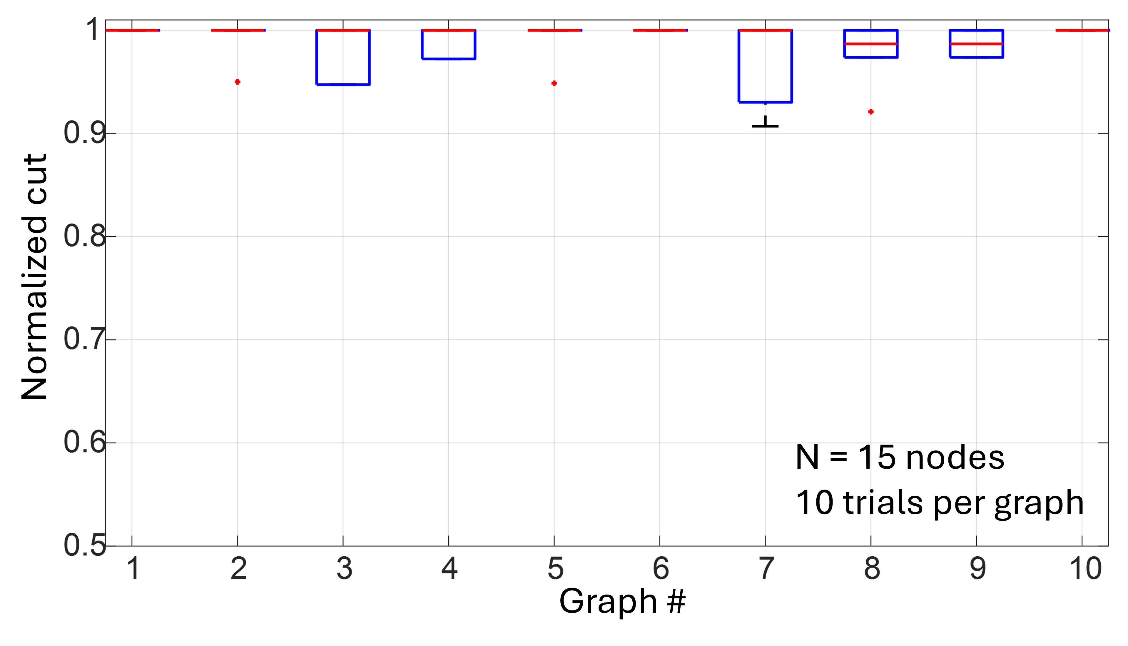
The image presents a series of box plots illustrating the distribution of "Normalized Cut" values across ten different graphs. Each graph was generated using 15 nodes and 10 trials. The box plots display the median, quartiles, and outliers for each graph's normalized cut values.
### Components/Axes
* **X-axis:** "Graph #" ranging from 1 to 10.
* **Y-axis:** "Normalized cut" ranging from 0.5 to 1.0.
* **Box Plot Elements:** Each box plot represents the distribution of normalized cut values for a single graph. The box represents the interquartile range (IQR), the line inside the box represents the median, and the whiskers extend to the most extreme data points within 1.5 times the IQR. Points beyond the whiskers are considered outliers and are plotted individually.
* **Annotation:** "N = 15 nodes\n10 trials per graph" located in the bottom-right corner.
### Detailed Analysis
The box plots are arranged horizontally, one for each graph number from 1 to 10.
* **Graph 1:** The median normalized cut is approximately 0.98. The IQR extends from roughly 0.96 to 1.0. There is one outlier at approximately 0.94.
* **Graph 2:** The median normalized cut is approximately 0.98. The IQR extends from roughly 0.96 to 1.0. There is one outlier at approximately 0.94.
* **Graph 3:** The median normalized cut is approximately 0.98. The IQR extends from roughly 0.96 to 1.0. There is one outlier at approximately 0.94.
* **Graph 4:** The median normalized cut is approximately 0.98. The IQR extends from roughly 0.96 to 1.0. There is one outlier at approximately 0.94.
* **Graph 5:** The median normalized cut is approximately 0.98. The IQR extends from roughly 0.96 to 1.0. There is one outlier at approximately 0.94.
* **Graph 6:** The median normalized cut is approximately 0.98. The IQR extends from roughly 0.96 to 1.0.
* **Graph 7:** The median normalized cut is approximately 0.94. The IQR extends from roughly 0.92 to 0.97.
* **Graph 8:** The median normalized cut is approximately 0.98. The IQR extends from roughly 0.96 to 1.0. There is one outlier at approximately 0.94.
* **Graph 9:** The median normalized cut is approximately 0.98. The IQR extends from roughly 0.96 to 1.0.
* **Graph 10:** The median normalized cut is approximately 0.98. The IQR extends from roughly 0.96 to 1.0.
### Key Observations
* Graphs 1, 2, 3, 4, 5, 8, 9, and 10 exhibit very similar distributions of normalized cut values, with medians close to 1.0 and minimal variation.
* Graph 7 shows a noticeably lower median normalized cut value (approximately 0.94) compared to the other graphs.
* Outliers are present in Graphs 1, 2, 3, 4, 5, and 8, all falling below 0.95.
* The normalized cut values are consistently high across most graphs, suggesting a strong degree of connectivity or separation within the graphs.
### Interpretation
The data suggests that the normalized cut values are generally high and consistent across most of the graphs generated. The normalized cut is a measure of the "strength of cut" between two sets of nodes in a graph. A higher normalized cut indicates a stronger separation between the sets. The consistency across graphs 1, 2, 3, 4, 5, 8, 9, and 10 suggests that the underlying graph structures are similar in terms of their connectivity patterns.
Graph 7 stands out as an anomaly, exhibiting a lower median normalized cut. This could indicate that the graph structure for Graph 7 is different from the others, potentially having weaker connections between node sets or a different overall topology. The outliers observed in some graphs may represent unusual configurations or edge cases within those specific graph instances.
The annotation "N = 15 nodes, 10 trials per graph" indicates that each graph consists of 15 nodes and that the normalized cut was calculated based on 10 independent trials for each graph. This suggests that the observed distributions represent the variability in normalized cut values due to random factors or variations in the graph generation process.