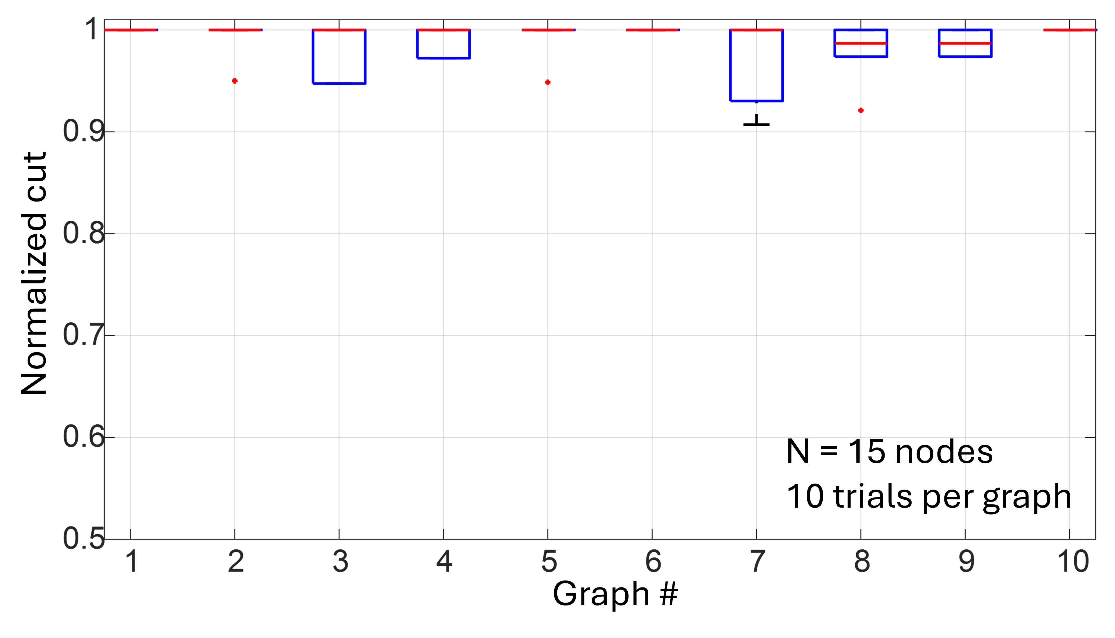
## Line Chart: Normalized Cut Values Across Graphs
### Overview
The chart displays normalized cut values for 10 graphs (Graph #1 to Graph #10) with 15 nodes each, based on 10 trials per graph. The y-axis represents the normalized cut metric (0.5–1.0), while the x-axis enumerates graph instances. Red horizontal lines at y=1.0 serve as reference points, and blue boxes with red internal lines highlight specific graph ranges. Red dots indicate outlier or trial-specific values.
### Components/Axes
- **X-axis (Graph #)**: Labeled "Graph #" with integer ticks from 1 to 10.
- **Y-axis (Normalized cut)**: Labeled "Normalized cut" with increments of 0.1 from 0.5 to 1.0.
- **Legend**: Located in the bottom-right corner, stating:
- "N = 15 nodes" (graph size)
- "10 trials per graph" (data granularity)
- **Key Elements**:
- **Red horizontal lines**: Fixed at y=1.0 across all graphs.
- **Blue boxes**: Enclose data points for Graphs #3, #4, #7, #8, and #9.
- **Red dots**: Scattered below the red lines (e.g., Graphs #2, #5, #8).
- **Black crosshair**: Annotated at Graph #7, y≈0.9.
### Detailed Analysis
1. **Graph #1**: No visible data points; implied baseline at y=1.0 (red line).
2. **Graph #2**: Red dot at y≈0.95, below the red line.
3. **Graph #3**: Blue box spans y≈0.95–1.0, with a red line at y=1.0.
4. **Graph #4**: Blue box spans y≈0.95–1.0, with a red line at y=1.0.
5. **Graph #5**: Red dot at y≈0.95, below the red line.
6. **Graph #6**: No visible data points; implied baseline at y=1.0.
7. **Graph #7**: Blue box spans y≈0.9–1.0, with a red line at y=1.0. Black crosshair marks y≈0.9.
8. **Graph #8**: Blue box spans y≈0.95–1.0, with a red line at y=1.0. Red dot at y≈0.92.
9. **Graph #9**: Blue box spans y≈0.95–1.0, with a red line at y=1.0.
10. **Graph #10**: No visible data points; implied baseline at y=1.0.
### Key Observations
- **Consistency**: Most graphs (1, 3, 4, 6, 9, 10) align with the red line at y=1.0, suggesting optimal normalized cut values.
- **Variability**: Graphs #2, #5, and #8 show red dots below y=1.0, indicating lower cut values in specific trials.
- **Confidence Intervals**: Blue boxes (Graphs #3, #4, #7, #8, #9) likely represent trial-based variability, with narrower ranges for #3, #4, and #9.
- **Outliers**: The black crosshair at Graph #7 (y≈0.9) highlights a significant deviation from the baseline.
### Interpretation
The data suggests that normalized cut values are generally high (close to 1.0), implying effective graph partitioning for most instances. However, the presence of red dots and variable blue box widths indicates trial-to-trial inconsistency. The red line at y=1.0 acts as a performance benchmark, while the blue boxes may reflect confidence intervals or interquartile ranges from the 10 trials. The outlier at Graph #7 (y≈0.9) warrants further investigation, as it deviates notably from the trend. The uniformity of Graphs #3, #4, and #9 (narrow blue boxes) suggests stable performance across trials, whereas Graphs #7 and #8 show greater variability. This could imply differences in graph structure or trial conditions affecting cut quality.