\n
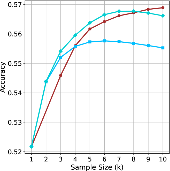
## Line Chart: Accuracy vs. Sample Size
### Overview
This image presents a line chart illustrating the relationship between sample size and accuracy. Three distinct lines represent different models or conditions, showing how accuracy changes as the sample size increases from 1k to 10k. The chart uses a grid background for easier readability.
### Components/Axes
* **X-axis:** Labeled "Sample Size (k)", ranging from 1 to 10, with increments of 1.
* **Y-axis:** Labeled "Accuracy", ranging from 0.52 to 0.57, with increments of 0.01.
* **Lines:** Three lines are present, each with a distinct color:
* Cyan (Light Blue)
* Red
* Blue
### Detailed Analysis
Let's analyze each line individually, noting trends and approximate data points.
* **Cyan Line:** This line shows a consistently upward trend, starting at approximately 0.525 at a sample size of 1k. It reaches a peak of approximately 0.57 at a sample size of 7k, then plateaus, remaining around 0.57 for sample sizes 8k, 9k, and 10k.
* **Red Line:** This line also exhibits an upward trend, but it is steeper than the cyan line initially. It starts at approximately 0.525 at 1k, rises rapidly, and reaches a peak of approximately 0.572 at a sample size of 6k. It then plateaus, remaining around 0.57 for sample sizes 7k, 8k, 9k, and 10k.
* **Blue Line:** This line shows a different pattern. It starts at approximately 0.525 at 1k, rises to a peak of approximately 0.56 at a sample size of 4k, and then declines slightly to approximately 0.555 at 10k.
Here's a table summarizing approximate data points:
| Sample Size (k) | Cyan (Accuracy) | Red (Accuracy) | Blue (Accuracy) |
|---|---|---|---|
| 1 | 0.525 | 0.525 | 0.525 |
| 2 | 0.535 | 0.545 | 0.54 |
| 3 | 0.55 | 0.56 | 0.55 |
| 4 | 0.56 | 0.568 | 0.56 |
| 5 | 0.565 | 0.57 | 0.558 |
| 6 | 0.568 | 0.572 | 0.557 |
| 7 | 0.57 | 0.57 | 0.557 |
| 8 | 0.57 | 0.57 | 0.556 |
| 9 | 0.57 | 0.57 | 0.556 |
| 10 | 0.57 | 0.57 | 0.555 |
### Key Observations
* The red and cyan lines converge at higher sample sizes, indicating that their accuracy levels become similar.
* The blue line demonstrates a different behavior, peaking at 4k and then decreasing, suggesting diminishing returns or potential overfitting.
* All three lines start at the same accuracy level at a sample size of 1k.
### Interpretation
The chart suggests that increasing the sample size generally improves accuracy, but the rate of improvement varies depending on the model or condition. The red line initially shows the most significant gains in accuracy, but the cyan line catches up as the sample size increases. The blue line's behavior indicates that there might be an optimal sample size for that particular model, beyond which increasing the sample size does not lead to further improvements and may even decrease accuracy. This could be due to the model becoming overly specialized to the training data (overfitting). The convergence of the red and cyan lines suggests that they may be approaching a saturation point in terms of accuracy, where further increases in sample size will not yield substantial gains. The data implies that the choice of sample size should be carefully considered, balancing the cost of data acquisition with the potential benefits in accuracy.