\n
## Line Chart: Query Budget vs. User Position
### Overview
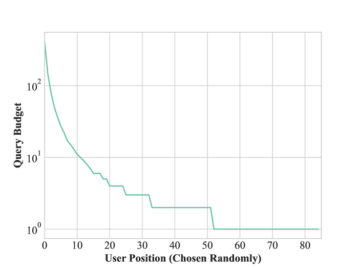
The image presents a line chart illustrating the relationship between "Query Budget" and "User Position (Chosen Randomly)". The chart displays a steep decline in Query Budget as User Position increases, suggesting a diminishing return or allocation of resources as users are considered in a random order. The y-axis is on a logarithmic scale.
### Components/Axes
* **X-axis:** "User Position (Chosen Randomly)", ranging from 0 to 80. The axis is linearly scaled.
* **Y-axis:** "Query Budget", ranging from 10⁰ to 10². The axis is logarithmically scaled, with markers at 1, 10, and 100.
* **Data Series:** A single line representing the Query Budget for each User Position. The line is teal in color.
* **Grid:** A light gray grid is present to aid in reading values.
### Detailed Analysis
The line representing Query Budget starts at approximately 100 (at User Position 0) and rapidly decreases. Here's a breakdown of approximate values at specific User Positions:
* User Position 0: Query Budget ≈ 100
* User Position 10: Query Budget ≈ 10
* User Position 20: Query Budget ≈ 5
* User Position 30: Query Budget ≈ 3
* User Position 40: Query Budget ≈ 2
* User Position 50: Query Budget ≈ 1
* User Position 60: Query Budget ≈ 0.5
* User Position 70: Query Budget ≈ 0.2
* User Position 80: Query Budget ≈ 0.1
The line exhibits a steep negative slope initially, gradually flattening out as the User Position increases. There are noticeable plateaus in the line around User Positions 20-30 and 40-50, indicating periods where the Query Budget remains relatively constant despite increasing User Position.
### Key Observations
* The Query Budget decreases exponentially with increasing User Position.
* The initial decrease is much more significant than the decrease at higher User Positions.
* The logarithmic scale of the Y-axis emphasizes the rapid initial decline.
* The plateaus suggest a threshold effect or a change in allocation strategy at certain User Positions.
### Interpretation
This chart likely represents a resource allocation strategy where the Query Budget is distributed among users chosen randomly. The decreasing Query Budget with increasing User Position suggests that the initial users receive a disproportionately larger share of the budget. This could be due to several reasons:
* **Prioritization:** The first users might be considered more valuable or important.
* **Diminishing Returns:** The benefit of allocating additional budget to later users might be lower.
* **Budget Constraint:** The total Query Budget is limited, and as more users are considered, the budget per user must decrease.
The plateaus could indicate that there's a minimum Query Budget allocated to each user, or that the allocation strategy changes after a certain number of users have been considered. The logarithmic scale highlights the significant impact of allocating budget to the initial users. The random selection of users suggests that this allocation strategy is not based on any specific user characteristics, but rather on a fair, albeit potentially inefficient, distribution of resources.