\n
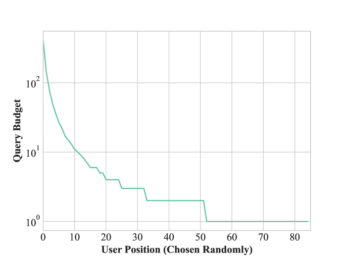
## Line Chart: Query Budget vs. Random User Position
### Overview
The image displays a single-series line chart plotting "Query Budget" against "User Position (Chosen Randomly)". The chart uses a logarithmic scale for the y-axis (Query Budget) and a linear scale for the x-axis. The data shows a steep, stepwise decline in query budget as the user position increases, eventually plateauing at a minimum value.
### Components/Axes
* **Chart Type:** Single-line chart.
* **X-Axis:**
* **Label:** "User Position (Chosen Randomly)"
* **Scale:** Linear, ranging from 0 to 80.
* **Major Tick Marks:** 0, 10, 20, 30, 40, 50, 60, 70, 80.
* **Y-Axis:**
* **Label:** "Query Budget"
* **Scale:** Logarithmic (base 10).
* **Major Tick Marks (Labels):** 10⁰ (1), 10¹ (10), 10² (100).
* **Grid Lines:** Horizontal grid lines are present at each major tick and at intermediate logarithmic intervals (e.g., 2, 3, 4, 5, 6, 7, 8, 9 between 1 and 10).
* **Data Series:**
* **Color:** A single teal/light green line.
* **Legend:** No separate legend is present; the single line is self-explanatory.
* **Spatial Layout:** The chart area is centered on a white background. The axes form a standard left and bottom border. The line originates in the top-left quadrant and terminates in the bottom-right quadrant.
### Detailed Analysis
**Trend Verification:** The teal line exhibits a clear, non-linear downward trend. It begins at a high value on the far left (low user position) and descends rapidly in a concave curve, transitioning into a series of distinct plateaus and drops before flattening completely.
**Approximate Data Points and Trend Description:**
* **At User Position ~0:** The line starts at its maximum value, approximately **200-300** (just above the 10² mark).
* **Positions 0-10:** The budget drops very steeply. By position 10, the value is approximately **10-12** (just above the 10¹ line).
* **Positions 10-20:** The decline continues but begins to show a stepwise pattern. A small plateau occurs around position 15-18 at a value of ~6-7. A drop occurs near position 20.
* **Positions 20-30:** A clear plateau exists from roughly position 20 to 25 at a value of **~4**. Another drop occurs near position 25.
* **Positions 30-50:** A longer plateau is visible from approximately position 33 to 50 at a value of **~2**.
* **Positions 50-80:** A final drop occurs just after position 50. From position ~52 to the end of the chart at position 80, the line is perfectly flat at the minimum value of **10⁰ (1)**.
### Key Observations
1. **Logarithmic Decline:** The use of a log scale for the y-axis highlights that the initial decrease in query budget is exponential, not linear.
2. **Stepwise Function:** After the initial smooth curve, the budget decreases in discrete steps, suggesting a quantized or tiered allocation system rather than a continuous function.
3. **Minimum Floor:** The budget hits a hard floor of 1 and does not decrease further, indicating a lower bound or minimum guaranteed allocation.
4. **Random Ordering Implication:** The x-axis label "User Position (Chosen Randomly)" is critical. It implies the users are not ordered by any inherent metric (like seniority or usage) but by a random shuffle. The strong correlation between position and budget suggests the allocation mechanism is highly sensitive to this random ordering.
### Interpretation
This chart likely visualizes the output of a resource allocation algorithm, possibly for a computational service, API, or experimental trial. The "Query Budget" represents a limit on the number of operations or requests a user can make.
The data suggests a **highly skewed, "winner-takes-most" allocation strategy**. The first few users in a random sequence receive a disproportionately large share of the total budget (hundreds of queries), while the vast majority of users (from position ~50 onward) receive only the bare minimum (1 query). The stepwise drops indicate predefined tiers or thresholds in the allocation logic.
The key insight is that **user outcome is dramatically determined by random chance** (their position in the shuffled queue). This could be a design for a fair lottery system (where everyone has an equal chance to be a "winner") or, conversely, an illustration of extreme inequity in a seemingly random process. The plateau at the end shows the system has a defined minimum service level, ensuring every user gets at least one query.