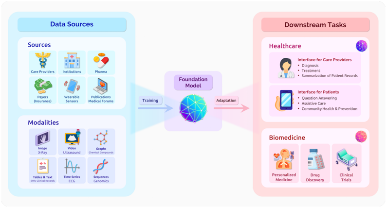
## Diagram: Healthcare and Biomedicine Foundation Model Architecture
### Overview
This diagram illustrates a system architecture for a foundation model in healthcare and biomedicine. It shows the flow of data from diverse sources through a central foundation model to specialized downstream applications. The diagram uses color-coded sections (blue for data sources, purple for the foundation model, pink for downstream tasks) and icons to represent different components and their relationships.
### Components/Axes
1. **Left Section (Data Sources - Blue)**
- **Sources (Top)**
- Care Providers (doctor icon)
- Institutions (hospital icon)
- Pharma (pill bottle icon)
- Payers (insurance card icon)
- Wearable Sensors (smartwatch icon)
- Publications (book icon)
- Medical Forums (laptop icon)
- **Modalities (Bottom)**
- Image X-Ray (X-ray icon)
- Video Ultrasound (video camera icon)
- Graphs (molecule structure icon)
- Tables & Text (document icon)
- Time Series (ECG waveform icon)
- Sequences (DNA helix icon)
2. **Center (Foundation Model - Purple)**
- Central globe-like icon labeled "Foundation Model"
- Arrows labeled "Training" (left) and "Adaptation" (right)
3. **Right Section (Downstream Tasks - Pink)**
- **Healthcare (Top)**
- Interface for Care Providers (doctor icon)
- Diagnosis
- Treatment
- Summarization of Patient Records
- Interface for Patients (smartphone icon)
- Question Answering
- Assistive Care
- Community Health & Prevention
- **Biomedicine (Bottom)**
- Personalized Medicine (human figure with DNA)
- Drug Discovery (pill bottle and microscope)
- Clinical Trials (hospital bed icon)
### Detailed Analysis
- **Data Flow**:
- Data sources feed into the foundation model through training
- The adapted foundation model then enables downstream tasks
- Arrows indicate unidirectional flow from left to right
- **Iconography**:
- Circular icons represent different data types (e.g., DNA helix for sequences)
- Square icons represent data collection methods (e.g., smartwatch for wearables)
- Human figures represent end-users (patients/care providers)
### Key Observations
1. The system emphasizes multimodal data integration (images, text, time series)
2. Healthcare applications focus on both provider and patient interfaces
3. Biomedicine applications span from molecular to clinical levels
4. No explicit quantitative metrics are shown (qualitative system architecture)
### Interpretation
This diagram demonstrates a knowledge transfer pipeline where:
1. Diverse real-world data (clinical, genomic, sensor) is aggregated
2. A general-purpose foundation model is trained on this heterogeneous data
3. The model is then specialized for specific healthcare and biomedical applications
4. The architecture suggests transfer learning capabilities across medical domains
The lack of explicit performance metrics implies this is a conceptual framework rather than an empirical study. The emphasis on both training and adaptation phases highlights the importance of continuous learning in medical AI systems.