## Line Chart: Proportion vs. Step for "gather" and "aggregate" Processes
### Overview
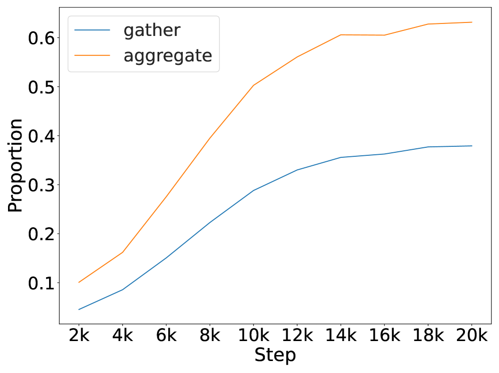
The image displays a line chart comparing the proportion of two processes, labeled "gather" and "aggregate," over a series of steps. The chart shows both processes increasing in proportion as the number of steps increases, with "aggregate" consistently maintaining a higher proportion and exhibiting a steeper initial growth rate than "gather."
### Components/Axes
* **Chart Type:** Line chart with two data series.
* **X-Axis:**
* **Label:** "Step"
* **Scale:** Linear, with major tick marks labeled at 2k, 4k, 6k, 8k, 10k, 12k, 14k, 16k, 18k, and 20k. The "k" denotes thousands.
* **Y-Axis:**
* **Label:** "Proportion"
* **Scale:** Linear, with major tick marks labeled at 0.1, 0.2, 0.3, 0.4, 0.5, and 0.6.
* **Legend:**
* **Position:** Top-left corner of the chart area.
* **Entries:**
1. A blue line segment labeled "gather".
2. An orange line segment labeled "aggregate".
* **Data Series:**
1. **gather (Blue Line):** A solid blue line.
2. **aggregate (Orange Line):** A solid orange line.
### Detailed Analysis
**Trend Verification & Data Point Extraction:**
* **"aggregate" (Orange Line):** This line shows a strong, continuous upward trend. It starts at approximately 0.10 at 2k steps. The growth is steepest between 2k and 10k steps, rising from ~0.10 to ~0.50. The rate of increase slows after 10k steps, reaching approximately 0.56 at 12k, 0.60 at 14k, and plateauing slightly above 0.60 (≈0.63) by 20k steps.
* **"gather" (Blue Line):** This line also shows a consistent upward trend but at a lower magnitude and with a less steep slope than "aggregate". It starts at approximately 0.05 at 2k steps. It rises steadily to ~0.09 at 4k, ~0.15 at 6k, ~0.22 at 8k, and ~0.29 at 10k. The growth continues more gradually, reaching ~0.33 at 12k, ~0.36 at 14k, and appears to plateau near 0.38 by 18k-20k steps.
**Spatial Grounding:** The legend is anchored in the top-left quadrant of the plot area. The "aggregate" line is positioned above the "gather" line across the entire x-axis range. Both lines originate from the lower-left region and extend toward the upper-right.
### Key Observations
1. **Consistent Hierarchy:** The proportion for "aggregate" is strictly greater than for "gather" at every measured step from 2k to 20k.
2. **Diverging Growth:** The gap between the two proportions widens significantly over time. At 2k steps, the difference is ~0.05. By 10k steps, the difference has grown to ~0.21, and by 20k steps, it is approximately 0.25.
3. **Saturation Behavior:** Both curves show signs of saturation (diminishing returns) as steps increase. The "aggregate" curve begins to flatten noticeably after 14k steps, while the "gather" curve starts to plateau earlier, around 14k-16k steps.
4. **Growth Phases:** The "aggregate" process exhibits two distinct growth phases: a rapid, near-linear increase from 2k to 10k steps, followed by a slower, logarithmic-like increase from 10k to 20k steps. The "gather" process shows a more uniform, gradual increase throughout.
### Interpretation
The chart demonstrates a clear performance or accumulation differential between two related processes, "gather" and "aggregate," over an extended operational timeline (20,000 steps).
* **What the data suggests:** The "aggregate" process is significantly more effective at increasing its associated "Proportion" metric than the "gather" process. This could imply that aggregation is a more efficient or higher-yield operation in the system being measured. The widening gap suggests that the advantage of aggregating compounds over time.
* **Relationship between elements:** The two processes are likely sequential or complementary stages in a pipeline (e.g., data is first *gathered* and then *aggregated*). The chart quantifies the value added by the aggregation stage. The fact that both plateau suggests a system limit or a point of diminishing returns is reached around 15,000-20,000 steps.
* **Notable anomalies/trends:** There are no apparent data anomalies; the trends are smooth and logical. The most significant finding is the substantial and growing disparity in outcomes between the two processes. The "aggregate" line reaching a proportion over 0.6 indicates it captures or constitutes a majority share of the measured quantity after about 14,000 steps, while "gather" never exceeds 0.4. This visual evidence strongly argues for the importance or dominance of the aggregation phase in this context.