## Line Chart: MER Average vs. N
### Overview
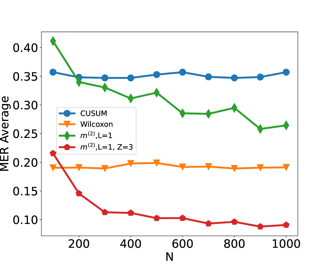
The image is a line chart comparing the MER (Mean Error Rate) Average for four different methods (CUSUM, Wilcoxon, m^(2), L=1, and m^(2), L=1, Z=3) as a function of N. The x-axis represents N, ranging from approximately 100 to 1000. The y-axis represents the MER Average, ranging from 0.10 to 0.40.
### Components/Axes
* **X-axis:** N, with tick marks at 200, 400, 600, 800, and 1000.
* **Y-axis:** MER Average, with tick marks at 0.10, 0.15, 0.20, 0.25, 0.30, 0.35, and 0.40.
* **Legend:** Located in the center-left of the chart, it identifies the four data series:
* Blue line with circle markers: CUSUM
* Orange line with inverted triangle markers: Wilcoxon
* Green line with diamond markers: m^(2), L=1
* Red line with square markers: m^(2), L=1, Z=3
### Detailed Analysis
* **CUSUM (Blue):** The CUSUM line starts at approximately 0.36 at N=100, decreases slightly to around 0.34 at N=200, then remains relatively stable between 0.34 and 0.36 for the rest of the range, ending at approximately 0.36 at N=1000.
* N=100, MER Average ≈ 0.36
* N=200, MER Average ≈ 0.34
* N=400, MER Average ≈ 0.35
* N=600, MER Average ≈ 0.36
* N=800, MER Average ≈ 0.35
* N=1000, MER Average ≈ 0.36
* **Wilcoxon (Orange):** The Wilcoxon line starts at approximately 0.19 at N=100, decreases slightly to around 0.19 at N=200, then remains relatively stable between 0.19 and 0.20 for the rest of the range, ending at approximately 0.19 at N=1000.
* N=100, MER Average ≈ 0.19
* N=200, MER Average ≈ 0.19
* N=400, MER Average ≈ 0.19
* N=600, MER Average ≈ 0.20
* N=800, MER Average ≈ 0.19
* N=1000, MER Average ≈ 0.19
* **m^(2), L=1 (Green):** The green line starts at approximately 0.41 at N=100, decreases to around 0.34 at N=200, then decreases to around 0.33 at N=300, then decreases to around 0.32 at N=400, then decreases to around 0.29 at N=600, then increases to around 0.29 at N=700, then increases to around 0.30 at N=800, then decreases to around 0.26 at N=900, then increases to around 0.27 at N=1000.
* N=100, MER Average ≈ 0.41
* N=200, MER Average ≈ 0.34
* N=400, MER Average ≈ 0.32
* N=600, MER Average ≈ 0.29
* N=800, MER Average ≈ 0.30
* N=1000, MER Average ≈ 0.27
* **m^(2), L=1, Z=3 (Red):** The red line starts at approximately 0.22 at N=100, decreases sharply to around 0.15 at N=200, then decreases to around 0.11 at N=300, then remains relatively stable between 0.09 and 0.11 for the rest of the range, ending at approximately 0.09 at N=1000.
* N=100, MER Average ≈ 0.22
* N=200, MER Average ≈ 0.15
* N=400, MER Average ≈ 0.11
* N=600, MER Average ≈ 0.10
* N=800, MER Average ≈ 0.10
* N=1000, MER Average ≈ 0.09
### Key Observations
* The m^(2), L=1, Z=3 method (red line) consistently has the lowest MER Average across the range of N values.
* The m^(2), L=1 method (green line) has the highest MER Average at lower N values, but decreases as N increases.
* The CUSUM (blue line) and Wilcoxon (orange line) methods have relatively stable MER Averages across the range of N values.
### Interpretation
The chart suggests that the m^(2), L=1, Z=3 method is the most effective in terms of minimizing the Mean Error Rate Average, especially as N increases. The m^(2), L=1 method performs worse at lower N values but improves as N increases, eventually performing better than CUSUM and Wilcoxon. The CUSUM and Wilcoxon methods provide relatively consistent performance regardless of the value of N. The parameter Z=3 appears to significantly improve the performance of the m^(2), L=1 method.