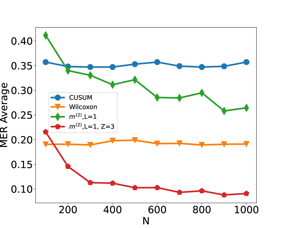
## Line Chart: MER Average vs. N
### Overview
This image presents a line chart comparing the Mean Error Rate (MER) Average for four different methods as a function of 'N', likely representing sample size or number of iterations. The chart displays the performance of CUSUM, Wilcoxon, m(2), L=1, and m(2), L=1, Z=3 methods.
### Components/Axes
* **X-axis:** Labeled "N", ranging from approximately 100 to 1000, with markers at 100, 200, 300, 400, 500, 600, 700, 800, 900, and 1000.
* **Y-axis:** Labeled "MER Average", ranging from approximately 0.05 to 0.42, with markers at 0.05, 0.10, 0.15, 0.20, 0.25, 0.30, 0.35, 0.40.
* **Legend:** Located in the top-left corner of the chart. It identifies the four data series:
* CUSUM (Blue) - Represented by circular markers.
* Wilcoxon (Orange) - Represented by triangular markers.
* m(2), L=1 (Green) - Represented by square markers.
* m(2), L=1, Z=3 (Red) - Represented by diamond markers.
### Detailed Analysis
* **CUSUM (Blue):** The line starts at approximately 0.36 at N=100, dips slightly to around 0.34 at N=200, remains relatively stable between 0.34 and 0.36 until N=1000, where it rises slightly to approximately 0.36.
* **Wilcoxon (Orange):** The line begins at approximately 0.21 at N=100, remains relatively stable around 0.18-0.20 from N=200 to N=1000, with minor fluctuations.
* **m(2), L=1 (Green):** The line starts at approximately 0.31 at N=100, decreases to around 0.26 at N=200, then fluctuates between approximately 0.26 and 0.31 until N=1000, where it is around 0.29.
* **m(2), L=1, Z=3 (Red):** The line starts at approximately 0.18 at N=100, rapidly decreases to around 0.11 at N=300, and remains relatively stable between 0.10 and 0.12 from N=300 to N=1000.
### Key Observations
* The m(2), L=1, Z=3 method consistently exhibits the lowest MER Average across all values of N.
* The Wilcoxon method maintains a relatively stable MER Average throughout the range of N.
* The CUSUM method shows the least variation in MER Average, remaining relatively constant.
* The m(2), L=1 method shows a decrease in MER Average from N=100 to N=200, but then fluctuates.
### Interpretation
The chart demonstrates the performance of different statistical methods for detecting changes or anomalies, as measured by the Mean Error Rate (MER). The 'N' parameter likely represents the sample size or the number of observations used. The results suggest that the m(2), L=1, Z=3 method is the most effective at minimizing the MER Average, indicating it has the highest accuracy in detecting changes. The Wilcoxon method provides a stable performance, while CUSUM shows minimal variation. The m(2), L=1 method shows initial improvement but then plateaus with some fluctuation.
The consistent low MER Average of m(2), L=1, Z=3 suggests it is less susceptible to false positives or false negatives compared to the other methods. The stability of the Wilcoxon method indicates it is a reliable, though potentially less sensitive, approach. The chart highlights the importance of selecting an appropriate statistical method based on the specific application and desired level of accuracy. The initial drop in MER for m(2), L=1, followed by stabilization, could indicate a point of diminishing returns where increasing the sample size beyond a certain point does not significantly improve performance.