# Technical Document Analysis of Line Chart
## 1. Chart Overview
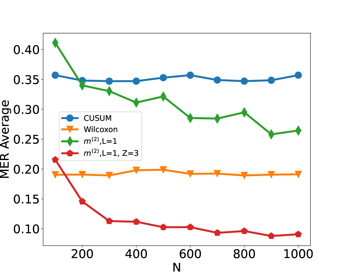
The image is a line chart depicting the relationship between variable **N** (x-axis) and **MER Average** (y-axis). The chart includes four distinct data series, each represented by unique markers and colors.
---
## 2. Axis Labels and Markers
- **X-axis (Horizontal):**
- Label: **N**
- Range: 200 to 1000
- Tick Marks: 200, 400, 600, 800, 1000
- **Y-axis (Vertical):**
- Label: **MER Average**
- Range: 0.10 to 0.40
- Increment: 0.05
---
## 3. Legend and Data Series
The legend is positioned on the **left side** of the chart, outside the plot area. Each data series is defined as follows:
| **Legend Label** | **Color** | **Marker** | **Visual Trend** |
|--------------------------|-----------|------------|----------------------------------------------------------------------------------|
| **CUSUM** | Blue | Circle | Flat line with minor fluctuations around 0.35 |
| **Wilcoxon** | Orange | Triangle | Stable line hovering near 0.20 |
| **m²,L=1** | Green | Diamond | Starts at 0.40, declines to ~0.25, with minor fluctuations |
| **m²,L=1, Z=3** | Red | Pentagon | Sharp decline from 0.22 to 0.09, with a consistent downward trend |
---
## 4. Key Data Points and Trends
### **CUSUM (Blue Circles)**
- **Trend:** Relatively flat with minor fluctuations.
- **Data Points:**
- N=200: 0.35
- N=400: 0.35
- N=600: 0.35
- N=800: 0.35
- N=1000: 0.35
### **Wilcoxon (Orange Triangles)**
- **Trend:** Stable with negligible variation.
- **Data Points:**
- N=200: 0.20
- N=400: 0.20
- N=600: 0.20
- N=800: 0.20
- N=1000: 0.20
### **m²,L=1 (Green Diamonds)**
- **Trend:** Starts at 0.40, declines to ~0.25, with minor fluctuations.
- **Data Points:**
- N=200: 0.40
- N=400: 0.30
- N=600: 0.28
- N=800: 0.29
- N=1000: 0.26
### **m²,L=1, Z=3 (Red Pentagons)**
- **Trend:** Sharp decline from 0.22 to 0.09, with a consistent downward trajectory.
- **Data Points:**
- N=200: 0.22
- N=400: 0.12
- N=600: 0.10
- N=800: 0.09
- N=1000: 0.09
---
## 5. Spatial Grounding and Validation
- **Legend Position:** Left side of the chart, outside the plot area.
- **Color-Marker Consistency:**
- Blue circles (CUSUM) match the legend.
- Orange triangles (Wilcoxon) match the legend.
- Green diamonds (m²,L=1) match the legend.
- Red pentagons (m²,L=1, Z=3) match the legend.
---
## 6. Additional Observations
- The **green line (m²,L=1)** exhibits the most significant variability, starting at the highest value (0.40) and ending at the lowest among the non-flat lines (0.26).
- The **red line (m²,L=1, Z=3)** shows the steepest decline, dropping from 0.22 to 0.09 across the N range.
- The **blue (CUSUM)** and **orange (Wilcoxon)** lines remain nearly constant, suggesting minimal sensitivity to changes in N.
---
## 7. Conclusion
The chart illustrates how different statistical methods (CUSUM, Wilcoxon, m² variants) perform across varying values of N. The **m²,L=1, Z=3** method demonstrates the most pronounced sensitivity to N, while **CUSUM** and **Wilcoxon** remain stable.