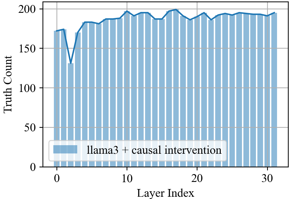
## Bar Chart: Truth Count vs. Layer Index for llama3 + causal intervention
### Overview
The image is a bar chart that displays the "Truth Count" on the y-axis against the "Layer Index" on the x-axis. The data represents the performance of "llama3 + causal intervention" across different layers. The chart includes a legend in the bottom-left corner.
### Components/Axes
* **Y-axis:** "Truth Count", ranging from 0 to 200, with gridlines at intervals of 50.
* **X-axis:** "Layer Index", ranging from 0 to 30, with tick marks at intervals of 10.
* **Legend:** Located in the bottom-left corner, labeled "llama3 + causal intervention" and represented by light blue bars.
### Detailed Analysis
The chart presents a series of light blue bars, each corresponding to a specific layer index. A dark blue line connects the tops of the bars, highlighting the trend.
* **Layer Index 0:** Truth Count is approximately 175.
* **Layer Index 1:** Truth Count drops to approximately 130.
* **Layer Index 2:** Truth Count increases to approximately 170.
* **Layer Index 3 to 30:** The Truth Count fluctuates between approximately 180 and 200. The trend is generally stable with minor variations.
### Key Observations
* There is a noticeable dip in the Truth Count at Layer Index 1.
* The Truth Count generally stabilizes and remains high after Layer Index 2.
* The Truth Count hovers around 190 for most of the layers.
### Interpretation
The chart illustrates the performance of "llama3 + causal intervention" across different layers. The initial dip at Layer Index 1 might indicate an initial adjustment phase or a specific challenge at that layer. The subsequent stabilization and high Truth Count suggest that the model performs consistently well across the remaining layers. The data suggests that the causal intervention is effective in maintaining a high truth count throughout the majority of the layers in the model.