# Technical Document Extraction: PubMed Rescaled Range Analysis
## 1. Image Overview
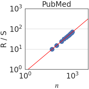
This image is a log-log scatter plot with a linear regression line, representing a technical data analysis (likely a Hurst exponent or Rescaled Range analysis) performed on a dataset labeled **PubMed**.
## 2. Component Isolation
### Header
* **Title:** `PubMed` (Centered at the top of the chart).
### Main Chart Area
* **Y-Axis Label:** `R / S` (Rescaled Range).
* **X-Axis Label:** `n` (Observation window size or number of observations).
* **Scale:** Both axes use a logarithmic scale (base 10).
* **Gridlines:** Horizontal grey gridlines are present at major powers of 10 ($10^1$ and $10^2$).
### Data Series
* **Scatter Points (Blue Circles):** Represent individual data observations.
* **Trend Line (Red Solid Line):** A linear regression line fitted to the scatter points.
---
## 3. Axis Markers and Scales
| Axis | Minimum Value | Maximum Value | Major Tick Marks |
| :--- | :--- | :--- | :--- |
| **X-axis ($n$)** | $10^0$ (1) | $\approx 3 \times 10^3$ | $10^0$, $10^3$ |
| **Y-axis ($R/S$)** | $10^0$ (1) | $10^3$ (1000) | $10^0$, $10^1$, $10^2$, $10^3$ |
---
## 4. Trend Verification and Data Extraction
### Trend Analysis
* **Blue Scatter Series:** The data points follow a strictly positive, linear trend on the log-log scale. The points are clustered more densely as $n$ increases toward $10^3$.
* **Red Line:** The line slopes upward from the bottom-left toward the top-right. Because this is a log-log plot, the linear appearance indicates a power-law relationship: $(R/S) \propto n^H$, where $H$ is the slope (Hurst exponent).
### Estimated Data Points
Based on the log-log coordinates:
* The first data point appears at approximately $n \approx 10^{1.5}$ ($\approx 32$) with an $R/S$ value of approximately $10^1$ (10).
* The data points terminate just before $n = 10^3$ (1000), where the $R/S$ value is approximately $10^{1.8}$ ($\approx 63$).
* The red regression line passes through $(10^0, 10^0)$ and continues past the data points, suggesting a slope ($H$) of approximately $0.6$ to $0.7$.
---
## 5. Summary of Technical Findings
The chart demonstrates a scaling relationship for the **PubMed** dataset. The rescaled range ($R/S$) increases predictably as the window size ($n$) increases. The tight alignment of the blue circles to the red regression line indicates a high degree of correlation and suggests that the underlying data possesses long-term memory or fractal characteristics typical of time-series analysis in informatics.