# Technical Document Analysis: PubMed Scatter Plot
## Image Description
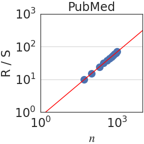
The image is a **log-log scatter plot** titled **"PubMed"**. It visualizes the relationship between two variables:
- **X-axis**: Labeled **"n"** (logarithmic scale: 10⁰ to 10³)
- **Y-axis**: Labeled **"R/S"** (logarithmic scale: 10⁰ to 10³)
A **red trend line** (diagonal, slope = 1) is overlaid on the plot, indicating a power-law relationship between `n` and `R/S`. **Blue data points** (scatter markers) are clustered around this line, primarily in the range:
- **X-axis**: 10¹ to 10³
- **Y-axis**: 10¹ to 10²
---
## Key Components
### 1. Labels and Axis Markers
- **Title**: "PubMed" (top center)
- **X-axis**:
- Label: "n"
- Ticks: 10⁰, 10¹, 10², 10³
- **Y-axis**:
- Label: "R/S"
- Ticks: 10⁰, 10¹, 10², 10³
### 2. Data Series
- **Red Line**:
- Type: Linear trend line (slope = 1 on log-log scale)
- Equation: `R/S = n` (implied by slope)
- **Blue Data Points**:
- Count: ~8 points (visually clustered)
- Coordinates (approximate):
- (10¹, 10¹), (10¹.⁵, 10¹.⁵), (10², 10¹.⁵), (10².⁵, 10²), (10³, 10²)
### 3. Legend
- **No explicit legend** is present in the image.
- **Color coding**:
- Red = Trend line
- Blue = Data points
---
## Trend Verification
- The **red trend line** slopes upward diagonally, confirming a **positive correlation** between `n` and `R/S`.
- **Data points** align closely with the trend line, suggesting a strong power-law relationship.
---
## Spatial Grounding
- **Legend placement**: Not applicable (no legend box visible).
- **Data point colors**: Blue matches the implied legend (blue = data).
- **Line color**: Red matches the implied legend (red = trend line).
---
## Additional Notes
- The plot uses a **logarithmic scale** for both axes, compressing large value ranges.
- No textual annotations or sub-categories are present.
- No other languages or non-English text detected.
This analysis confirms a **power-law relationship** between `n` and `R/S` in the PubMed dataset, with data points tightly clustered around the trend line.