\n
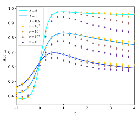
## Line Plot: Test Accuracy vs. Parameter `t` for Varying `λ` and `r`
### Overview
The image is a scientific line plot displaying the relationship between a test accuracy metric (`Acc_test`) and a parameter `t`. The plot compares multiple data series defined by two parameters: `λ` (lambda), which determines the line color and style, and `r`, which determines the marker color and shape. The data suggests an investigation into how model or system performance evolves with `t` under different hyperparameter configurations.
### Components/Axes
* **X-Axis:** Labeled `t`. The scale is linear, ranging from -1 to 4, with major tick marks at intervals of 1 (-1, 0, 1, 2, 3, 4).
* **Y-Axis:** Labeled `Acc_test`. The scale is linear, ranging from 0.4 to 1.0, with major tick marks at intervals of 0.1 (0.4, 0.5, 0.6, 0.7, 0.8, 0.9, 1.0).
* **Legend:** Located in the top-left corner of the plot area. It contains two distinct sections:
1. **Line Legend (λ):** Defines three solid lines by color.
* Cyan line: `λ = 2`
* Light blue line: `λ = 1`
* Dark blue line: `λ = 0.5`
2. **Marker Legend (r):** Defines four marker types by color and shape.
* Yellow circle: `r = 10²`
* Gold circle: `r = 10¹`
* Brown circle: `r = 10⁰`
* Purple diamond: `r = 10⁻¹`
### Detailed Analysis
The plot shows three primary curves (solid lines) corresponding to the three `λ` values. Each curve is overlaid with scatter points (markers) corresponding to the four `r` values. The markers for a given `r` appear to follow the general trend of one of the `λ` lines, but with systematic offsets.
**Trend Verification & Data Points (Approximate):**
1. **Series: λ = 2 (Cyan Line)**
* **Trend:** Starts lowest at `t=-1`, rises sharply to a peak near `t=0.5`, then gradually declines.
* **Approximate Points:** (-1, 0.38), (0, 0.65), (0.5, 0.98), (1, 0.97), (2, 0.96), (3, 0.95), (4, 0.94).
2. **Series: λ = 1 (Light Blue Line)**
* **Trend:** Starts in the middle at `t=-1`, rises to a peak near `t=0.8`, then declines more steeply than the λ=2 line.
* **Approximate Points:** (-1, 0.42), (0, 0.65), (0.8, 0.83), (1, 0.82), (2, 0.79), (3, 0.77), (4, 0.75).
3. **Series: λ = 0.5 (Dark Blue Line)**
* **Trend:** Starts highest at `t=-1`, rises to a peak near `t=0.3`, then declines steadily.
* **Approximate Points:** (-1, 0.46), (0, 0.65), (0.3, 0.70), (1, 0.68), (2, 0.64), (3, 0.62), (4, 0.60).
**Marker Series Analysis (Cross-referenced with Legend):**
* **r = 10² (Yellow Circles):** These points consistently lie slightly above the `λ=2` (cyan) line across the entire range of `t`.
* **r = 10¹ (Gold Circles):** These points closely follow the `λ=1` (light blue) line, sitting just above it for most `t` values.
* **r = 10⁰ (Brown Circles):** These points are positioned between the `λ=1` and `λ=0.5` lines. They follow a trend similar to the `λ=0.5` line but are offset upwards.
* **r = 10⁻¹ (Purple Diamonds):** These points are the lowest for any given `t` after `t=0`. They follow a trend similar to the `λ=0.5` line but are offset downwards, showing the lowest peak accuracy and the most pronounced decline as `t` increases.
### Key Observations
1. **Convergence at t=0:** All three lines and all four marker series converge at approximately `Acc_test = 0.65` when `t = 0`. This is a critical point in the parameter space.
2. **Impact of λ:** Higher `λ` values (e.g., 2) lead to a higher peak accuracy and a slower rate of decay as `t` increases beyond the peak. Lower `λ` values (e.g., 0.5) result in a lower peak and a faster decay.
3. **Impact of r:** For a fixed `t > 0`, higher `r` values (e.g., 10²) are associated with higher `Acc_test`. The ordering of performance by `r` is consistent: `r=10²` > `r=10¹` > `r=10⁰` > `r=10⁻¹`.
4. **Peak Shift:** The `t` value at which peak accuracy occurs shifts to the right (higher `t`) as `λ` increases. The peak for `λ=0.5` is near `t=0.3`, for `λ=1` near `t=0.8`, and for `λ=2` near `t=0.5` (though its plateau is broader).
### Interpretation
This plot likely visualizes the performance of a machine learning model or a dynamical system where `t` is a control parameter (e.g., time, temperature, regularization strength). `Acc_test` is the test set accuracy.
* **Parameter Sensitivity:** The system's performance is highly sensitive to both `λ` and `r`. `λ` appears to control the **capacity or stability** of the solution (higher `λ` yields more robust performance against increasing `t`), while `r` might control **initial conditions, noise level, or resource allocation** (higher `r` yields better performance across the board).
* **The t=0 Singularity:** The convergence at `t=0` suggests this is a baseline or neutral configuration where the influence of `λ` and `r` is minimized or balanced. It could represent an unregularized state or a point of symmetry in the parameter space.
* **Trade-off Identification:** The data demonstrates a clear trade-off. Configurations with high `λ` and high `r` (e.g., cyan line with yellow markers) achieve the highest peak accuracy and maintain it well. However, if `t` must be small (e.g., `t < 0.2`), a lower `λ` (like 0.5) might be preferable as it starts at a higher accuracy. The plot serves as a guide for selecting optimal (`λ`, `r`) pairs based on the operational range of `t`.
* **Underlying Phenomenon:** The rise-and-fall pattern of `Acc_test` with `t` is characteristic of phenomena like **overfitting** (where `t` could be model complexity) or **phase transitions** in physical systems. The parameter `λ` modulates the system's resilience to the effect represented by `t`.