## Density Plot: Sampled r Distribution
### Overview
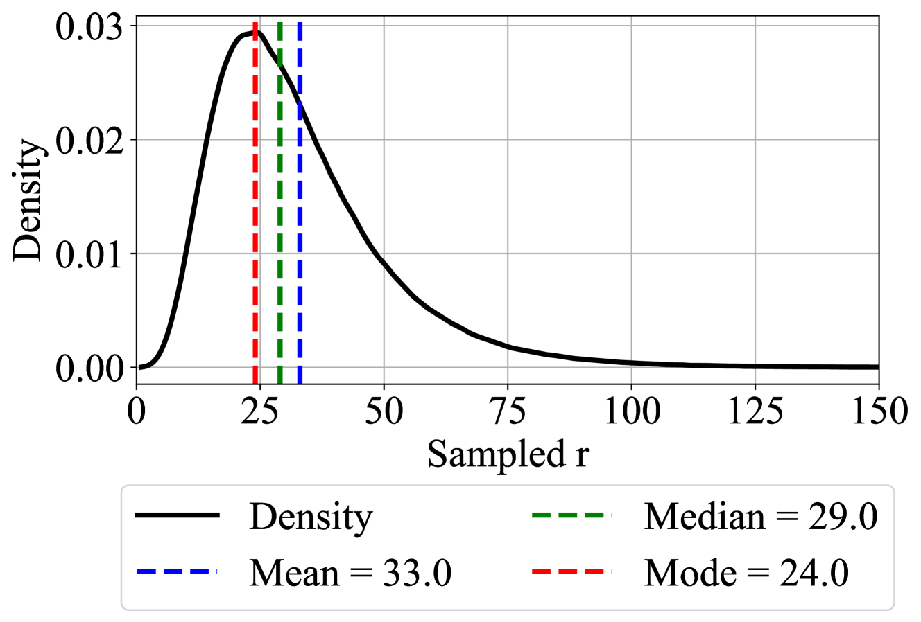
The image is a density plot showing the distribution of a variable "Sampled r". The plot displays the density of the variable on the y-axis and the values of "Sampled r" on the x-axis. Vertical lines indicate the mean, median, and mode of the distribution.
### Components/Axes
* **X-axis:** "Sampled r", with a scale from 0 to 150, marked at intervals of 25 (0, 25, 50, 75, 100, 125, 150).
* **Y-axis:** "Density", with a scale from 0.00 to 0.03, marked at intervals of 0.01 (0.00, 0.01, 0.02, 0.03).
* **Density Curve:** A black line representing the probability density function of "Sampled r".
* **Mean:** A blue dashed vertical line indicating the mean value of "Sampled r". Mean = 33.0
* **Median:** A green dashed vertical line indicating the median value of "Sampled r". Median = 29.0
* **Mode:** A red dashed vertical line indicating the mode value of "Sampled r". Mode = 24.0
* **Legend:** Located at the bottom of the chart, explaining the meaning of the lines:
* Black line: "Density"
* Blue dashed line: "Mean = 33.0"
* Green dashed line: "Median = 29.0"
* Red dashed line: "Mode = 24.0"
### Detailed Analysis
* **Density Curve:** The black density curve starts near 0 on the y-axis at x=0, rises to a peak around x=24 (the mode), and then gradually decreases towards 0 as x increases to 150. The curve is right-skewed.
* **Mean:** The blue dashed line is positioned at x=33.0.
* **Median:** The green dashed line is positioned at x=29.0.
* **Mode:** The red dashed line is positioned at x=24.0.
### Key Observations
* The distribution is unimodal and right-skewed.
* The mode (24.0) is less than the median (29.0), which is less than the mean (33.0), confirming the right skewness.
* The density is highest around the mode (24.0) and decreases as "Sampled r" moves away from this value.
### Interpretation
The density plot illustrates the distribution of the "Sampled r" variable. The right skewness indicates that there are more values clustered towards the lower end of the range, with a tail extending towards higher values. The mean being greater than the median further supports this skewness. The mode represents the most frequently occurring value of "Sampled r" in the sample. The plot provides a visual representation of the probability of observing different values of "Sampled r".