## Density Plot: Distribution of Sampled r Values
### Overview
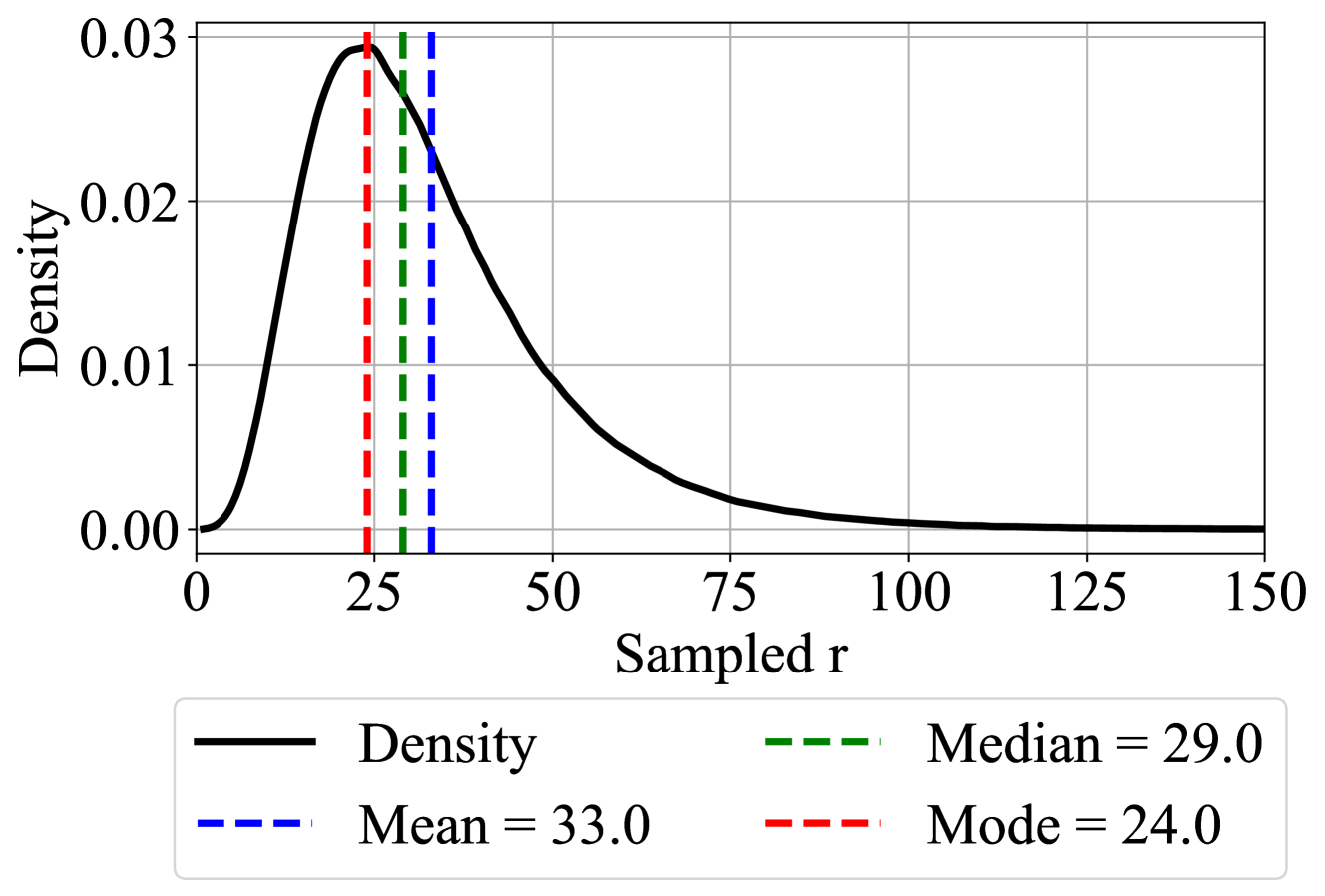
The image depicts a density plot illustrating the distribution of a variable labeled "Sampled r." The plot includes a probability density curve (black solid line) and three vertical dashed lines representing central tendency measures: Mode (red), Median (green), and Mean (blue). The x-axis ranges from 0 to 150, while the y-axis (Density) ranges from 0 to 0.03. The legend is positioned at the bottom of the plot.
---
### Components/Axes
- **X-axis (Sampled r)**: Labeled "Sampled r," with tick marks at 0, 25, 50, 75, 100, 125, and 150.
- **Y-axis (Density)**: Labeled "Density," with tick marks at 0.00, 0.01, 0.02, and 0.03.
- **Legend**: Located at the bottom, with color-coded labels:
- Black solid line: Density curve.
- Red dashed line: Mode = 24.0.
- Green dashed line: Median = 29.0.
- Blue dashed line: Mean = 33.0.
---
### Detailed Analysis
1. **Density Curve**:
- The black solid line forms a unimodal, right-skewed distribution.
- The peak density occurs near **x ≈ 25–30**, with a maximum value of approximately **0.03**.
- The curve declines gradually after the peak, approaching zero as x increases beyond 100.
2. **Central Tendency Lines**:
- **Mode (Red, 24.0)**: Aligns with the leftmost peak of the density curve, indicating the most frequent value.
- **Median (Green, 29.0)**: Positioned slightly right of the peak, suggesting the middle value of the distribution.
- **Mean (Blue, 33.0)**: Further right of the median, reflecting the influence of higher values in the tail.
3. **Skewness**:
- The mean (33.0) > median (29.0) > mode (24.0) confirms a **right-skewed distribution**.
- The tail extends toward higher x-values, pulling the mean upward.
---
### Key Observations
- The density curve’s peak (Mode) is at **24.0**, but the median and mean are higher, indicating asymmetry.
- The distribution tapers off slowly after the peak, with density values remaining non-zero up to x = 150.
- The mean (33.0) is notably higher than the median, suggesting the presence of outliers or a long right tail.
---
### Interpretation
This plot demonstrates a right-skewed distribution of "Sampled r" values. The Mode (24.0) represents the most common value, while the Median (29.0) and Mean (33.0) highlight the distribution’s asymmetry. The mean being pulled rightward implies that higher values, though less frequent, significantly influence the average. This could reflect real-world scenarios where extreme values (e.g., rare but large measurements) skew statistical summaries. The gradual decline in density after the peak suggests a concentration of data near the Mode, with fewer observations at higher x-values.