## Line Chart: Test Accuracy vs. Parameter `t` for Various Model Configurations
### Overview
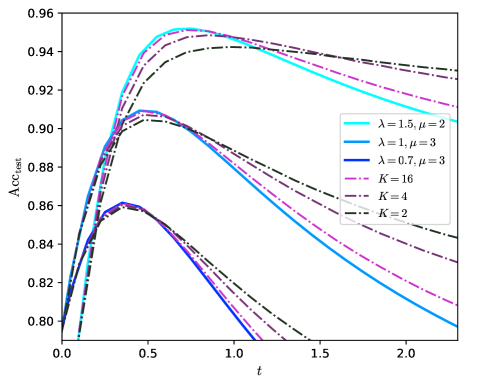
The image is a line chart plotting test accuracy (`Acc_test`) against a parameter `t`. It displays six distinct curves, each representing a different model configuration defined by parameters `λ`, `μ`, or `K`. The chart illustrates how the test accuracy evolves as `t` increases from 0.0 to approximately 2.3 for each configuration.
### Components/Axes
* **Chart Type:** Multi-line graph.
* **X-Axis:**
* **Label:** `t`
* **Scale:** Linear, ranging from 0.0 to 2.0 with major tick marks at 0.0, 0.5, 1.0, 1.5, and 2.0. The axis extends slightly beyond 2.0.
* **Y-Axis:**
* **Label:** `Acc_test`
* **Scale:** Linear, ranging from 0.80 to 0.96 with major tick marks at intervals of 0.02 (0.80, 0.82, 0.84, 0.86, 0.88, 0.90, 0.92, 0.94, 0.96).
* **Legend:** Positioned in the top-right quadrant of the chart area. It contains six entries, each with a line sample and a label.
1. **Cyan Solid Line:** `λ=1.5, μ=2`
2. **Blue Solid Line:** `λ=1, μ=3`
3. **Dark Blue Solid Line:** `λ=0.7, μ=3`
4. **Magenta Dashed Line:** `K=16`
5. **Purple Dash-Dot Line:** `K=4`
6. **Black Dash-Dot-Dot Line:** `K=2`
### Detailed Analysis
The chart shows six curves, all following a similar general pattern: a rapid initial increase in accuracy, reaching a peak, followed by a decline as `t` increases further. The peak accuracy and the rate of decline vary significantly between configurations.
**Trend Verification & Data Points (Approximate):**
1. **Cyan Solid Line (`λ=1.5, μ=2`):**
* **Trend:** Steepest initial ascent, reaches the highest peak, then declines steadily.
* **Key Points:** Starts near (0.0, 0.80). Peaks at approximately (0.5, 0.955). At t=1.0, Acc ≈ 0.945. At t=2.0, Acc ≈ 0.915.
2. **Magenta Dashed Line (`K=16`):**
* **Trend:** Similar steep ascent to the cyan line, peaks slightly lower and later, then declines more gradually.
* **Key Points:** Starts near (0.0, 0.80). Peaks at approximately (0.6, 0.95). At t=1.0, Acc ≈ 0.948. At t=2.0, Acc ≈ 0.935.
3. **Purple Dash-Dot Line (`K=4`):**
* **Trend:** Rises quickly, peaks lower than the top two, then declines at a moderate rate.
* **Key Points:** Starts near (0.0, 0.80). Peaks at approximately (0.5, 0.91). At t=1.0, Acc ≈ 0.89. At t=2.0, Acc ≈ 0.84.
4. **Blue Solid Line (`λ=1, μ=3`):**
* **Trend:** Rises quickly, peaks, then declines sharply.
* **Key Points:** Starts near (0.0, 0.80). Peaks at approximately (0.4, 0.91). At t=1.0, Acc ≈ 0.87. At t=1.5, Acc ≈ 0.82.
5. **Dark Blue Solid Line (`λ=0.7, μ=3`):**
* **Trend:** Follows a path very close to but slightly below the blue line (`λ=1, μ=3`) for most of its trajectory.
* **Key Points:** Starts near (0.0, 0.80). Peaks at approximately (0.4, 0.905). At t=1.0, Acc ≈ 0.865.
6. **Black Dash-Dot-Dot Line (`K=2`):**
* **Trend:** Has the lowest peak and the most gradual decline, showing the most stability over the range of `t`.
* **Key Points:** Starts near (0.0, 0.80). Peaks at approximately (0.4, 0.86). At t=1.0, Acc ≈ 0.855. At t=2.0, Acc ≈ 0.845.
### Key Observations
1. **Peak Performance Hierarchy:** The configuration `λ=1.5, μ=2` achieves the highest overall test accuracy (~0.955), followed closely by `K=16` (~0.95). The `K=2` configuration has the lowest peak accuracy (~0.86).
2. **Stability vs. Peak Trade-off:** Configurations with higher peak accuracy (`λ=1.5, μ=2` and `K=16`) exhibit a more pronounced decline after their peak. Conversely, the `K=2` configuration, while having a lower peak, maintains its accuracy more consistently as `t` increases.
3. **Parameter Grouping:** The three curves defined by `λ` and `μ` (cyan, blue, dark blue) show that for a fixed `μ=3`, decreasing `λ` from 1 to 0.7 results in a very slight decrease in performance. The `λ=1.5, μ=2` configuration is an outlier, performing significantly better.
4. **K-Value Trend:** Among the `K`-defined curves, increasing `K` (from 2 to 4 to 16) leads to a higher peak accuracy but also a steeper subsequent decline.
### Interpretation
This chart likely visualizes the performance of a machine learning model (e.g., a neural network) under different regularization or architectural settings, where `t` could represent a training hyperparameter like temperature, noise level, or a time-like evolution parameter.
* **What the data suggests:** There is a clear optimal value for `t` (around 0.4-0.6) that maximizes test accuracy for all shown configurations. Beyond this point, increasing `t` harms performance, possibly by over-regularizing the model or pushing it into a less optimal state.
* **Relationship between elements:** The parameters `λ`, `μ`, and `K` control the model's behavior. Higher `K` (which might represent the number of components, clusters, or a complexity parameter) and a specific combination of higher `λ` with lower `μ` enable the model to reach higher accuracy peaks. However, these high-performance configurations appear more sensitive to the value of `t`, degrading faster as `t` moves away from the optimum.
* **Notable Anomaly:** The `λ=1.5, μ=2` curve is distinct. It not only has the highest peak but also maintains a higher accuracy than all other curves for `t > ~0.8`, suggesting this parameter combination offers a better balance of peak performance and robustness to increasing `t` compared to the high-`K` models.
* **Practical Implication:** The choice of model configuration involves a trade-off. If one can precisely control `t` to stay near 0.5, a high-peak model like `λ=1.5, μ=2` or `K=16` is preferable. If `t` is expected to vary or be less controlled, a more stable model like `K=2` might be more reliable, albeit with lower maximum accuracy.