## Bar Chart: Token Fraction vs. Average Accuracy
### Overview
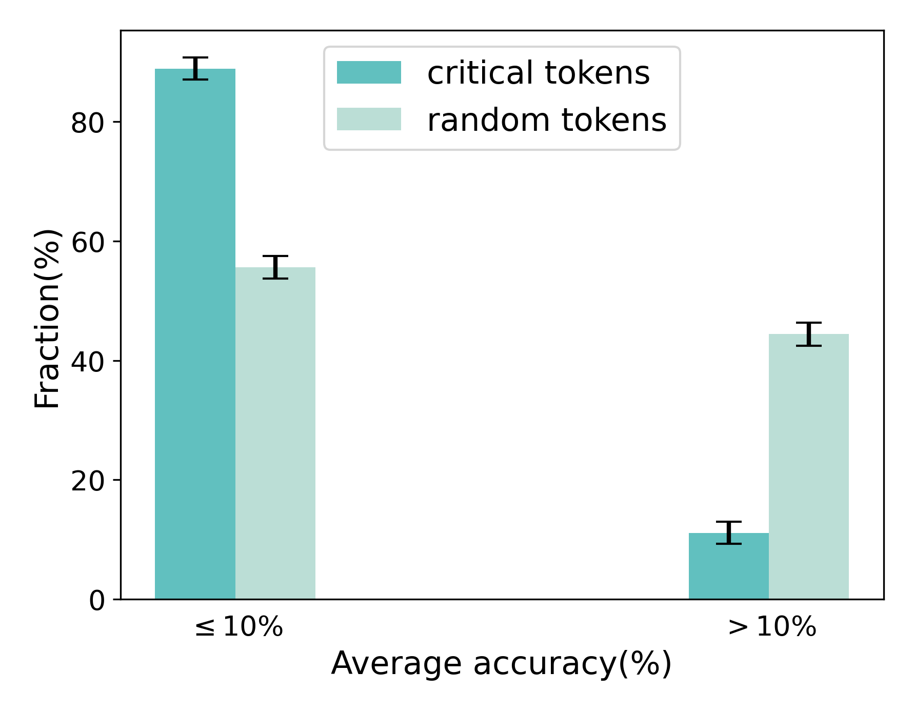
The image is a bar chart comparing the fraction (percentage) of "critical tokens" and "random tokens" against two categories of average accuracy: "≤ 10%" and "> 10%". Error bars are included on each bar.
### Components/Axes
* **X-axis:** "Average accuracy(%)" with two categories: "≤ 10%" and "> 10%".
* **Y-axis:** "Fraction(%)" with a scale from 0 to 80 in increments of 20.
* **Legend:** Located at the top-right of the chart.
* "critical tokens" represented by a teal bar.
* "random tokens" represented by a light-green bar.
### Detailed Analysis
* **Category: ≤ 10% Average Accuracy**
* "critical tokens" (teal): Approximately 88% with an error bar range of approximately +/- 2%.
* "random tokens" (light-green): Approximately 55% with an error bar range of approximately +/- 3%.
* **Category: > 10% Average Accuracy**
* "critical tokens" (teal): Approximately 11% with an error bar range of approximately +/- 3%.
* "random tokens" (light-green): Approximately 44% with an error bar range of approximately +/- 3%.
### Key Observations
* For average accuracy ≤ 10%, "critical tokens" have a significantly higher fraction than "random tokens".
* For average accuracy > 10%, "random tokens" have a significantly higher fraction than "critical tokens".
* The fraction of "critical tokens" decreases sharply as average accuracy increases from ≤ 10% to > 10%.
* The fraction of "random tokens" decreases slightly as average accuracy increases from ≤ 10% to > 10%.
### Interpretation
The chart suggests that "critical tokens" are more prevalent when the average accuracy is low (≤ 10%), while "random tokens" become more prevalent when the average accuracy is higher (> 10%). This could indicate that the model relies more on "critical tokens" when it struggles to achieve high accuracy, and relies more on "random tokens" when it is more accurate. The error bars indicate the variability in the data, but the overall trends are clear.