\n
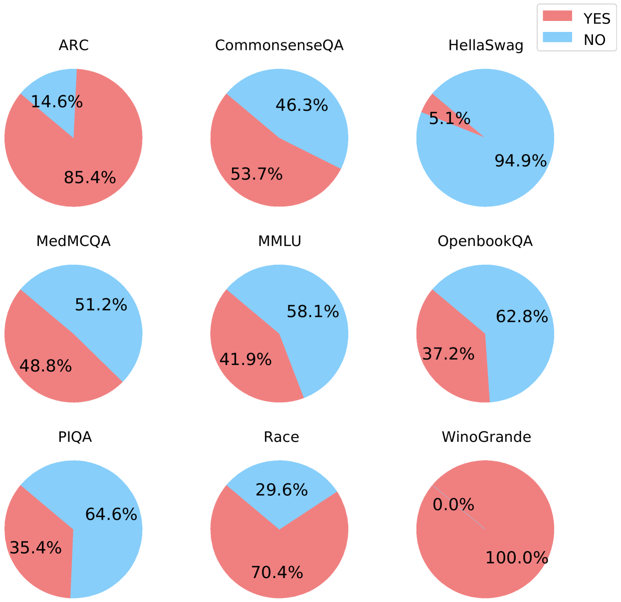
## Pie Charts: Performance on Various Question Answering Benchmarks
### Overview
The image presents a 3x3 grid of pie charts, each representing the performance of a model on a different question answering benchmark. The performance is categorized into "YES" and "NO" answers, represented by red and light blue slices respectively. Each chart is labeled with the name of the benchmark.
### Components/Axes
* **Benchmarks:** ARC, CommonsenseQA, HellaSwag, MedMCQA, MMLU, OpenbookQA, PIQA, Race, and Winogrande.
* **Categories:** YES (red), NO (light blue).
* **Legend:** Located in the top-right corner, indicating that red represents "YES" and light blue represents "NO".
### Detailed Analysis
Here's a breakdown of each pie chart, with approximate values:
1. **ARC:** The pie chart shows a dominant "NO" response. Approximately 85.4% of the answers are "NO" (red), and 14.6% are "YES" (light blue).
2. **CommonsenseQA:** This chart is more balanced. Approximately 53.7% of the answers are "YES" (light blue), and 46.3% are "NO" (red).
3. **HellaSwag:** This chart shows a very strong "NO" response. Approximately 94.9% of the answers are "NO" (light blue), and 5.1% are "YES" (red).
4. **MedMCQA:** This chart is nearly balanced. Approximately 51.2% of the answers are "YES" (light blue), and 48.8% are "NO" (red).
5. **MMLU:** This chart shows a slight preference for "NO". Approximately 58.1% of the answers are "NO" (red), and 41.9% are "YES" (light blue).
6. **OpenbookQA:** This chart shows a strong "YES" response. Approximately 62.8% of the answers are "YES" (light blue), and 37.2% are "NO" (red).
7. **PIQA:** This chart shows a strong "YES" response. Approximately 64.6% of the answers are "YES" (light blue), and 35.4% are "NO" (red).
8. **Race:** This chart shows a strong "NO" response. Approximately 70.4% of the answers are "NO" (red), and 29.6% are "YES" (light blue).
9. **WinoGrande:** This chart shows a complete "NO" response. 100% of the answers are "NO" (red), and 0.0% are "YES" (light blue).
### Key Observations
* The performance varies significantly across different benchmarks.
* HellaSwag and Winogrande show overwhelmingly "NO" responses.
* CommonsenseQA, MedMCQA, MMLU, OpenbookQA, PIQA, and Race show more balanced or slightly skewed responses.
* ARC shows a strong preference for "NO" responses.
### Interpretation
The data suggests that the model being evaluated struggles with certain types of question answering tasks more than others. The benchmarks with high "NO" response rates (HellaSwag, Winogrande, ARC) likely represent tasks that are more challenging for the model, potentially due to requiring deeper reasoning, common sense knowledge, or nuanced understanding of language. The more balanced benchmarks (CommonsenseQA, MedMCQA, MMLU, OpenbookQA, PIQA, Race) indicate that the model has some ability to answer these questions correctly, but still makes a significant number of errors. The complete "NO" response on Winogrande is particularly striking and suggests a fundamental limitation in the model's ability to handle that specific type of question. The "YES" and "NO" labels likely represent whether the model's answer is correct or incorrect, respectively. The data provides a snapshot of the model's strengths and weaknesses across a range of question answering benchmarks, which can be used to guide further development and improvement.