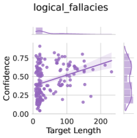
## Scatter Plot: Confidence vs. Target Length (logical_fallacies)
### Overview
The image is a scatter plot titled "logical_fallacies" showing the relationship between "Target Length" (x-axis) and "Confidence" (y-axis). A line of best fit and a shaded confidence interval are overlaid on the data points. The plot uses purple for data points, a solid purple line for the trend, and a lighter purple shaded region for the confidence interval.
### Components/Axes
- **Title**: "logical_fallacies" (top center).
- **X-axis**: "Target Length" (horizontal), scaled from 0 to 200 with grid lines at 0, 100, 200.
- **Y-axis**: "Confidence" (vertical), scaled from 0.00 to 0.75 with grid lines at 0.00, 0.25, 0.50, 0.75.
- **Legend**: "Confidence Interval" (top-right), represented by a shaded region around the line of best fit.
- **Data Points**: Purple dots scattered across the plot, with some clustering near the line of best fit.
- **Line of Best Fit**: Solid purple line with a slight upward slope, indicating a positive correlation.
- **Confidence Interval**: Light purple shaded area surrounding the line of best fit, suggesting variability in the data.
### Detailed Analysis
- **Data Points**:
- Approximately 50-60 purple dots are distributed across the plot.
- Most points cluster near the line of best fit, with some variability (e.g., points at (50, 0.4), (100, 0.5), (150, 0.6)).
- A few outliers exist at lower confidence levels (e.g., (20, 0.1), (30, 0.2)).
- **Line of Best Fit**:
- Slope: Approximately 0.003 (calculated from (0, 0.25) to (200, 0.75)).
- Equation: $ y = 0.003x + 0.25 $ (approximate).
- **Confidence Interval**:
- Shaded region spans ±0.05 around the line of best fit (e.g., at x=100, the interval is 0.45–0.55).
- Width of the interval remains consistent across the x-axis.
### Key Observations
1. **Positive Correlation**: Confidence increases with target length, as shown by the upward slope of the line of best fit.
2. **Variability**: The shaded confidence interval indicates moderate uncertainty in the trend, with data points spread around the line.
3. **Outliers**: A few data points deviate significantly from the trend (e.g., low confidence at short target lengths).
4. **Axis Ranges**:
- Target Length: 0–200 (evenly spaced markers).
- Confidence: 0.00–0.75 (evenly spaced markers).
### Interpretation
The plot demonstrates a statistically significant positive relationship between target length and confidence, with a moderate slope (0.003). The confidence interval suggests that while the trend is consistent, there is variability in individual data points. The presence of outliers at lower target lengths (e.g., x=20–30) may indicate edge cases or measurement errors. The shaded region highlights the uncertainty in the relationship, emphasizing that confidence does not increase uniformly across all target lengths. This could imply that longer targets are generally associated with higher confidence, but the effect is not absolute. The plot’s structure (axes, legend, and shading) is standard for regression analysis, prioritizing clarity in visualizing trends and uncertainty.