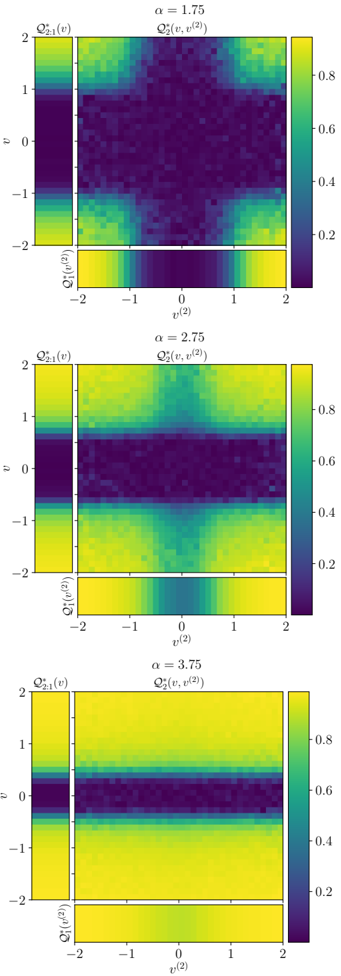
## Heatmap Series: Correlation Function Q₂²(v, v⁽²⁾) for Varying α
### Overview
The image displays three vertically stacked heatmap plots, each visualizing a two-dimensional correlation or interaction function, denoted as Q₂²(v, v⁽²⁾), for three distinct values of a parameter α (alpha). Each plot includes a main 2D heatmap and two marginal 1D plots (left and bottom). The color scale represents the magnitude of Q₂², ranging from 0 (dark purple) to approximately 0.8 (bright yellow).
### Components/Axes
**Common Elements Across All Three Plots:**
* **Main Plot Title:** `Q₂²(v, v⁽²⁾)` (Centered above the main heatmap).
* **Main Plot Axes:**
* **Y-axis (Left):** Label `v`. Scale ranges from -2 to 2, with major ticks at -2, -1, 0, 1, 2.
* **X-axis (Bottom):** Label `v⁽²⁾`. Scale ranges from -2 to 2, with major ticks at -2, -1, 0, 1, 2.
* **Marginal Plot (Left):** Label `Q₂,₁²(v)`. This is a 1D plot aligned with the Y-axis of the main plot, showing the function's behavior integrated or sliced along the `v` dimension.
* **Marginal Plot (Bottom):** Label `Q₂,₀²(v⁽²⁾)`. This is a 1D plot aligned with the X-axis of the main plot, showing the function's behavior integrated or sliced along the `v⁽²⁾` dimension.
* **Color Bar (Right):** A vertical scale bar indicating the mapping of color to numerical value. Ticks are labeled at 0, 0.2, 0.4, 0.6, 0.8. The gradient runs from dark purple (0) through teal and green to bright yellow (~0.8).
* **Parameter Label:** Each plot has a unique α value centered above the main title.
**Plot-Specific Parameter:**
1. **Top Plot:** `α = 1.75`
2. **Middle Plot:** `α = 2.75`
3. **Bottom Plot:** `α = 3.75`
### Detailed Analysis
**1. Plot for α = 1.75:**
* **Main Heatmap Trend:** A prominent, wide, dark purple horizontal band (low Q₂² value, ~0) is centered at `v = 0`, spanning the full range of `v⁽²⁾`. The regions above (`v > 0.5`) and below (`v < -0.5`) this band show higher values (yellow-green, ~0.6-0.8). The high-value regions are not uniform; they show a subtle checkerboard or grid-like pattern of slightly varying intensity.
* **Marginal Plot `Q₂,₁²(v)`:** Shows a deep, wide trough centered at `v=0`, corresponding to the dark band. The function rises sharply to high values (~0.8) as `|v|` increases beyond ~0.5.
* **Marginal Plot `Q₂,₀²(v⁽²⁾)`:** Shows a relatively flat, high-value plateau (~0.7-0.8) across most of the `v⁽²⁾` range, with a slight dip near `v⁽²⁾=0`.
**2. Plot for α = 2.75:**
* **Main Heatmap Trend:** The central dark horizontal band at `v=0` has become significantly narrower compared to the α=1.75 case. The high-value regions (yellow) above and below are more extensive and uniform in intensity. The checkerboard pattern is less distinct.
* **Marginal Plot `Q₂,₁²(v)`:** The central trough is narrower and slightly shallower than in the first plot. The rise to high values is steeper.
* **Marginal Plot `Q₂,₀²(v⁽²⁾)`:** The plateau is flatter and maintains a high value (~0.8) across the entire range, with almost no visible dip at the center.
**3. Plot for α = 3.75:**
* **Main Heatmap Trend:** The central dark band is very narrow, confined to a thin strip around `v=0`. The vast majority of the plot area is occupied by high-value regions (bright yellow, ~0.8), which appear very uniform.
* **Marginal Plot `Q₂,₁²(v)`:** The trough is very narrow and shallow. The function reaches its maximum value (~0.8) very quickly as `|v|` moves away from zero.
* **Marginal Plot `Q₂,₀²(v⁽²⁾)`:** Shows a nearly perfect, flat line at the maximum value (~0.8) across the entire `v⁽²⁾` range.
### Key Observations
1. **Parameter-Driven Trend:** As the parameter α increases from 1.75 to 3.75, the region of low correlation/interaction (the dark band at `v=0`) in the main heatmap becomes progressively narrower.
2. **Value Increase:** The overall magnitude of Q₂² increases with α. The high-value regions become brighter (more yellow) and cover a larger area of the plot.
3. **Marginal Behavior:** The marginal plot along the `v` axis (`Q₂,₁²(v)`) directly reflects the narrowing of the central band. The marginal plot along the `v⁽²⁾` axis (`Q₂,₀²(v⁽²⁾)`) evolves from a slightly dipped plateau to a perfectly flat, high-value line, indicating the function becomes independent of `v⁽²⁾` at higher α.
4. **Symmetry:** All plots are symmetric about both the `v=0` and `v⁽²⁾=0` axes.
### Interpretation
This series of heatmaps likely visualizes the behavior of a correlation function or an order parameter in a statistical physics or machine learning context (e.g., in neural network theory or kernel methods). The parameter α appears to control the "sharpness" or "localization" of the interaction.
* **Low α (1.75):** The interaction is more diffuse. There is a broad region of parameter space (`v` near zero) where the correlation Q₂² is suppressed, and this suppression is present for all values of the second parameter `v⁽²⁾`.
* **High α (3.75):** The interaction becomes highly localized. The suppression of Q₂² is confined to an extremely narrow region around `v=0`. Everywhere else, the correlation is strong and uniform, and crucially, it becomes independent of the second parameter `v⁽²⁾`.
The progression suggests a phase transition or a critical change in the system's behavior as α increases. The system moves from a state with a broad, parameter-dependent region of low correlation to a state with a sharply defined, parameter-independent region of high correlation. The narrowing of the central band in the main plot and the flattening of the `Q₂,₀²(v⁽²⁾)` marginal plot are the key visual signatures of this transition.