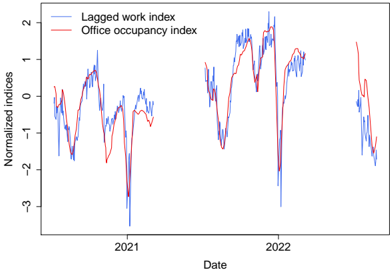
## Line Chart: Normalized Indices of Lagged Work and Office Occupancy (2020-2022)
### Overview
The image displays a time-series line chart comparing two normalized indices over a period spanning approximately late 2020 to late 2022. The chart illustrates the temporal relationship and volatility between a "Lagged work index" and an "Office occupancy index."
### Components/Axes
* **Chart Type:** Dual-line time-series plot.
* **X-Axis (Horizontal):**
* **Label:** `Date`
* **Markers:** Major tick marks labeled `2021` and `2022`. The data appears to start before 2021 and end after the 2022 marker.
* **Y-Axis (Vertical):**
* **Label:** `Normalized indices`
* **Scale:** Linear scale ranging from approximately -3.5 to +2.5. Major tick marks are present at -3, -2, -1, 0, 1, and 2.
* **Legend:**
* **Position:** Top-left corner of the plot area.
* **Entries:**
1. `Lagged work index` - Represented by a blue line.
2. `Office occupancy index` - Represented by a red line.
### Detailed Analysis
**Trend Verification & Data Points:**
* **Lagged Work Index (Blue Line):**
* **Trend:** Highly volatile with frequent, sharp peaks and troughs. It exhibits a general pattern of recovery and decline in cycles.
* **Key Points (Approximate):**
* Starts near 0 in late 2020.
* Drops to a significant trough of ~ -3.5 in early 2021.
* Recovers to a peak of ~ +1.5 in mid-2021.
* Experiences another deep trough of ~ -3.0 in mid-2022.
* Reaches its highest peak of ~ +2.2 in late 2022.
* Ends the series near -1.5.
* **Office Occupancy Index (Red Line):**
* **Trend:** Follows a similar cyclical pattern to the blue line but with generally lower volatility and amplitude. It appears to lag or lead the blue line at different points.
* **Key Points (Approximate):**
* Starts near 0 in late 2020.
* Drops to a trough of ~ -2.0 in early 2021.
* Recovers to a peak of ~ +1.0 in mid-2021.
* Experiences a trough of ~ -1.5 in mid-2022.
* Reaches a peak of ~ +1.5 in late 2022.
* Ends the series near -1.0.
**Spatial Grounding & Cross-Reference:**
* The legend is clearly positioned in the top-left, with the blue line entry above the red line entry.
* The blue line is consistently more jagged and reaches more extreme values (both high and low) than the red line throughout the chart.
* The two lines show a strong visual correlation, moving in the same direction for most major swings. For example, both plunge in early 2021 and mid-2022, and both rise in mid-2021 and late 2022.
### Key Observations
1. **Strong Correlation:** The most prominent feature is the high degree of co-movement between the Lagged Work Index and the Office Occupancy Index. Major peaks and troughs align closely in time.
2. **Volatility Differential:** The Lagged Work Index (blue) is significantly more volatile, with deeper troughs and higher peaks compared to the Office Occupancy Index (red).
3. **Major Downturns:** Two severe downturns are evident: one centered in early 2021 and another in mid-2022. The 2021 trough appears to be the most severe for the blue line.
4. **Recovery Phases:** Following each major trough, both indices show a recovery trend, though the path is noisy.
5. **Normalization:** The use of "Normalized indices" suggests the raw data for each series has been transformed (e.g., z-score) to have a mean of 0 and a standard deviation of 1, allowing direct comparison of their relative movements despite potentially different original scales.
### Interpretation
This chart likely illustrates the relationship between remote/work-from-home activity (proxied by a "Lagged work index") and physical office presence. The strong correlation suggests that periods of reduced work activity (perhaps due to lockdowns, holidays, or seasonal trends) are closely followed by reduced office occupancy, and vice-versa.
The **"lagged"** nature of the work index is a critical detail. It implies that the work index data is shifted forward in time relative to the occupancy data. This could be testing the hypothesis that changes in work patterns (e.g., logging into work systems from home) *precede* and predict changes in office attendance. The visual correlation supports this predictive relationship.
The greater volatility of the work index might indicate that work activity (as measured by this index) is a more sensitive or leading indicator, reacting more sharply to external shocks (like pandemic waves or policy changes) than the decision to physically go to an office, which may involve more inertia. The deep troughs in early 2021 and mid-2022 could correspond to specific waves of the COVID-19 pandemic or other significant societal events impacting work habits.
In essence, the data suggests a tight, potentially predictive coupling between where work is performed and the utilization of physical office space during the observed period.