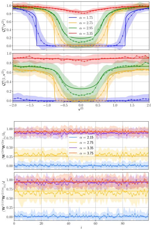
## Line Charts: Q^sp(v^(2)) and Ratio Trends Across Alpha Values
### Overview
The image contains two sets of line charts. The top section shows two subplots of Q^sp(v^(2)) as a function of v^(2), while the bottom section displays three subplots of ratio metrics (W^(2)W^(21))_ii/k1 and (W^(21)W^(21))_ii/d as functions of index i. All charts use color-coded lines to represent different α (alpha) parameter values, with shaded regions indicating uncertainty bounds.
### Components/Axes
**Top Charts:**
- **X-axis (v^(2))**: Ranges from -2.0 to 2.0 in increments of 0.5
- **Y-axis (Q^sp(v^(2)))**: Ranges from 0.0 to 1.0 in increments of 0.2
- **Legend**: Positioned centrally, mapping colors to α values:
- Blue: α = 1.75
- Orange: α = 2.75
- Green: α = 2.95
- Red: α = 3.35
**Bottom Charts:**
- **X-axis (i)**: Ranges from 0 to 80 in increments of 20
- **Y-axis (Ratios)**:
- Left subplot: (W^(2)W^(21))_ii/k1 (0.0–1.0)
- Middle subplot: (W^(21)W^(21))_ii/d (0.0–1.0)
- **Legend**: Positioned at top, mapping colors to α values:
- Blue: α = 2.15
- Orange: α = 2.75
- Purple: α = 3.35
- Red: α = 3.75
### Detailed Analysis
**Top Charts:**
1. **Q^sp(v^(2)) Trends**:
- All α values show a U-shaped curve with minima near v^(2) = 0
- Higher α values (red/orange) maintain higher Q^sp values across v^(2)
- Blue (α=1.75) shows the deepest dip (Q^sp ≈ 0.1 at v^(2)=0)
- Red (α=3.35) remains above 0.8 for |v^(2)| > 0.5
- Uncertainty bands widen near v^(2)=0 for all α values
2. **Bottom Charts**:
- **Left Subplot (W^(2)W^(21))_ii/k1)**:
- All α values hover between 0.7–0.9 with minor fluctuations
- Red (α=3.75) consistently highest (~0.95)
- Blue (α=2.15) consistently lowest (~0.75)
- **Middle Subplot (W^(21)W^(21))_ii/d)**:
- All α values cluster tightly between 0.8–0.95
- Red (α=3.75) shows slight upward trend
- Blue (α=2.15) shows slight downward trend
- **Right Subplot (W^(2)W^(21))_ii/d)**:
- All α values cluster tightly between 0.7–0.85
- Red (α=3.75) shows most variability
- Blue (α=2.15) shows least variability
### Key Observations
1. **Top Charts**:
- U-shaped Q^sp(v^(2)) curves suggest threshold behavior
- Higher α values correlate with higher Q^sp magnitudes
- Uncertainty bands indicate greater variability near v^(2)=0
2. **Bottom Charts**:
- Ratios show weak α dependence but consistent ordering
- Red (highest α) dominates in magnitude across metrics
- Blue (lowest α) shows most stable behavior
- Variability increases with higher α values
### Interpretation
The data demonstrates that α parameter strongly influences both Q^sp(v^(2)) and ratio metrics:
1. **Threshold Effects**: The U-shaped Q^sp(v^(2)) curves suggest a critical transition at v^(2)=0, with higher α values resisting this transition
2. **Stability vs Sensitivity**: Lower α values (blue) show more stable behavior in ratio metrics, while higher α values (red) exhibit greater variability
3. **Consistency Across Metrics**: The same α ordering (blue < orange < purple < red) appears in all charts, suggesting a fundamental relationship between α and the measured quantities
4. **Uncertainty Patterns**: Wider uncertainty bands near v^(2)=0 in top charts indicate measurement challenges in this region
The charts collectively suggest that α acts as a control parameter modulating system behavior, with higher values producing more pronounced effects but reduced stability. The consistent α ordering across different metrics implies a universal scaling relationship in the underlying system.