## Comparative Map Visualization: Paris Stations and Aggregated Areas
### Overview
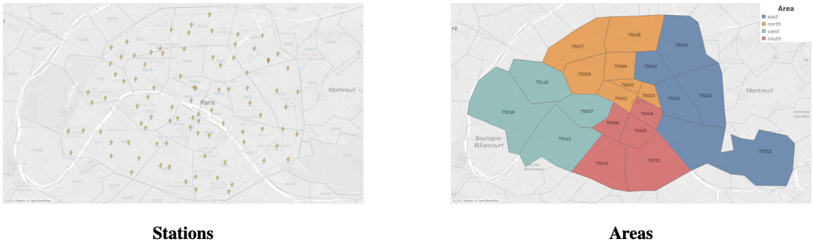
The image displays two side-by-side maps of central Paris, France, presented as a comparative visualization. The left map, titled "Stations," shows the precise locations of numerous individual service points (likely bike-sharing or transit stations) as small icons. The right map, titled "Areas," shows the same geographic region divided into four distinct, color-coded polygonal zones, each containing a subset of the stations from the left map. The visualization demonstrates the aggregation of discrete point data into broader categorical regions.
### Components/Axes
* **Map Type:** Both panels are street-level maps of Paris, with major roads and the Seine River visible. The base map appears to be from a mapping service (© Mapbox, © OpenStreetMap).
* **Left Panel ("Stations"):**
* **Data Layer:** Numerous small, brownish-gold icons resembling a stylized tree or pin, representing individual stations.
* **Labels:** Station codes (e.g., "T01A", "T02B") are printed in small text next to each icon.
* **Geographic Labels:** Major district names are visible, including "Paris" (center), "Montreuil" (east), and "Boulogne-Billancourt" (southwest).
* **Right Panel ("Areas"):**
* **Data Layer:** Four contiguous, semi-transparent colored polygons overlaying the map.
* **Legend:** Located in the top-right corner. It is a box titled "Area" with four entries:
* A blue square labeled "north"
* An orange square labeled "east"
* A red square labeled "south"
* A teal/green square labeled "west"
* **Labels:** Each colored polygon contains multiple station codes (e.g., "T01A", "T02B") printed within its boundaries, corresponding to the stations from the left map.
* **Geographic Labels:** Same as the left panel ("Paris", "Montreuil", "Boulogne-Billancourt").
### Detailed Analysis
**1. Station Distribution (Left Map):**
* Stations are densely clustered in the central area labeled "Paris."
* The distribution is not uniform; there are visible corridors and clusters following major streets and neighborhoods.
* Station codes follow a pattern: a letter 'T' followed by a two-digit number and a letter suffix (e.g., T01A, T01B, T02A, T02B). This suggests a systematic naming convention, possibly denoting lines or zones.
**2. Area Aggregation (Right Map):**
* **North Area (Blue):** Located in the upper-right quadrant. Contains stations including: T01A, T01B, T02A, T02B, T03A, T03B, T04A, T04B, T05A, T05B, T06A, T06B.
* **East Area (Orange):** Located in the upper-central and right area. Contains stations including: T07A, T07B, T08A, T08B, T09A, T09B, T10A, T10B, T11A, T11B, T12A, T12B.
* **South Area (Red):** Located in the lower-central area. Contains stations including: T13A, T13B, T14A, T14B, T15A, T15B, T16A, T16B, T17A, T17B, T18A, T18B.
* **West Area (Teal/Green):** Located in the left and lower-left quadrant. Contains stations including: T19A, T19B, T20A, T20B, T21A, T21B, T22A, T22B, T23A, T23B, T24A, T24B.
* The polygons are contiguous and partition the central city area without overlap. The boundaries appear to follow major roads or administrative lines.
### Key Observations
* **Spatial Correlation:** There is a perfect one-to-one correspondence between the stations on the left map and the station codes listed within the areas on the right map. Every station icon has a corresponding label inside one of the four colored zones.
* **Naming Convention:** The station codes are grouped sequentially within areas. For example, the "north" area contains the T01-T06 series, the "east" contains T07-T12, and so on. This indicates the areas were likely defined based on this pre-existing station numbering system.
* **Geographic Coverage:** The four areas collectively cover the dense urban core of Paris, stopping at the approximate boundary of the city proper (the Périphérique ring road is faintly visible). The outlying communes like Montreuil and Boulogne-Billancourt are not included in any colored area.
### Interpretation
This visualization is a classic example of **spatial data aggregation**. It transforms a complex point dataset (dozens of individual stations) into a simpler, more interpretable zonal model.
* **Purpose:** The likely purpose is for operational management, service planning, or data reporting. Instead of analyzing or managing 48+ individual stations, a system can be managed across four logical "areas" (North, East, South, West). This simplifies logistics, resource allocation, and performance dashboards.
* **Underlying Logic:** The data suggests the areas are not arbitrary but are based on a **pre-defined grid or sector system** encoded in the station IDs (T01-T24). The "A" and "B" suffixes might indicate specific platforms, entrances, or sub-types within a station location.
* **Relationship:** The left map shows the *physical reality* (where stations actually are), while the right map shows the *operational or analytical model* (how the system is conceptually organized). The right map is a derived, simplified representation of the left.
* **Anomaly/Note:** The area boundaries are geometric and clean, suggesting they were computationally generated (e.g., as Voronoi polygons or based on a grid) rather than following organic neighborhood boundaries. This is efficient for systematic management but may not perfectly align with natural city districts.
**Language Note:** All text in the image is in English ("Stations", "Areas", "north", "east", etc.), with the exception of the underlying French geographic place names ("Paris", "Montreuil", "Boulogne-Billancourt") on the base map.