## Scatter Plot: Computed Docking Energy vs. Normalized In-Vivo Neuron Response
### Overview
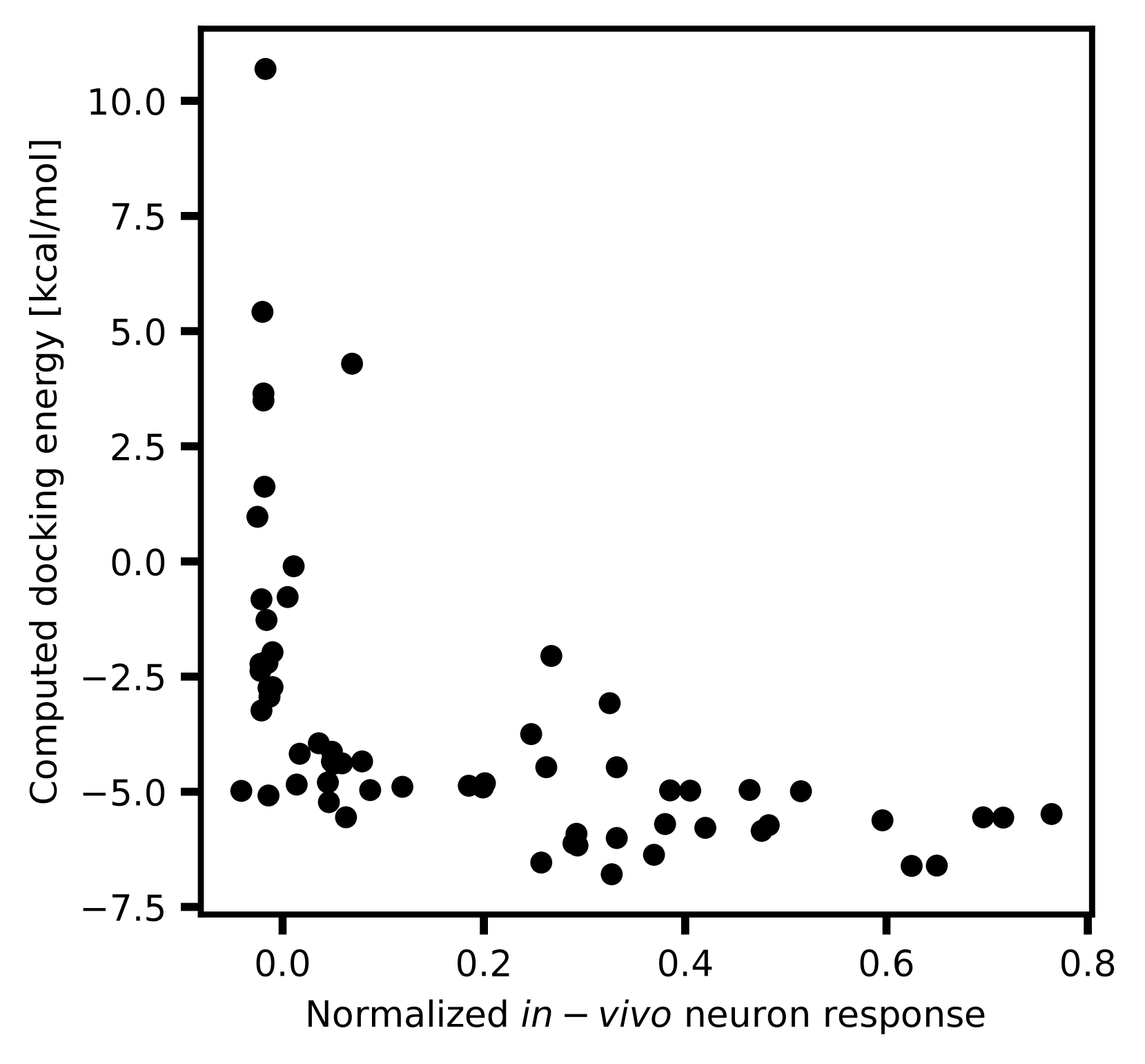
The image is a scatter plot visualizing the relationship between **normalized in-vivo neuron response** (x-axis) and **computed docking energy** (y-axis). Data points are represented as black dots, with no connecting lines or additional annotations.
---
### Components/Axes
- **X-axis**: "Normalized in-vivo neuron response" (range: 0.0 to 0.8, increments of 0.2).
- **Y-axis**: "Computed docking energy [kcal/mol]" (range: -7.5 to 10.0, increments of 2.5).
- **Legend**: None present.
- **Data Points**: Black dots distributed across the plot.
---
### Detailed Analysis
1. **Data Distribution**:
- **Lower Left Cluster**: A dense cluster of points between x=0.0–0.2 and y=-5.0 to -2.5.
- **Upper Left Outlier**: A single point at (x=0.0, y=10.0), far above the main cluster.
- **Lower Right Spread**: Points between x=0.4–0.8 and y=-5.0 to -2.5, with sparse distribution.
- **Mid-Range Variability**: Scattered points between x=0.2–0.4 and y=-2.5 to 2.5.
2. **Trends**:
- No clear linear or nonlinear trend is evident. The data shows significant scatter, suggesting weak or no direct correlation.
- The outlier at (0.0, 10.0) deviates sharply from the rest of the data.
3. **Key Observations**:
- Most data points cluster in the negative y-axis range (-5.0 to -2.5), indicating predominantly negative docking energies.
- The outlier at (0.0, 10.0) represents the highest docking energy observed.
- As x increases beyond 0.2, data points become more dispersed, with no consistent pattern.
---
### Interpretation
- **Biological Implications**: The negative docking energies (-5.0 to -2.5 kcal/mol) suggest favorable protein-ligand interactions in most cases, as lower (more negative) values typically indicate stronger binding. The outlier at y=10.0 may represent a weak or non-specific interaction.
- **Neuron Response Correlation**: The lack of a clear trend implies that normalized neuron response does not strongly predict docking energy in this dataset. The outlier at x=0.0 (highest y-value) could indicate an anomalous case where low neuron response correlates with high docking energy.
- **Data Limitations**: The scatter suggests potential confounding variables or experimental noise. Further analysis (e.g., regression, clustering) may be needed to identify hidden patterns.
---
### Notable Anomalies
- **Outlier at (0.0, 10.0)**: This point lies far outside the main data distribution, warranting investigation into experimental conditions or data entry errors.
- **Mid-Range Variability**: Points between x=0.2–0.4 and y=-2.5 to 2.5 show no clear grouping, suggesting possible experimental variability or biological heterogeneity.
---
### Conclusion
The plot highlights a complex relationship between neuron response and docking energy, with most interactions showing favorable binding energies. The outlier and scatter emphasize the need for cautious interpretation and further validation.