## Line Chart: Pass@1 Accuracy vs. Threshold
### Overview
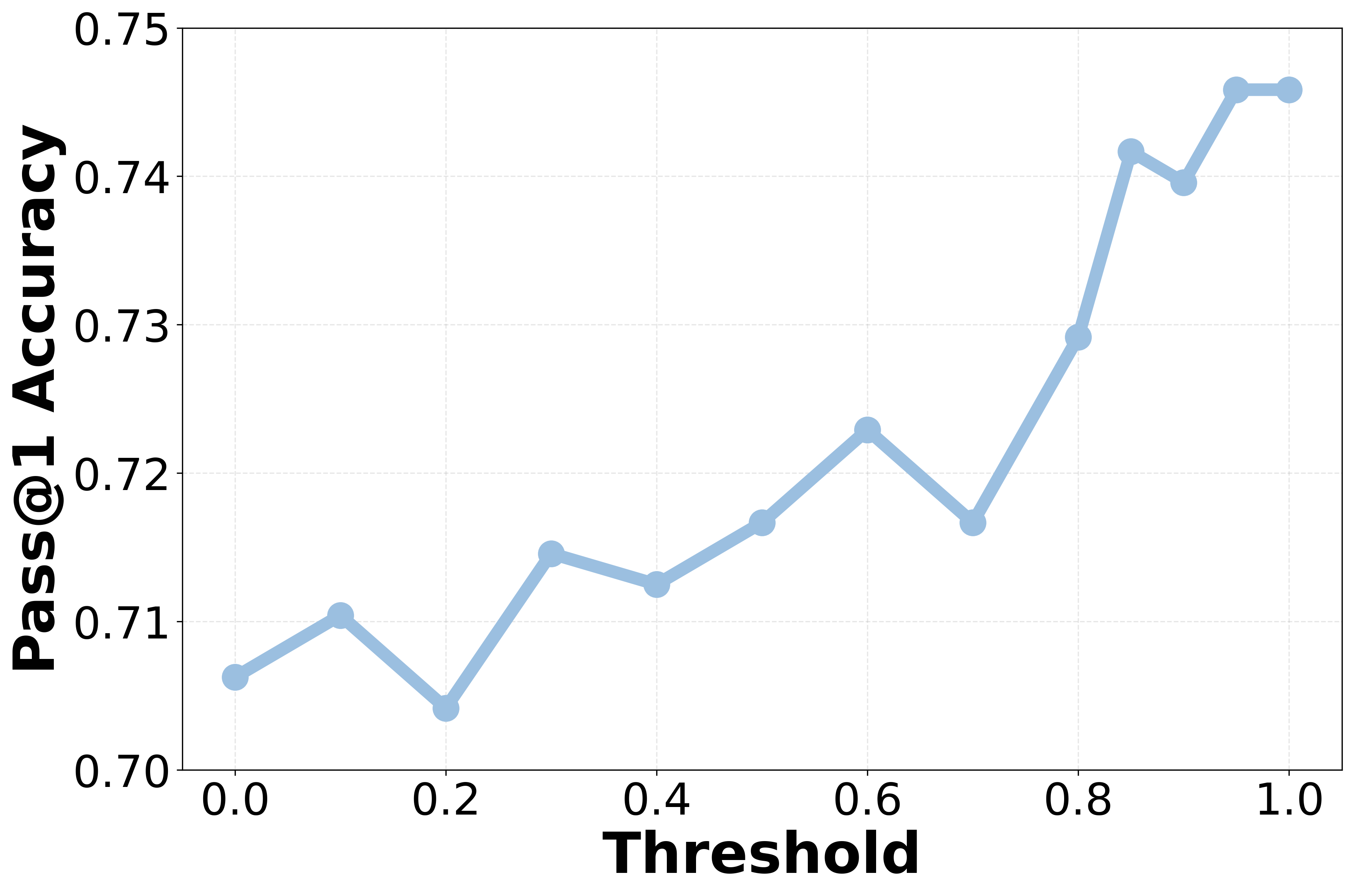
The image displays a single-series line chart plotting "Pass@1 Accuracy" against a "Threshold" value. The chart uses a light blue line with circular markers at each data point. The overall trend shows a general increase in accuracy as the threshold increases, with some fluctuations.
### Components/Axes
* **X-Axis (Horizontal):**
* **Label:** "Threshold"
* **Scale:** Linear, ranging from 0.0 to 1.0.
* **Major Tick Marks:** 0.0, 0.2, 0.4, 0.6, 0.8, 1.0.
* **Y-Axis (Vertical):**
* **Label:** "Pass@1 Accuracy"
* **Scale:** Linear, ranging from 0.70 to 0.75.
* **Major Tick Marks:** 0.70, 0.71, 0.72, 0.73, 0.74, 0.75.
* **Data Series:** A single series represented by a light blue line connecting circular markers. There is no legend, as only one series is present.
* **Grid:** A faint, dashed grid is present in the background, aligned with the major tick marks on both axes.
### Detailed Analysis
The chart plots 13 distinct data points. The following table lists the approximate coordinates for each marker, read from left to right. Values are estimated based on visual alignment with the grid.
| Threshold (X) | Pass@1 Accuracy (Y) | Visual Trend from Previous Point |
| :--- | :--- | :--- |
| 0.0 | ~0.706 | Starting point. |
| 0.1 | ~0.710 | Slight upward slope. |
| 0.2 | ~0.704 | Downward slope (local minimum). |
| 0.3 | ~0.715 | Sharp upward slope. |
| 0.4 | ~0.712 | Slight downward slope. |
| 0.5 | ~0.717 | Upward slope. |
| 0.6 | ~0.723 | Upward slope (local peak). |
| 0.7 | ~0.717 | Downward slope. |
| 0.8 | ~0.729 | Sharp upward slope. |
| 0.85 | ~0.742 | Very sharp upward slope. |
| 0.9 | ~0.740 | Slight downward slope. |
| 0.95 | ~0.746 | Sharp upward slope (global maximum). |
| 1.0 | ~0.746 | Plateau (equal to previous point). |
**Trend Verification:** The line exhibits a general upward trajectory from left (Threshold=0.0) to right (Threshold=1.0). The ascent is not monotonic; it features several local peaks (e.g., at 0.6) and dips (e.g., at 0.2 and 0.7). The most significant and sustained increase occurs between Threshold values of 0.7 and 0.95.
### Key Observations
1. **Overall Positive Correlation:** There is a clear positive relationship between the Threshold and Pass@1 Accuracy. Higher thresholds are generally associated with higher accuracy.
2. **Non-Linearity and Fluctuations:** The relationship is not perfectly linear. Notable dips occur at Threshold = 0.2 and 0.7, interrupting the upward trend.
3. **Sharp Increase in Upper Range:** The accuracy gains are most pronounced in the upper threshold range (0.7 to 0.95), where the slope of the line is steepest.
4. **Plateau at Maximum:** The accuracy appears to plateau at its maximum value (~0.746) between Threshold = 0.95 and 1.0, suggesting a potential ceiling effect.
5. **Range of Variation:** The Pass@1 Accuracy varies across a range of approximately 0.042 (from a low of ~0.704 to a high of ~0.746) over the full threshold spectrum.
### Interpretation
This chart likely illustrates the performance of a machine learning or classification system where a confidence threshold is being tuned. "Pass@1 Accuracy" is a common metric indicating the proportion of times the model's top prediction is correct.
* **What the data suggests:** The data demonstrates that increasing the confidence threshold for accepting predictions generally improves the system's accuracy. This is a typical trade-off: a higher threshold means the model only makes predictions when it is more confident, which tends to increase precision (accuracy of accepted predictions) but may reduce the number of predictions made (recall).
* **How elements relate:** The X-axis (Threshold) is the independent control variable, and the Y-axis (Accuracy) is the dependent performance metric. The line connects the observed performance at discrete threshold settings.
* **Notable patterns and anomalies:**
* The **dip at Threshold=0.2** is an anomaly in the early upward trend. This could indicate a region where the model's confidence scores are poorly calibrated, or it could be statistical noise.
* The **sharp rise after 0.7** suggests that the model's confidence scores become highly informative in this range. Predictions with confidence above 0.7 are significantly more likely to be correct.
* The **plateau at 0.95-1.0** indicates diminishing returns. Setting the threshold beyond 0.95 does not yield further accuracy gains in this evaluation, possibly because very few predictions have confidence scores in that extreme range, or because the remaining errors are due to fundamental model limitations rather than low confidence.
In summary, the chart provides empirical evidence for selecting an optimal operating point for the system. A threshold around 0.95 appears to maximize accuracy based on this data, though the practical choice would also consider the cost of rejecting predictions (lower recall).