## Probability Distribution Plot: P(q) vs. q for Different ℓ Values
### Overview
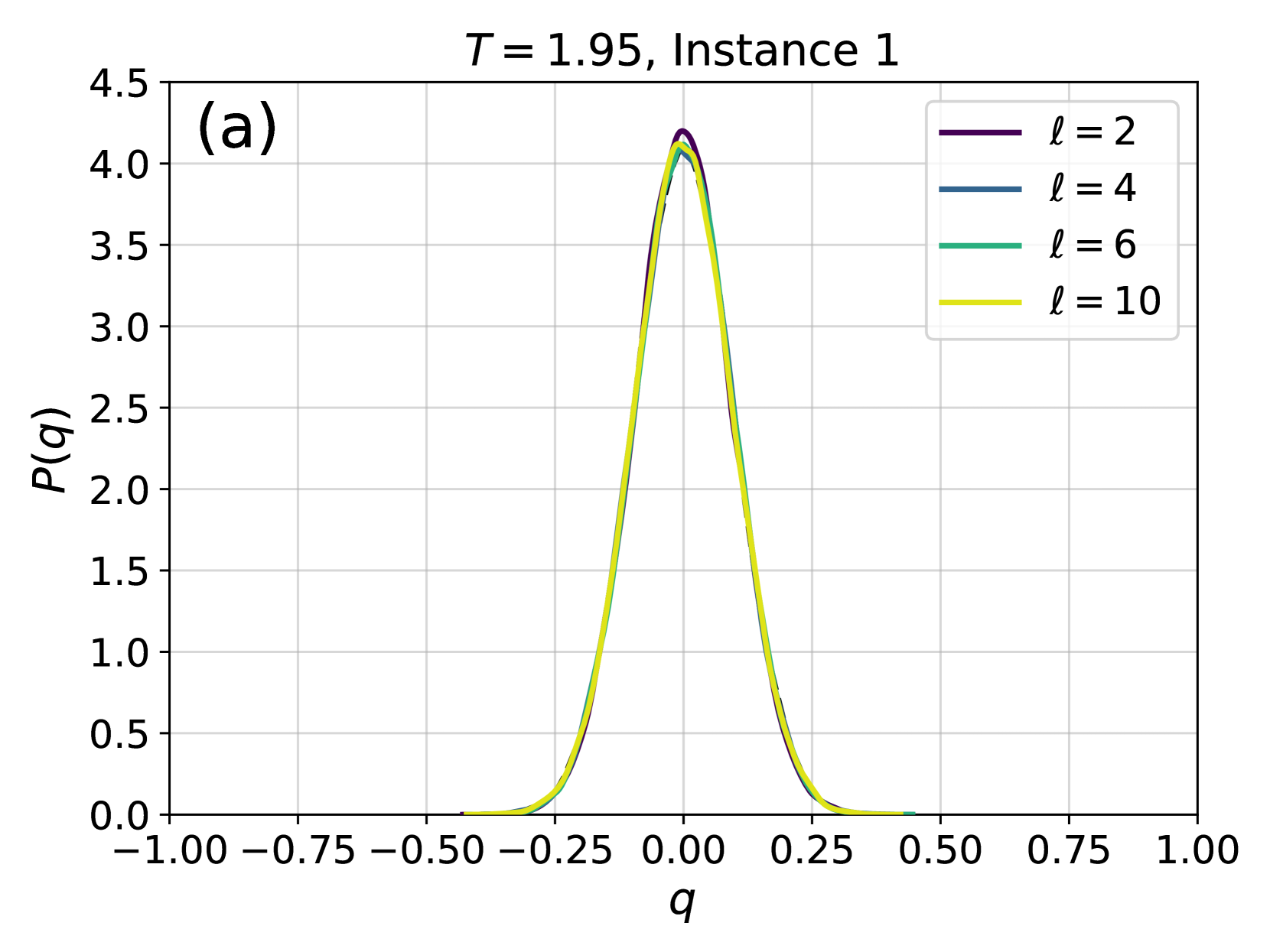
The image displays a line chart showing four probability distribution curves, labeled as P(q), plotted against a variable q. The chart is titled "T = 1.95, Instance 1" and is marked with the identifier "(a)" in the top-left corner. The curves represent different values of a parameter ℓ (ell). All distributions are symmetric, bell-shaped, and centered at q = 0, resembling Gaussian or normal distributions.
### Components/Axes
* **Title:** "T = 1.95, Instance 1"
* **Panel Label:** "(a)" located in the top-left corner of the plot area.
* **X-Axis:**
* **Label:** "q"
* **Scale:** Linear, ranging from -1.00 to 1.00.
* **Major Tick Marks:** At intervals of 0.25: -1.00, -0.75, -0.50, -0.25, 0.00, 0.25, 0.50, 0.75, 1.00.
* **Y-Axis:**
* **Label:** "P(q)"
* **Scale:** Linear, ranging from 0.0 to 4.5.
* **Major Tick Marks:** At intervals of 0.5: 0.0, 0.5, 1.0, 1.5, 2.0, 2.5, 3.0, 3.5, 4.0, 4.5.
* **Legend:** Located in the top-right corner of the plot area. It contains four entries, each associating a color with a value of ℓ:
* Purple line: ℓ = 2
* Blue line: ℓ = 4
* Teal line: ℓ = 6
* Yellow line: ℓ = 10
* **Grid:** A light gray grid is present in the background.
### Detailed Analysis
The chart plots the probability density function P(q) for four different scenarios defined by the parameter ℓ.
**Trend Verification:** All four curves exhibit the same fundamental trend: they are symmetric, unimodal distributions centered at q = 0. They rise sharply from near-zero probability at q ≈ ±0.5 to a peak at q = 0, then fall symmetrically.
**Data Series Analysis (from highest peak to lowest):**
1. **ℓ = 2 (Purple Line):** This curve has the highest peak. The maximum value of P(q) at q = 0 is approximately **4.2**.
2. **ℓ = 4 (Blue Line):** This curve has the second-highest peak. The maximum value of P(q) at q = 0 is approximately **4.1**.
3. **ℓ = 6 (Teal Line):** This curve has the third-highest peak. The maximum value of P(q) at q = 0 is approximately **4.0**.
4. **ℓ = 10 (Yellow Line):** This curve has the lowest peak of the four. The maximum value of P(q) at q = 0 is approximately **3.9**.
**Spatial Grounding & Shape:** The curves are tightly clustered. The purple line (ℓ=2) is the outermost at the peak, followed inward by blue (ℓ=4), teal (ℓ=6), and yellow (ℓ=10). The width of the distributions (related to variance) appears very similar for all ℓ values, with all curves approaching P(q) ≈ 0 at around q = ±0.4.
### Key Observations
1. **Central Tendency:** All distributions are perfectly centered at q = 0.
2. **Parameter Influence:** As the parameter ℓ increases from 2 to 10, the peak height of the probability distribution P(q) at q=0 decreases monotonically. The order of peak height is strictly ℓ=2 > ℓ=4 > ℓ=6 > ℓ=10.
3. **Distribution Shape:** The shape (width/skew) of the distribution appears largely insensitive to the value of ℓ within the range shown. The primary effect is a scaling of the peak amplitude.
4. **No Outliers:** All data series follow the same smooth, bell-shaped pattern without any anomalous points or deviations.
### Interpretation
This plot demonstrates the probability distribution of a variable `q` under a specific condition (T = 1.95, Instance 1) for different values of a system parameter `ℓ`.
* **What the data suggests:** The variable `q` is most likely to be found at or very near zero. The probability of observing values of `q` further from zero decreases rapidly and symmetrically.
* **Relationship between elements:** The parameter `ℓ` modulates the "concentration" or "certainty" of the distribution. A lower `ℓ` (e.g., 2) results in a higher probability density at the mean (q=0), implying the system is more strongly peaked or constrained around that value. A higher `ℓ` (e.g., 10) results in a slightly lower peak, suggesting a marginally broader or less certain distribution, though the effect on the width is minimal in this visualization.
* **Underlying Context (Inferred):** Given the notation (P(q), ℓ, T), this is likely from a statistical physics, machine learning, or computational science context. `q` could represent an order parameter, overlap, or correlation measure. `T` often denotes temperature, and `ℓ` could represent a length scale, layer depth, or system size. The plot shows that at a fixed temperature (T=1.95), increasing the length scale `ℓ` slightly reduces the probability of the system being in a state of perfect alignment or correlation (q=0). The consistency of the shape suggests the underlying statistical mechanics of the system is stable across these `ℓ` values.