\n
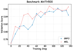
## Line Chart: Validation Score vs. Training Step (Benchmark: MATH500)
### Overview
The image presents a line chart comparing the validation scores of two models, GPRO and MEL, against the training step. The chart appears to track the performance of these models on the MATH500 benchmark.
### Components/Axes
* **Title:** Benchmark: MATH500 (positioned at the top-center)
* **X-axis:** Training Step (ranging from approximately 0 to 140, with markers at intervals of 20)
* **Y-axis:** Validation Score (ranging from approximately 0.78 to 0.87, with markers at intervals of 0.02)
* **Legend:** Located in the bottom-right corner.
* GPRO (represented by a light blue line with circular markers)
* MEL (represented by a light red line with triangular markers)
* **Grid:** A faint grid is visible, aiding in reading values.
### Detailed Analysis
**GPRO (Light Blue Line):**
The GPRO line generally slopes upward from step 0 to approximately step 100, then plateaus and slightly declines.
* Step 0: Approximately 0.78
* Step 20: Approximately 0.81
* Step 40: Approximately 0.81
* Step 60: Approximately 0.82
* Step 80: Approximately 0.84
* Step 100: Approximately 0.85
* Step 120: Approximately 0.86
* Step 140: Approximately 0.85
**MEL (Light Red Line):**
The MEL line exhibits more fluctuation. It starts at approximately 0.78 at step 0, rises sharply, then experiences some dips before reaching a peak around step 100, and then declines slightly.
* Step 0: Approximately 0.78
* Step 20: Approximately 0.82
* Step 40: Approximately 0.85
* Step 60: Approximately 0.84
* Step 80: Approximately 0.85
* Step 100: Approximately 0.87
* Step 120: Approximately 0.86
* Step 140: Approximately 0.86
### Key Observations
* Both models show an initial increase in validation score as training progresses.
* MEL generally achieves a higher validation score than GPRO throughout most of the training process.
* MEL's performance is more volatile, with larger fluctuations in validation score.
* Both models appear to converge in performance towards the end of the training process (around step 120-140).
### Interpretation
The chart demonstrates the learning curves of two models (GPRO and MEL) on the MATH500 benchmark. The validation score serves as a proxy for the model's generalization ability. The fact that both models' validation scores increase with training suggests that both are learning from the data. MEL's consistently higher scores indicate that it may be a more effective model for this particular benchmark. However, its higher volatility could also suggest that it is more sensitive to the training data or requires more careful hyperparameter tuning. The convergence of the two lines towards the end of the training process could indicate that GPRO is catching up to MEL, or that both models are reaching a point of diminishing returns. The data suggests that further training might not significantly improve the performance of either model. The benchmark MATH500 likely involves mathematical problem-solving, and the chart illustrates the progress of these models in mastering such tasks.