TECHNICAL ASSET FINGERPRINT
e4db6b9d816425d77b458ec2
Click to view fullscreen
Press ESC or click to close
FOUND IN PAPERS
EXPERT: gemini-2.0-flash VERSION 1
RUNTIME: nugit/gemini/gemini-2.0-flash
INTEL_VERIFIED
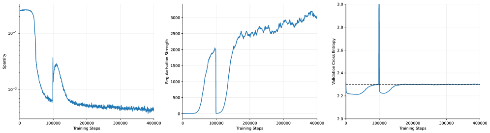
## Line Charts: Training Metrics
### Overview
The image presents three line charts displaying the training metrics of a model over 400,000 training steps. The charts depict Sparsity, Regularisation Strength, and Validation Cross Entropy. All three charts share the same x-axis: "Training Steps".
### Components/Axes
**Chart 1: Sparsity**
* **Y-axis:** Sparsity (log scale)
* Scale ranges from approximately 0.005 to 0.2.
* Markers at 10^-2 and 10^-1.
* **X-axis:** Training Steps
* Scale ranges from 0 to 400,000.
* Markers at 0, 100,000, 200,000, 300,000, and 400,000.
**Chart 2: Regularisation Strength**
* **Y-axis:** Regularisation Strength
* Scale ranges from 0 to 3000.
* Markers at 0, 500, 1000, 1500, 2000, 2500, and 3000.
* **X-axis:** Training Steps
* Scale ranges from 0 to 400,000.
* Markers at 0, 100,000, 200,000, 300,000, and 400,000.
**Chart 3: Validation Cross Entropy**
* **Y-axis:** Validation Cross Entropy
* Scale ranges from 2.0 to 3.0.
* Markers at 2.0, 2.2, 2.4, 2.6, 2.8, and 3.0.
* **X-axis:** Training Steps
* Scale ranges from 0 to 400,000.
* Markers at 0, 100,000, 200,000, 300,000, and 400,000.
* A dashed horizontal line is present at approximately y = 2.3.
### Detailed Analysis
**Chart 1: Sparsity**
* **Trend:** The sparsity starts high (around 0.2), rapidly decreases until approximately 80,000 training steps, then experiences a sharp increase around 100,000 steps, followed by a gradual decrease and stabilization around 0.005 for the remainder of the training.
* **Data Points:**
* Initial Sparsity: ~0.2
* Sparsity at 80,000 steps: ~0.006
* Peak after increase: ~0.03
* Final Sparsity: ~0.005
**Chart 2: Regularisation Strength**
* **Trend:** The regularisation strength starts at 0, remains low until around 50,000 training steps, then rapidly increases until approximately 100,000 steps, drops back to 0, then increases again until approximately 200,000 steps, and then continues to increase more gradually with some fluctuations until the end of training.
* **Data Points:**
* Initial Regularisation Strength: 0
* Regularisation Strength at 100,000 steps: ~2000
* Regularisation Strength at 200,000 steps: ~2000
* Final Regularisation Strength: ~3000
**Chart 3: Validation Cross Entropy**
* **Trend:** The validation cross entropy starts around 2.2, decreases slightly until approximately 50,000 training steps, then increases sharply until approximately 100,000 steps, followed by a decrease and stabilization around 2.3 for the remainder of the training.
* **Data Points:**
* Initial Validation Cross Entropy: ~2.2
* Minimum Validation Cross Entropy: ~2.2
* Peak after increase: ~2.3
* Final Validation Cross Entropy: ~2.3
### Key Observations
* All three metrics exhibit significant changes around 50,000-100,000 training steps.
* Sparsity and Regularisation Strength appear to be inversely related in the initial phase of training.
* Validation Cross Entropy stabilizes after the initial fluctuations.
### Interpretation
The charts suggest that the model undergoes a significant adjustment phase during the first 100,000 training steps. The initial decrease in sparsity corresponds to an increase in regularisation strength, indicating that the model is learning to prioritize important features. The subsequent increase in validation cross entropy suggests a potential overfitting issue, which is then corrected as the model continues to train and the validation cross entropy stabilizes. The dashed line on the Validation Cross Entropy chart likely represents a target or acceptable level of validation error. The model appears to achieve and maintain this level after the initial adjustment period.
DECODING INTELLIGENCE...
EXPERT: gemini-3.1-pro-preview VERSION 1
RUNTIME: gemini/gemini-3.1-pro-preview
INTEL_VERIFIED
## Line Charts: Training Metrics over Time (Sparsity, Regularisation Strength, Validation Cross Entropy)
### Overview
The image consists of three line charts arranged horizontally side-by-side. All three charts share an identical X-axis representing "Training Steps" from 0 to 400,000. The charts display the evolution of three distinct machine learning metrics during a training run. A highly notable, synchronized anomaly or intervention occurs across all three charts at exactly 100,000 training steps.
### Components/Axes
**Global X-Axis (Applies to all three charts):**
* **Label:** `Training Steps`
* **Scale:** Linear
* **Range:** 0 to 400,000
* **Major Markers:** 0, 100000, 200000, 300000, 400000
**Left Chart Y-Axis:**
* **Label:** `Sparsity`
* **Scale:** Logarithmic
* **Major Markers:** $10^{-2}$, $10^{-1}$ (Gridlines suggest minor ticks between these powers of 10)
**Middle Chart Y-Axis:**
* **Label:** `Regularisation Strength`
* **Scale:** Linear
* **Range:** 0 to slightly above 3000
* **Major Markers:** 0, 500, 1000, 1500, 2000, 2500, 3000
**Right Chart Y-Axis:**
* **Label:** `Validation Cross Entropy`
* **Scale:** Linear
* **Range:** 2.0 to 3.0
* **Major Markers:** 2.0, 2.2, 2.4, 2.6, 2.8, 3.0
* **Additional Element:** A horizontal dashed black line is present at exactly the 2.3 mark.
---
### Detailed Analysis
#### 1. Left Chart: Sparsity vs. Training Steps
* **Visual Trend:** The line begins at a high value, remains relatively flat, and then experiences a steep drop. It bottoms out just before the 100k mark. At exactly 100,000 steps, there is a sharp, instantaneous upward spike. Following the spike, the line forms a rounded local peak before gradually decaying with high-frequency noise (jitter) for the remainder of the training, ending at its lowest point.
* **Data Points (Approximate):**
* **Step 0 to ~30,000:** Starts flat at approximately $2 \times 10^{-1}$ (0.2).
* **Step ~30,000 to 99,999:** Drops sharply, reaching a local minimum of approximately $6 \times 10^{-3}$ (0.006).
* **Step 100,000:** Instantaneous spike up to approximately $3 \times 10^{-2}$ (0.03).
* **Step ~110,000:** Forms a local peak at approximately $2 \times 10^{-2}$ (0.02).
* **Step 150,000 to 400,000:** Gradual, noisy decay, ending at approximately $4 \times 10^{-3}$ (0.004) at step 400,000.
#### 2. Middle Chart: Regularisation Strength vs. Training Steps
* **Visual Trend:** The line starts at zero and remains flat. It then rises in a smooth S-curve (sigmoid-like) shape. At exactly 100,000 steps, it plummets instantaneously back to zero. It remains at zero briefly before initiating a second, much larger S-curve rise. This second rise becomes increasingly noisy and continues to trend upward until the end of the chart.
* **Data Points (Approximate):**
* **Step 0 to ~40,000:** Flat at 0.
* **Step ~40,000 to 99,999:** Rises steeply, peaking at approximately 2050.
* **Step 100,000:** Instantaneous drop to 0.
* **Step 100,000 to ~120,000:** Remains near 0.
* **Step ~120,000 to 400,000:** Rises steeply again, crossing the previous peak of 2000 around step 175,000. The line becomes noisy, reaching a maximum of approximately 3150 near step 380,000, and ends slightly lower at ~3000 at step 400,000.
#### 3. Right Chart: Validation Cross Entropy vs. Training Steps
* **Visual Trend:** The line starts near the dashed reference line, dips down to a minimum, and then slowly curves back up to meet the dashed line. At exactly 100,000 steps, there is a massive, instantaneous vertical spike that exceeds the upper bounds of the chart. Immediately after, it drops back down to a low value, and slowly curves back up, eventually asymptoting perfectly onto the horizontal dashed line for the entire second half of the training run.
* **Data Points (Approximate):**
* **Step 0:** Starts at approximately 2.3.
* **Step ~20,000 to 40,000:** Dips to a minimum of approximately 2.21.
* **Step ~40,000 to 99,999:** Rises smoothly, reaching exactly 2.3 (the dashed line) just before the 100k mark.
* **Step 100,000:** A massive spike that shoots vertically past the maximum Y-axis value of 3.0.
* **Step ~105,000:** Drops rapidly back down to approximately 2.22.
* **Step ~105,000 to 200,000:** Rises smoothly back toward the dashed line.
* **Step 200,000 to 400,000:** The line flattens out and tracks exactly on the dashed reference line at 2.3, with very minor noise.
---
### Key Observations
1. **The 100k Step Anomaly:** There is a highly coordinated event at exactly 100,000 training steps. Regularisation is turned off (drops to 0), Sparsity spikes upward, and Validation Cross Entropy experiences a massive, out-of-bounds spike.
2. **Correlated Curves:** The shape of the "Regularisation Strength" curve (Middle) is inversely correlated with the initial drop in "Sparsity" (Left) and directly correlated with the rise in "Validation Cross Entropy" (Right). When regularisation is 0, cross-entropy is at its lowest (~2.21). As regularisation increases, cross-entropy increases.
3. **The Dashed Target Line:** The dashed line at 2.3 on the rightmost chart acts as a hard ceiling or target. The system appears to increase regularisation *until* the validation cross-entropy hits 2.3, at which point it stops increasing the loss further.
### Interpretation
These charts depict a sophisticated, dynamic training curriculum for a machine learning model, likely involving automated network pruning or a sparsity-inducing penalty (such as L1 regularization).
* **Phase 1 (0 - 100k steps):** The model begins training normally. Around 40k steps, an automated controller begins applying a "Regularisation Strength" penalty. As this penalty increases, the model becomes less sparse (Sparsity drops from $10^{-1}$ to $10^{-2}$). However, this regularisation harms the model's performance, causing the Validation Cross Entropy (loss) to rise from its natural minimum of 2.21 up to a predefined tolerance threshold of 2.3.
* **The Intervention (100k steps):** At 100,000 steps, a hard reset or phase shift occurs. The regularisation penalty is instantly removed (drops to 0). This sudden change in the loss landscape causes a massive, temporary shock to the model's validation loss (the spike > 3.0). Simultaneously, the sparsity spikes, indicating a sudden change in the network's weights (perhaps a pruning mask was updated or weights were re-initialized).
* **Phase 2 (100k - 400k steps):** The model recovers quickly from the shock, and loss drops back down. The automated controller once again begins ramping up the Regularisation Strength. This time, it pushes the regularisation much higher (up to 3000 compared to the previous 2000). It continues to push this penalty higher and higher, driving Sparsity down to its absolute minimum ($~4 \times 10^{-3}$), while perfectly balancing the Validation Cross Entropy exactly on the maximum allowed threshold of 2.3.
**Conclusion:** The data demonstrates an algorithm designed to maximize regularisation (and thereby minimize sparsity) *subject to the constraint* that validation loss must not exceed 2.3. The event at 100k steps was likely a programmed curriculum shift to allow the model to escape a local minimum and find a state where it could accept even higher regularisation while maintaining the target loss.
DECODING INTELLIGENCE...
EXPERT: gemma-3-27b-it-free VERSION 1
RUNTIME: google-free/gemma-3-27b-it
INTEL_VERIFIED
## Charts: Training Dynamics
### Overview
The image presents three line charts arranged horizontally, depicting the dynamics of a training process. The charts show the evolution of Sparsity, Regularisation Strength, and Validation Cross Entropy as a function of Training Steps. All three charts share the same x-axis (Training Steps) but have different y-axes and scales.
### Components/Axes
* **Chart 1 (Left):**
* X-axis: Training Steps (0 to 40000)
* Y-axis: Sparsity (Logarithmic scale, from 10^-1 to 10^-3)
* **Chart 2 (Center):**
* X-axis: Training Steps (0 to 40000)
* Y-axis: Regularisation Strength (0 to 3000)
* **Chart 3 (Right):**
* X-axis: Training Steps (0 to 40000)
* Y-axis: Validation Cross Entropy (2.2 to 3.0)
* All charts share the same x-axis label: "Training Steps".
* No legend is present. The single blue line in each chart represents the respective metric.
### Detailed Analysis or Content Details
**Chart 1: Sparsity vs. Training Steps**
The line representing Sparsity initially starts at approximately 0.1 (10^-1) and rapidly decreases to around 0.01 (10^-2) by approximately 10,000 training steps. It then plateaus and fluctuates around 0.005 (10^-2) to 0.01 (10^-2) for the remainder of the training process, up to 40,000 steps. There are some minor oscillations, but the overall trend is a decrease and then stabilization.
**Chart 2: Regularisation Strength vs. Training Steps**
The line representing Regularisation Strength starts at approximately 0 at 0 training steps. It increases relatively quickly to around 500 by 10,000 training steps. From 10,000 to 30,000 steps, it continues to increase, reaching approximately 2500. After 30,000 steps, the increase slows down, and the line fluctuates between 2500 and 3000, reaching a maximum of approximately 3100 at 40,000 steps. The overall trend is an increasing Regularisation Strength.
**Chart 3: Validation Cross Entropy vs. Training Steps**
The line representing Validation Cross Entropy begins at approximately 2.8 at 0 training steps. It exhibits a sharp decrease to around 2.2 by 10,000 training steps. Between 10,000 and 20,000 steps, it continues to decrease, reaching a minimum of approximately 2.15 at around 15,000 steps. After 20,000 steps, the line fluctuates around 2.2 to 2.3, with some minor oscillations, and remains relatively stable until 40,000 steps. There is a large spike at the beginning of the training process.
### Key Observations
* Sparsity decreases rapidly initially and then stabilizes.
* Regularisation Strength consistently increases throughout the training process.
* Validation Cross Entropy decreases initially and then plateaus, indicating potential convergence.
* The initial spike in Validation Cross Entropy suggests a period of instability or high error at the beginning of training.
* The stabilization of Validation Cross Entropy suggests the model is learning and generalizing well.
### Interpretation
The charts collectively illustrate the training dynamics of a model. The decreasing Sparsity suggests that the model is becoming less reliant on a large number of parameters, potentially leading to a more efficient representation. The increasing Regularisation Strength indicates that a penalty is being applied to complex models, preventing overfitting. The decreasing and then stabilizing Validation Cross Entropy suggests that the model is learning to generalize to unseen data.
The initial spike in Validation Cross Entropy could be due to random initialization or a learning rate that is initially too high. The subsequent decrease indicates that the model is adapting and improving its performance. The plateau in Validation Cross Entropy suggests that the model has reached a point of diminishing returns and further training may not significantly improve its performance.
The relationship between these metrics is crucial. The increasing Regularisation Strength likely contributes to the decreasing Sparsity and the stabilization of Validation Cross Entropy. By penalizing complex models, Regularisation encourages the model to find a simpler, more generalizable solution. The interplay between these factors is essential for achieving optimal model performance.
DECODING INTELLIGENCE...
EXPERT: healer-alpha-free VERSION 1
RUNTIME: free/openrouter/healer-alpha
INTEL_VERIFIED
## Line Charts: Training Dynamics of a Machine Learning Model
### Overview
The image displays three horizontally aligned line charts that track different metrics over the course of model training. The charts share a common x-axis ("Training Steps") but monitor distinct y-axis variables: Sparsity, Regularization Strength, and Validation Cross Entropy. The data suggests a training process with a significant event or intervention occurring around 100,000 steps.
### Components/Axes
**Common X-Axis (All Charts):**
* **Label:** `Training Steps`
* **Scale:** Linear, from 0 to 400,000.
* **Major Tick Marks:** 0, 100000, 200000, 300000, 400000.
**Left Chart:**
* **Y-Axis Label:** `Sparsity`
* **Y-Axis Scale:** Logarithmic (base 10). Major ticks at `10^-2` (0.01) and `10^-1` (0.1).
* **Data Series:** A single blue line.
**Middle Chart:**
* **Y-Axis Label:** `Regularization Strength`
* **Y-Axis Scale:** Linear, from 0 to 3000.
* **Major Tick Marks:** 0, 500, 1000, 1500, 2000, 2500, 3000.
* **Data Series:** A single blue line.
**Right Chart:**
* **Y-Axis Label:** `Validation Cross Entropy`
* **Y-Axis Scale:** Linear, from 2.0 to 3.0.
* **Major Tick Marks:** 2.0, 2.2, 2.4, 2.6, 2.8, 3.0.
* **Data Series:** A single blue line.
* **Additional Element:** A horizontal dashed black line at approximately y = 2.3.
### Detailed Analysis
**1. Sparsity (Left Chart):**
* **Trend:** The line begins at a high sparsity value (≈0.2-0.3) and remains stable until approximately 50,000 steps. It then undergoes a steep, near-vertical drop to a minimum near `10^-2` (0.01) around 75,000 steps. Following this, there is a sharp rebound, forming a peak of ≈0.03-0.04 at 100,000 steps. After this peak, the sparsity decays exponentially, stabilizing at a low, noisy baseline between `10^-2` and `2x10^-2` from 200,000 steps onward.
* **Key Points (Approximate):**
* Start (0 steps): ~0.25
* Minimum (~75k steps): ~0.01
* Local Peak (100k steps): ~0.035
* End (400k steps): ~0.015 (with noise)
**2. Regularization Strength (Middle Chart):**
* **Trend:** The line starts near zero and remains low until ≈50,000 steps. It then rises sharply, forming a first major peak of ≈2000 at 100,000 steps. Immediately after this peak, the value plummets back to near zero. From ≈125,000 steps, it begins a second, more sustained ascent, characterized by high-frequency noise/fluctuations. This second rise continues throughout the training, reaching its maximum value of ≈3100-3200 by 400,000 steps.
* **Key Points (Approximate):**
* First Peak (100k steps): ~2000
* Trough (~110k steps): ~50
* Value at 200k steps: ~2500
* End (400k steps): ~3150
**3. Validation Cross Entropy (Right Chart):**
* **Trend:** The line is remarkably stable, hovering just below the dashed reference line (≈2.3) for almost the entire training duration. The most prominent feature is an extreme, narrow spike where the cross-entropy shoots up to the maximum y-axis value of 3.0 precisely at 100,000 steps. It immediately returns to its baseline level. A very slight, temporary dip is visible just before the spike.
* **Key Points (Approximate):**
* Baseline (most of training): ~2.28 - 2.30
* Spike Peak (100k steps): 3.0
* Dashed Reference Line: ~2.3
### Key Observations
1. **Synchronized Event at 100,000 Steps:** All three metrics exhibit a dramatic, simultaneous change at exactly 100,000 training steps. Sparsity peaks, Regularization Strength peaks and then crashes, and Validation Cross Entropy spikes to its maximum.
2. **Two-Phase Regularization:** The Regularization Strength plot shows two distinct phases: an initial sharp increase and reset, followed by a noisier, sustained increase.
3. **Stable Validation Performance:** Despite the dramatic internal changes (sparsity, regularization), the model's validation loss (cross entropy) remains largely unaffected, except for the single anomalous spike. The dashed line suggests a target or baseline performance level that is consistently met.
4. **Sparsity Dynamics:** The model's sparsity is highly dynamic early in training, undergoing a collapse and recovery before settling into a low, stable regime.
### Interpretation
This set of charts likely visualizes the training dynamics of a neural network employing a **dynamic or adaptive regularization technique**, possibly related to pruning or sparsity induction (e.g., a method that adjusts regularization strength based on gradient statistics or model weights).
* **The 100k-Step Event:** The synchronized anomaly strongly suggests a planned intervention or a phase transition in the training algorithm. This could be:
* A scheduled change in the learning rate or optimization hyperparameters.
* The activation or deactivation of a specific regularization component.
* A "reset" or "re-evaluation" point in an adaptive algorithm, where the regularization strength is recalculated, causing a temporary disruption (the cross-entropy spike) before recovery.
* **Relationship Between Metrics:** The data implies a causal relationship. The initial rise in Regularization Strength (50k-100k steps) correlates with the collapse in Sparsity. The event at 100k steps resets the regularization, allowing sparsity to recover slightly. The subsequent sustained increase in regularization does not further reduce sparsity, suggesting the model has reached a stable sparse state. The validation loss remains robust, indicating these internal adjustments do not harm generalization (outside the transient spike).
* **Purpose of the Dashed Line:** The horizontal dashed line in the Validation Cross Entropy chart serves as a performance benchmark. The model's ability to stay at or below this line for nearly all steps (except the spike) demonstrates successful training relative to that target.
**In summary, the image documents a training run where an adaptive regularization mechanism is actively modulating model sparsity. A critical algorithmic event at 100,000 steps causes a temporary loss spike but is followed by recovery and continued stable training, ultimately maintaining validation performance at a desired benchmark level.**
DECODING INTELLIGENCE...
EXPERT: nemotron-free VERSION 1
RUNTIME: free/nvidia/nemotron-nano-12b-v2-vl:free
INTEL_VERIFIED
## Line Graphs: Training Metrics Over Steps
### Overview
The image contains three line graphs depicting training metrics across 400,000 training steps. Each graph tracks a distinct metric: sparsity, regularization strength, and validation cross entropy. All graphs share the same x-axis (training steps) but have unique y-axes and trends.
---
### Components/Axes
1. **Left Graph (Sparsity)**
- **Y-axis**: "Sparsity" (logarithmic scale: 10⁻¹ to 10⁻²)
- **X-axis**: "Training Steps" (0 to 400,000)
- **Line**: Blue, single data series.
2. **Middle Graph (Regularisation Strength)**
- **Y-axis**: "Regularisation Strength" (linear scale: 0 to 3,000)
- **X-axis**: "Training Steps" (0 to 400,000)
- **Line**: Blue, single data series.
3. **Right Graph (Validation Cross Entropy)**
- **Y-axis**: "Validation Cross Entropy" (linear scale: 2.0 to 3.0)
- **X-axis**: "Training Steps" (0 to 400,000)
- **Line**: Blue, single data series.
- **Dashed Line**: Horizontal reference at ~2.4.
---
### Detailed Analysis
#### Left Graph (Sparsity)
- **Initial Drop**: Sparsity plunges from ~10⁻¹ to ~10⁻² within ~50,000 steps.
- **Secondary Peak**: A sharp spike to ~10⁻¹ occurs at ~100,000 steps, followed by a rapid decline.
- **Stabilization**: Settles near ~10⁻² between 200,000 and 400,000 steps.
#### Middle Graph (Regularisation Strength)
- **Initial Rise**: Gradual increase from 0 to ~1,500 by ~100,000 steps.
- **Sharp Drop**: Plummets to ~0 at ~100,000 steps.
- **Secondary Rise**: Peaks at ~2,500 around 200,000 steps, then fluctuates between 2,000–2,500 until 400,000 steps.
#### Right Graph (Validation Cross Entropy)
- **Initial Stability**: Remains near 2.2 until ~100,000 steps.
- **Sharp Spike**: Jumps to ~2.8 at ~100,000 steps, then drops back to ~2.2.
- **Final Stability**: Fluctuates slightly (~2.2–2.3) but remains stable after 200,000 steps.
- **Dashed Line**: Horizontal reference at ~2.4, indicating a target or threshold.
---
### Key Observations
1. **Sparsity**: Initial high sparsity drops sharply, with a brief rebound at 100k steps before stabilizing.
2. **Regularisation Strength**: Two distinct phases—initial growth, abrupt reset, then gradual increase with fluctuations.
3. **Validation Cross Entropy**: A single catastrophic spike at 100k steps, followed by recovery and stability.
4. **Dashed Line**: The ~2.4 threshold in the right graph is never consistently met, suggesting suboptimal validation performance.
---
### Interpretation
- **Sparsity & Regularisation**: The sharp drop in sparsity and regularisation strength at 100k steps suggests a major model adjustment (e.g., weight pruning or hyperparameter tuning). The subsequent rise in regularisation strength may indicate rebalancing to prevent overfitting.
- **Validation Cross Entropy Spike**: The 100k-step spike in validation error implies overfitting or instability during model adjustment. The recovery afterward suggests the model stabilized post-adjustment.
- **Dashed Line Significance**: The ~2.4 threshold likely represents a target validation error. The model’s inability to sustainably meet this threshold indicates room for improvement in regularisation or architecture.
- **Correlation**: The synchronization of spikes in sparsity, regularisation, and validation error at 100k steps implies a coordinated training intervention (e.g., learning rate change or layer freezing).
The data highlights critical phases in training dynamics, emphasizing the interplay between model complexity (sparsity), regularisation, and validation performance.
DECODING INTELLIGENCE...