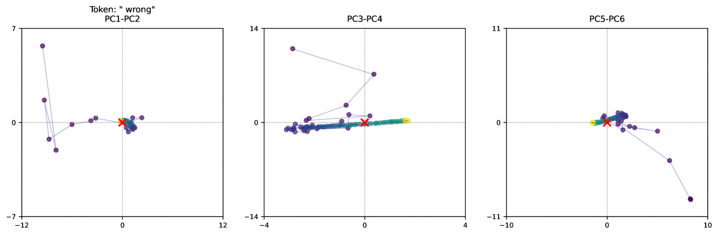
## Scatter Plot: Principal Component Analysis of "wrong" Token
### Overview
The image presents three scatter plots, each displaying the relationship between two principal components (PCs) derived from the analysis of the token "wrong". The plots show the trajectory of data points, with each point connected by a line, and colored from purple to yellow. A red 'X' marks the approximate center of the final cluster of points. The plots are labeled PC1-PC2, PC3-PC4, and PC5-PC6, indicating the principal components being compared in each plot.
### Components/Axes
* **Titles:**
* Top-center: "Token: "wrong""
* Left Plot: "PC1-PC2"
* Middle Plot: "PC3-PC4"
* Right Plot: "PC5-PC6"
* **Axes:**
* Left Plot:
* X-axis: PC1, ranges from approximately -12 to 12
* Y-axis: PC2, ranges from approximately -7 to 7
* Middle Plot:
* X-axis: PC3, ranges from approximately -4 to 4
* Y-axis: PC4, ranges from approximately -14 to 14
* Right Plot:
* X-axis: PC5, ranges from approximately -10 to 10
* Y-axis: PC6, ranges from approximately -11 to 11
* **Axis Markers:**
* Left Plot: X-axis: -12, 0, 12; Y-axis: -7, 0, 7
* Middle Plot: X-axis: -4, 0, 4; Y-axis: -14, 0, 14
* Right Plot: X-axis: -10, 0, 10; Y-axis: -11, 0, 11
* **Data Points:** Each plot contains a series of data points connected by a line. The points are colored along a spectrum from purple to yellow, indicating a progression or sequence.
* **Red 'X':** Each plot has a red 'X' marking a central location, likely representing a mean or final state.
### Detailed Analysis
* **PC1-PC2 Plot (Left):**
* The data points start in the top-left quadrant and move towards the center, clustering around the origin (0,0).
* The initial points are more scattered, while the later points (yellowish) are tightly clustered.
* The red 'X' is located near the origin, approximately at (0,0).
* **PC3-PC4 Plot (Middle):**
* The data points start in the top-left quadrant and move horizontally towards the right, forming a line along the x-axis.
* The color gradient transitions from purple to yellow as the points move rightward.
* The red 'X' is located near the origin, approximately at (0,0).
* **PC5-PC6 Plot (Right):**
* The data points start near the origin, move slightly to the left, and then curve downward and to the right.
* The color gradient transitions from purple to yellow as the points move along the curve.
* The red 'X' is located near the origin, approximately at (0,0).
### Key Observations
* All three plots show a convergence or clustering of data points towards a central location, indicated by the red 'X'.
* The color gradient from purple to yellow suggests a temporal or sequential aspect to the data.
* The PC3-PC4 plot shows a strong linear trend along the x-axis, indicating a dominant influence of PC3.
* The PC1-PC2 and PC5-PC6 plots show more complex trajectories, suggesting a more balanced influence of the respective principal components.
### Interpretation
The plots visualize the trajectory of the "wrong" token in a reduced-dimensional space defined by principal component analysis. The convergence of data points towards the origin in all three plots suggests that the token's representation stabilizes or reaches a steady state over time or iterations. The color gradient indicates a progression, possibly representing the learning or adaptation process of a model. The different patterns observed in each plot (linear vs. curved) reflect the varying degrees of influence and interaction between the different principal components. The red 'X' likely represents the final or average state of the token's representation after the process has converged.