## Scatter Plots: Principal Component Analysis (PCA) Visualizations
### Overview
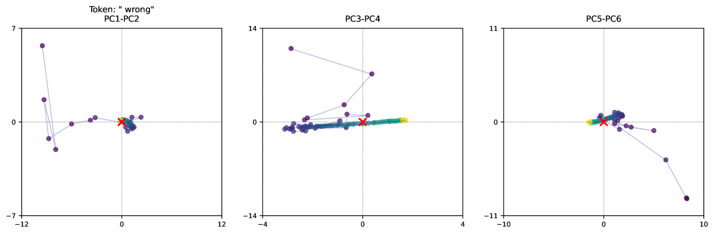
The image presents three scatter plots, each representing a Principal Component Analysis (PCA) projection of data. Each plot displays data points projected onto two principal components. The plots are labeled "PC1-PC2", "PC3-PC4", and "PC5-PC6", indicating the principal component pairs used for each projection. A token "wrong" is present above the first plot. There are several data points in each plot, colored differently (purple, cyan, orange, red, and green). One plot also contains a single data point marked with an 'x' in red.
### Components/Axes
Each plot has two axes: a horizontal axis (x-axis) and a vertical axis (y-axis). The scales vary for each plot:
* **PC1-PC2:** X-axis ranges from approximately -12 to 12, Y-axis ranges from approximately -7 to 7.
* **PC3-PC4:** X-axis ranges from approximately -4 to 4, Y-axis ranges from approximately -14 to 14.
* **PC5-PC6:** X-axis ranges from approximately -10 to 10, Y-axis ranges from approximately -11 to 11.
There is no explicit legend, but the colors of the data points are consistent across all three plots.
### Detailed Analysis or Content Details
**PC1-PC2:**
* **Purple Data Points:** A cluster of approximately 7 purple points are located in the bottom-left quadrant, with x-values ranging from approximately -11 to -2 and y-values ranging from approximately -6 to -1. A single purple point is located near the origin (x ≈ 0, y ≈ 0). Another purple point is located at approximately (2, 1).
* **Cyan Data Points:** Two cyan points are present. One is near the origin (x ≈ 0, y ≈ 0), and the other is at approximately (1, 0).
* **Orange Data Points:** Two orange points are present. One is at approximately (-1, -1) and the other is at approximately (0, 0).
* **Red Data Points:** One red point is located at approximately (0, 0).
* **Green Data Points:** One green point is located at approximately (-1, 1).
**PC3-PC4:**
* **Purple Data Points:** A cluster of approximately 6 purple points are located near the origin, with x-values ranging from approximately -1 to 1 and y-values ranging from approximately -1 to 1. One purple point is located at approximately (0, 12).
* **Cyan Data Points:** Two cyan points are present, both near the origin (x ≈ 0, y ≈ 0).
* **Orange Data Points:** Two orange points are present, both near the origin (x ≈ 0, y ≈ 0).
* **Red Data Points:** One red point, marked with an 'x', is located at approximately (0, 0).
* **Green Data Points:** One green point is located at approximately (0, 0).
**PC5-PC6:**
* **Purple Data Points:** A cluster of approximately 5 purple points are located in the top-right quadrant, with x-values ranging from approximately 2 to 8 and y-values ranging from approximately 2 to 8. One purple point is located at approximately (-8, -8).
* **Cyan Data Points:** Two cyan points are present. One is near the origin (x ≈ 0, y ≈ 0), and the other is at approximately (8, -6).
* **Orange Data Points:** Two orange points are present. One is at approximately (0, 0) and the other is at approximately (2, 2).
* **Red Data Points:** One red point is located at approximately (0, 0).
* **Green Data Points:** One green point is located at approximately (0, 0).
### Key Observations
* The purple data points consistently show the most spread across the principal components.
* The cyan, orange, red, and green data points are often clustered near the origin in each plot.
* The red 'x' in PC3-PC4 is an outlier, as it is explicitly marked and distinct from the other points.
* The token "wrong" above the PC1-PC2 plot suggests a potential issue or labeling error related to that projection.
### Interpretation
These plots visualize the results of a PCA, a dimensionality reduction technique. Each point represents a data sample, and its position in the plot indicates its projection onto the selected principal components. The principal components are ordered by the amount of variance they explain in the data.
The spread of the purple points suggests that this group exhibits the most variance across the principal components, meaning it contains the most information. The clustering of the other colors near the origin suggests they have less variance and may be more similar to each other.
The "wrong" token above the PC1-PC2 plot is significant. It implies that the projection or the data used for that specific PCA might be flawed or mislabeled. This could be due to errors in data preprocessing, feature selection, or the PCA algorithm itself. The red 'x' in PC3-PC4 could represent an outlier or an error in the data.
The different PCA projections (PC1-PC2, PC3-PC4, PC5-PC6) provide different perspectives on the data's structure. Analyzing these projections together can help identify underlying patterns and relationships within the data. The fact that the cyan, orange, red, and green points are often clustered near the origin in each plot suggests they may represent a relatively homogeneous group.