## Scatter Plots: Principal Component Analysis (PCA) Visualization
### Overview
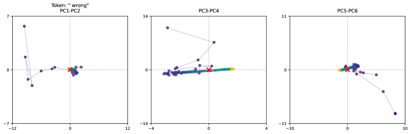
The image contains three scatter plots labeled **PC1-PC2**, **PC3-PC4**, and **PC5-PC6**, each visualizing data points in a 2D PCA space. The plots include labeled axes, a red "X" marker, and colored data points (yellow, green, blue). The red "X" appears to represent a reference or target point, while the colored points may indicate clusters or categories.
---
### Components/Axes
#### Axis Labels and Ranges
- **PC1-PC2 Plot**:
- X-axis: **PC1** (range: -12 to 12)
- Y-axis: **PC2** (range: -7 to 7)
- **PC3-PC4 Plot**:
- X-axis: **PC3** (range: -14 to 4)
- Y-axis: **PC4** (range: -14 to 14)
- **PC5-PC6 Plot**:
- X-axis: **PC5** (range: -11 to 10)
- Y-axis: **PC6** (range: -11 to 11)
#### Legends and Markers
- **Red "X" Marker**: Positioned near the origin (0,0) in all plots, likely indicating a reference or target value.
- **Colored Points**:
- **Yellow**: Appears in PC1-PC2 and PC3-PC4 plots.
- **Green**: Appears in PC3-PC4 and PC5-PC6 plots.
- **Blue**: Appears in PC5-PC6 plot.
- No explicit legend is visible, but colors likely correspond to distinct data categories or error types.
---
### Detailed Analysis
#### PC1-PC2 Plot
- **Data Points**:
- A cluster of purple points (likely representing the majority of data) is centered near the origin.
- A single yellow point is located at approximately **(0.5, 0.5)**.
- A red "X" is positioned at **(0, 0)**.
- **Trend**: Points form a loose cluster with a slight upward trajectory from the lower left to upper right.
#### PC3-PC4 Plot
- **Data Points**:
- A dense cluster of purple points spans from **(-10, -10)** to **(2, 10)**.
- A yellow point is at **(1, 2)**, and a green point is at **(3, 4)**.
- A red "X" is at **(0, 0)**.
- **Trend**: Points show a linear gradient from lower left to upper right, with the red "X" acting as a focal point.
#### PC5-PC6 Plot
- **Data Points**:
- A tight cluster of purple points near the origin.
- A yellow point at **(0.5, 0.5)** and a green point at **(1, 1)**.
- A red "X" at **(0, 0)**.
- **Trend**: Points are tightly grouped, with minimal spread.
---
### Key Observations
1. **Red "X" Consistency**: The red "X" is consistently placed at the origin (0,0) across all plots, suggesting it represents a baseline or target value.
2. **Colored Points**:
- Yellow and green points are positioned near the red "X" in all plots, possibly indicating anomalies or specific categories.
- Blue points appear only in the PC5-PC6 plot, suggesting a distinct subgroup.
3. **Cluster Distribution**:
- PC1-PC2 and PC3-PC4 show broader spreads, while PC5-PC6 has a more concentrated cluster.
- The red "X" is often surrounded by colored points, implying it may be a central or critical data point.
---
### Interpretation
- **PCA Context**: The plots likely represent principal component analysis, where PC1-PC6 are derived features explaining variance in the data. The red "X" could denote the mean or a ground-truth value.
- **Colored Points**: The yellow and green points may represent errors, outliers, or specific subgroups. Their proximity to the red "X" suggests they are closely related to the reference value.
- **Trends**: The linear trajectories in PC3-PC4 and PC5-PC6 indicate potential relationships between components, while the tighter clustering in PC5-PC6 suggests lower variability in that subspace.
- **Anomalies**: The single yellow point in PC1-PC2 and the spread in PC3-PC4 may highlight data points that deviate from the majority.
---
**Note**: No explicit legend or textual explanation is provided in the image. The interpretation assumes standard PCA conventions and color-coding practices.