## Scatter Plot: Predicted Loss vs. Observed Loss
### Overview
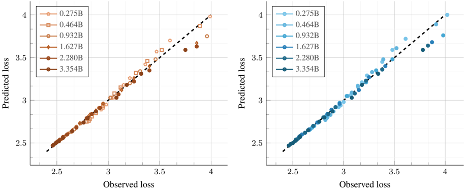
The image contains two scatter plots, each comparing predicted loss against observed loss for different model sizes. The left plot uses shades of brown, while the right plot uses shades of blue to represent different model sizes. A dashed black line, representing perfect prediction (predicted loss equals observed loss), is overlaid on both plots.
### Components/Axes
* **X-axis (Observed loss):** Both plots share the same x-axis, labeled "Observed loss," ranging from approximately 2.3 to 4.0, with gridlines at intervals of 0.5.
* **Y-axis (Predicted loss):** Both plots share the same y-axis, labeled "Predicted loss," ranging from approximately 2.3 to 4.0, with gridlines at intervals of 0.5.
* **Legend (Left Plot):** Located in the top-left corner of the left plot. It indicates the model sizes represented by different shades of brown:
* Lightest Brown (circle): 0.275B
* Light Brown (square): 0.464B
* Medium Light Brown (circle with line): 0.932B
* Medium Dark Brown (diamond): 1.627B
* Dark Brown (triangle): 2.280B
* Darkest Brown (circle): 3.354B
* **Legend (Right Plot):** Located in the top-left corner of the right plot. It indicates the model sizes represented by different shades of blue:
* Lightest Blue (circle): 0.275B
* Light Blue (circle): 0.464B
* Medium Light Blue (circle): 0.932B
* Medium Dark Blue (circle): 1.627B
* Dark Blue (circle): 2.280B
* Darkest Blue (circle): 3.354B
* **Dashed Line:** A dashed black line runs diagonally across each plot, representing the ideal scenario where predicted loss equals observed loss.
### Detailed Analysis
**Left Plot (Brown Shades):**
* **0.275B (Lightest Brown, circle):** The data points generally follow the dashed line, indicating good prediction accuracy. Observed loss ranges from approximately 2.4 to 3.9, and predicted loss ranges from approximately 2.4 to 4.0.
* **0.464B (Light Brown, square):** The data points generally follow the dashed line, indicating good prediction accuracy. Observed loss ranges from approximately 2.4 to 3.9, and predicted loss ranges from approximately 2.4 to 3.9.
* **0.932B (Medium Light Brown, circle with line):** The data points generally follow the dashed line, indicating good prediction accuracy. Observed loss ranges from approximately 2.4 to 3.9, and predicted loss ranges from approximately 2.4 to 3.9.
* **1.627B (Medium Dark Brown, diamond):** The data points generally follow the dashed line, indicating good prediction accuracy. Observed loss ranges from approximately 2.4 to 3.9, and predicted loss ranges from approximately 2.4 to 3.9.
* **2.280B (Dark Brown, triangle):** The data points generally follow the dashed line, indicating good prediction accuracy. Observed loss ranges from approximately 2.4 to 3.9, and predicted loss ranges from approximately 2.4 to 3.9.
* **3.354B (Darkest Brown, circle):** The data points generally follow the dashed line, indicating good prediction accuracy. Observed loss ranges from approximately 2.4 to 3.9, and predicted loss ranges from approximately 2.4 to 3.9.
**Right Plot (Blue Shades):**
* **0.275B (Lightest Blue, circle):** The data points generally follow the dashed line, indicating good prediction accuracy. Observed loss ranges from approximately 2.4 to 3.9, and predicted loss ranges from approximately 2.4 to 3.9.
* **0.464B (Light Blue, circle):** The data points generally follow the dashed line, indicating good prediction accuracy. Observed loss ranges from approximately 2.4 to 3.9, and predicted loss ranges from approximately 2.4 to 3.9.
* **0.932B (Medium Light Blue, circle):** The data points generally follow the dashed line, indicating good prediction accuracy. Observed loss ranges from approximately 2.4 to 3.9, and predicted loss ranges from approximately 2.4 to 3.9.
* **1.627B (Medium Dark Blue, circle):** The data points generally follow the dashed line, indicating good prediction accuracy. Observed loss ranges from approximately 2.4 to 3.9, and predicted loss ranges from approximately 2.4 to 3.9.
* **2.280B (Dark Blue, circle):** The data points generally follow the dashed line, indicating good prediction accuracy. Observed loss ranges from approximately 2.4 to 3.9, and predicted loss ranges from approximately 2.4 to 3.9.
* **3.354B (Darkest Blue, circle):** The data points generally follow the dashed line, indicating good prediction accuracy. Observed loss ranges from approximately 2.4 to 3.9, and predicted loss ranges from approximately 2.4 to 3.9.
### Key Observations
* Both plots show a strong correlation between predicted loss and observed loss across all model sizes.
* The data points cluster closely around the dashed line, indicating that the models are generally accurate in their predictions.
* There is no clear trend indicating that larger model sizes consistently perform better or worse than smaller model sizes.
* The shapes of the data points in the left plot are different, while the shapes of the data points in the right plot are the same.
### Interpretation
The scatter plots demonstrate the performance of different model sizes in predicting loss. The close alignment of data points with the dashed line suggests that all model sizes are reasonably accurate. The absence of a clear performance difference between model sizes implies that increasing model size may not necessarily lead to significant improvements in prediction accuracy for this particular task or dataset. The use of different colors (browns vs. blues) likely serves to visually distinguish the two plots, possibly representing different experimental conditions or model architectures, while the shapes in the left plot may represent different training parameters.